Tutorial - Rydia Bloom
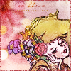
Disclaimer: this tutorial is not going to be very useful to you, as it is specific to this icon:
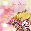
But someone requested it, so what the hell. ^^
Beware: the following tutorial is convoluted & image-heavy. There is no real method to this. Every icon is a new experiment. I hope that, even if this isn't directly helpful to you, it will at least show you that you can rescue an icon you don't like.
Starting image: Rydia
Part One: Making the mediocre version
1. I cropped the image & prepared my base, which (for me) involved duplicating the image, using unsharp mask, and then duplicating again and setting the layer to soft light. Even at 17% opacity, it was looking overly bright:
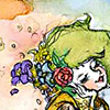
2. So I desaturated it & made it a bit darker, then messed with the color balance to tone down the green:
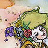
3. Next I wanted to soften it & add some pink, since it looked kind of dingy. So I used this texture by anais_dirge, from her "pastels" texture set:
I set it to screen at 10% opacity.
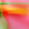
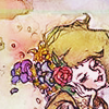
4. Then I desaturated the icon further, masking out the flowers (in her hair) so that they'd be brighter than the rest of the icon. But . . . it was looking kind of colorless at that point, so I added this texture (also by anais_dirge, from her "sunday morning" set), set to overlay at 48%:
-->
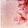
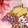
5. I wanted a different look for the background, so I took another texture (hee, again by the lovely anais_dirge, this time from her "cinnamon & sugar" set), flipped it, and cut it to fit around Rydia's head. Then I touched everything up with levels. (Actually, I probably did the levels adjustment right away, but I'm going by the layer order in my .psd.)
-->
6. After that I added a light texture (from anais_dirge's "light thingies" set), text, and a border. It looked okay, but I didn't like it. :(
Part Two: In which the icon I dislike is transformed
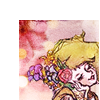
7. I did not want to re-color & cut out & do all the masking again. So rather than starting from scratch, I took the icon I had made, removed the text and the border, and shrunk it down. To . . . maybe 75x75? I can't remember. In any case, it was smaller:
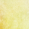
8. I put this texture (from anais_dirge's "rainbow mildew" set) behind it:
9. I was making this icon for the "flower" theme at ff_eye_candy, & even though Rydia has flowers in her hair, I wanted more flowers. So I stamped this brush (from yumei_k's "hibiscus" set) on top of the texture, and used a pattern overlay to make it look like this:
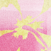
Pattern Overlay Screenshot
10. But um, this looked weird: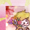
Something needed to be done to integrate that flower shape. So I used the smudge tool to smear the texture (the one behind her, not the green one), so that it sort of matched the shape of the flower brush:
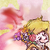
11. Okay, but that looks a bit too smeary. So to soften it, I added this texture (from anais_dirge's "le jardin" set) at 28% opacity (I masked out Rydia's face, so only the background was affected), and added another light texture from the "light thingies" set.
-->
12. After adding the text, a dotted line brush (under the text), and a border, I was finished! Yay! And I was very happy with the result:

Whew! Okay, so . . . that's the end. My icons do not usually involve this many steps/layers. *falls over*
Thanks for reading! ♥
If you have any questions, go ahead and leave a comment. And if you like pretty colors, go visit anais_dirge! ♥
P.S. This probably goes without saying, but don't hotlink any of these images. ^^
But someone requested it, so what the hell. ^^
Beware: the following tutorial is convoluted & image-heavy. There is no real method to this. Every icon is a new experiment. I hope that, even if this isn't directly helpful to you, it will at least show you that you can rescue an icon you don't like.
Starting image: Rydia
Part One: Making the mediocre version
1. I cropped the image & prepared my base, which (for me) involved duplicating the image, using unsharp mask, and then duplicating again and setting the layer to soft light. Even at 17% opacity, it was looking overly bright:

2. So I desaturated it & made it a bit darker, then messed with the color balance to tone down the green:

3. Next I wanted to soften it & add some pink, since it looked kind of dingy. So I used this texture by anais_dirge, from her "pastels" texture set:

I set it to screen at 10% opacity.
4. Then I desaturated the icon further, masking out the flowers (in her hair) so that they'd be brighter than the rest of the icon. But . . . it was looking kind of colorless at that point, so I added this texture (also by anais_dirge, from her "sunday morning" set), set to overlay at 48%:

-->

5. I wanted a different look for the background, so I took another texture (hee, again by the lovely anais_dirge, this time from her "cinnamon & sugar" set), flipped it, and cut it to fit around Rydia's head. Then I touched everything up with levels. (Actually, I probably did the levels adjustment right away, but I'm going by the layer order in my .psd.)

-->

6. After that I added a light texture (from anais_dirge's "light thingies" set), text, and a border. It looked okay, but I didn't like it. :(

Part Two: In which the icon I dislike is transformed
7. I did not want to re-color & cut out & do all the masking again. So rather than starting from scratch, I took the icon I had made, removed the text and the border, and shrunk it down. To . . . maybe 75x75? I can't remember. In any case, it was smaller:

8. I put this texture (from anais_dirge's "rainbow mildew" set) behind it:

9. I was making this icon for the "flower" theme at ff_eye_candy, & even though Rydia has flowers in her hair, I wanted more flowers. So I stamped this brush (from yumei_k's "hibiscus" set) on top of the texture, and used a pattern overlay to make it look like this:

Pattern Overlay Screenshot
10. But um, this looked weird:

Something needed to be done to integrate that flower shape. So I used the smudge tool to smear the texture (the one behind her, not the green one), so that it sort of matched the shape of the flower brush:

11. Okay, but that looks a bit too smeary. So to soften it, I added this texture (from anais_dirge's "le jardin" set) at 28% opacity (I masked out Rydia's face, so only the background was affected), and added another light texture from the "light thingies" set.

-->

12. After adding the text, a dotted line brush (under the text), and a border, I was finished! Yay! And I was very happy with the result:
Whew! Okay, so . . . that's the end. My icons do not usually involve this many steps/layers. *falls over*
Thanks for reading! ♥
If you have any questions, go ahead and leave a comment. And if you like pretty colors, go visit anais_dirge! ♥
P.S. This probably goes without saying, but don't hotlink any of these images. ^^