TUTORIAL 11 >> Christina Aguilera
From 
to
or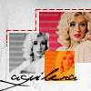
USING PS7 - Translatable :)
WARNING - IMAGE HEAVY
01. I used this image from Christina Aguilera Zone. Crop and resize to 100x100. You know the deal. Duplicate your base and set the layer to Screen. Do this as many times as necessary until the base sort of resembles this one. Also, note the reddish tint to the icon because the following step will help neutralize the red.

>
02. Create a new layer and fill it with a light blue (#ABEAFF). Set the layer to Color Burn. The icon was still looking a bit red, so I duplicated the color burn layer. I left both of those layers at 100%.

>
>
03. Now I wanted to emphasize the lips and the background, so I created a new layer. Using the Brush Tool in a pinkish color (#FF74D2), I went over the lips and the background and set the layer to Soft Light at 75%.

>
04. Create a new layer and fill it with a dark tan color (#E1CCBA) and set that to Multiply at 100%. This will give you the darker, more washed out look.

>
05. However, it looks a little too washed out. So I created a new adjustment layer (Layer > New Adjustment Layer > Hue/Saturation). Leave all the settings at 0 and click ‘OK’. Set the layer to Soft Light. I lowered the opacity for mine to 60%. This gives the icon more depth.

>
**YOU CAN STOP HERE OR GO ON TO MAKE THE SECOND ICON**
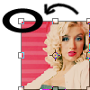
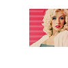
06. Don’t flatten the image because then we can’t move it, so I instead I just copy merged the whole icon, opened a new 100x100 document, and pasted it there. To make the icon smaller go to Edit > Free Transform (Ctrl+T). To maintain equal proportions, hold the Shift button while you pull the corners in. Once I did that, I moved the base to the right side and sharpened it (Filter > Unsharp Mask).
>
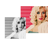
07. Duplicate that base and again, using Free Transform, make the base copy smaller. I positioned it to the left, with it slightly overlapping the base. I desaturated that layer (Ctrl+Shift+U). It was looking a bit dull, so I duplicated the desaturated layer and set the blend mode to Overlay at 100%.

>
08. Duplicate the desaturated layer and make it smaller using the Free Transform again. Position it wherever you’d like. I duplicate that layer and set it to Overlay at 100% for more depth. Now, select ONLY the small layer. You can do this by using the Rectangle Marquee Tool or load the selection. To load the selection, move your mouse over the layers palette to the layer you want to select. Hold Ctrl and click the layer and your layer should be selected. (THIS IS IN PS7, I’m not sure how to do this in the other programs).

>
09. THIS STEP IS WITH THE SMALL DESATURATED LAYER SELECTED. Create a new layer and fill it with an orange (#FFAC00) and set the layer to Multiply at 100%. Create a new layer and fill it with a bright red (#FF0000) and set the layer to Screen at 100%. With the layer selected, the color layers should ONLY affect that layer. You may now deselect the layer.

>
>
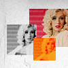
10. I modified and cropped this texture by peoplemachines to my liking and pasted it on top of everything. Set the layer to Linear Burn at 100%.
>
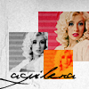
11. Now you can decorate the base however you want. I used jey at 46pt with a -25 tracking in black and wrote ‘aguilera’. For the dashed line, you can do this many ways. But since I don’t know of an easy way to create dashed lines in Photoshop, I used the line tool to trace around the borders of the base in red (#FF0000). Then, I used the eraser to erase in between. Set the layer to Multiply.

>
>
AND FINALLY, THERE YOU HAVE IT!
I would love to see your results!
This tutorial is kind of long and confusing, so if you have any questions, don’t hesitate to ask! :D
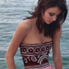
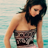
Examples using this technique:

>
>
For My Last Tutorials:

**MY LIST OF TUTORIALS IS NOW UP HERE.**
to
or
USING PS7 - Translatable :)
WARNING - IMAGE HEAVY
01. I used this image from Christina Aguilera Zone. Crop and resize to 100x100. You know the deal. Duplicate your base and set the layer to Screen. Do this as many times as necessary until the base sort of resembles this one. Also, note the reddish tint to the icon because the following step will help neutralize the red.
>
02. Create a new layer and fill it with a light blue (#ABEAFF). Set the layer to Color Burn. The icon was still looking a bit red, so I duplicated the color burn layer. I left both of those layers at 100%.
>
>
03. Now I wanted to emphasize the lips and the background, so I created a new layer. Using the Brush Tool in a pinkish color (#FF74D2), I went over the lips and the background and set the layer to Soft Light at 75%.
>
04. Create a new layer and fill it with a dark tan color (#E1CCBA) and set that to Multiply at 100%. This will give you the darker, more washed out look.
>
05. However, it looks a little too washed out. So I created a new adjustment layer (Layer > New Adjustment Layer > Hue/Saturation). Leave all the settings at 0 and click ‘OK’. Set the layer to Soft Light. I lowered the opacity for mine to 60%. This gives the icon more depth.
>
**YOU CAN STOP HERE OR GO ON TO MAKE THE SECOND ICON**
06. Don’t flatten the image because then we can’t move it, so I instead I just copy merged the whole icon, opened a new 100x100 document, and pasted it there. To make the icon smaller go to Edit > Free Transform (Ctrl+T). To maintain equal proportions, hold the Shift button while you pull the corners in. Once I did that, I moved the base to the right side and sharpened it (Filter > Unsharp Mask).
>
07. Duplicate that base and again, using Free Transform, make the base copy smaller. I positioned it to the left, with it slightly overlapping the base. I desaturated that layer (Ctrl+Shift+U). It was looking a bit dull, so I duplicated the desaturated layer and set the blend mode to Overlay at 100%.
>
08. Duplicate the desaturated layer and make it smaller using the Free Transform again. Position it wherever you’d like. I duplicate that layer and set it to Overlay at 100% for more depth. Now, select ONLY the small layer. You can do this by using the Rectangle Marquee Tool or load the selection. To load the selection, move your mouse over the layers palette to the layer you want to select. Hold Ctrl and click the layer and your layer should be selected. (THIS IS IN PS7, I’m not sure how to do this in the other programs).
>
09. THIS STEP IS WITH THE SMALL DESATURATED LAYER SELECTED. Create a new layer and fill it with an orange (#FFAC00) and set the layer to Multiply at 100%. Create a new layer and fill it with a bright red (#FF0000) and set the layer to Screen at 100%. With the layer selected, the color layers should ONLY affect that layer. You may now deselect the layer.
>
>
10. I modified and cropped this texture by peoplemachines to my liking and pasted it on top of everything. Set the layer to Linear Burn at 100%.
>
11. Now you can decorate the base however you want. I used jey at 46pt with a -25 tracking in black and wrote ‘aguilera’. For the dashed line, you can do this many ways. But since I don’t know of an easy way to create dashed lines in Photoshop, I used the line tool to trace around the borders of the base in red (#FF0000). Then, I used the eraser to erase in between. Set the layer to Multiply.
>
>
AND FINALLY, THERE YOU HAVE IT!
I would love to see your results!
This tutorial is kind of long and confusing, so if you have any questions, don’t hesitate to ask! :D
Examples using this technique:
>
>
For My Last Tutorials:
**MY LIST OF TUTORIALS IS NOW UP HERE.**