(part two) icon recs
TORTES' ICON RECS
FYI » This is not meant to be a comprehensive list of good icon makers for any fandom. Recommendations were categorized based on our own recollection of when an icon maker dropped onto our radar. If we didn't know your gender, we made an educated guess (female). Lastly, if you steal this table code, I will kill you. Enjoy! /quadruple suicide
THE COME BACK WE MISS YOU
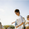
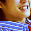
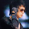
EPICALLY » I remember when I first started out iconning; I'd visit Sarah's community ridiculously frequently for some inspiration, and I was never disappointed. To me, she was one of the elite of kpop iconning on LJ and remains as such even after her departure.
THRIFT » What can I say about this girl? Her icons are vibrant, stunning, dazzling, and a whole bunch of other adjectives. Her love for the lost Kibum was notorious, and now, she's become one herself. She and Mary should be sat down and given a stern talking to.
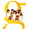
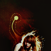


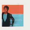
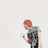
CLARIONS » Mina needs to make a comeback even more than CSJH the Grace do. Her ability to adapt all kinds of images to her beautiful, soft coloring is amazing, as are her clean cutouts. Her simple icons are to die for and her complicated icons aren't far behind.
ENGINEDRIVEN » This icon maker is one sharp-dressed woman. She icons for just about every fandom imaginable, and her icons are always sharp, with her unique skin-tone coloring. Her use of cloudy textures and overlapping images is her one-in-a-million trademark.
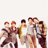
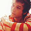
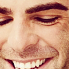
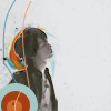


HONEYMELLOW » Pipe dream, I know, but no one did the scrapbook style better than its pioneer, honeymellow. With her beautiful handcrafted textures and bright coloring (neon done right?!), she set a trend that still refuses to die long after she left.
SUSHIKABOB89 » Big crops. Multiple textures. Coloring. Simple or complicated, anything you can do, this icon maker can do better. Whether it was stock, video games, kpop or fashion, she excelled. A new icon post by sushikabob89 is what you really should be wishing for at 11:11.
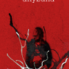
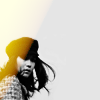
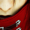


STICKERBOX » Def. one of my favorites. This icon maker provided the kpop scene with a dose of sick creativity, and by sick I mean the good kind. Her use of texture, puple-ish coloring THAT WORKS and most of all composition is absolutely stunning. I'm in love with her icons. And I miss them dearly!
5254 » Misaki has been MIA for at least 2-3 years now but her legacy still lives. Her icons always showed the best creative composition out there and her text use were always unique. She stood out in comparison to others due to her creativity and bold coloring. She needs a comeback, we all miss her dearly!


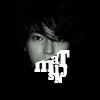
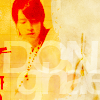

REDCHEMISTRY » elsa has this really unique style. okay, so everyone has their own tagline. her fetish with cairo is simply amusing. her icons are not only god-like, her wallpapers are worth the wait. the typograpy implemented into her art, amazing. elsa, please come back :(
KOKOROMONSTER » i love everything about helen's icons. the colouring is amazing, and her crops are perfect. the way she adds her textures makes everything look naturally ~together~ there is nothing about any of her icons to hate at all. A+, i'd say

AIRFLIGHTS » MUST. LOVE. THU'S. WORK. clean crops and colouring of all sorts. other than that, what i love about her icons are her witty texts she manages to incorporate in. thu's colouring isn't perfect, no one's is but she has an amazing variety of soft colouring which prevails when she shows a more serious side to her icons.
EPIKISH » vbfdhbvdfhbv her very first batch of icons was all it took to blow me away. hyun is a natural at this. her colourings are really fresh and i love how she manages to make her textures blend in every composition she has. she has a really wide range of fandoms and her kfashion icons seem like some kind of trademark. big fan here.

THE HIDDEN GEMS


ZANAO » It's like happening upon a hidden cafe in a bustling city, where everything's quiet, casual, and just so comfortable. And the food? Godly. This is Sarah and her hidden-away community of icons. A burst of flavor in the otherwise stale icon communities.
STARSURFER » Among the animanga world, there is a hidden talent who can do almost anything with her icons. Crisp, muted, natural, this girl's icons are just what you'd want to see popping up in your flist after a hard day at school or work. From fanart to people to stock, one glance at her icons, and you're sure to fall in love.
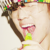
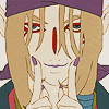

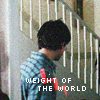
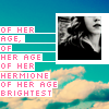
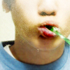
WINGSHOPPE » Avant-garde crops and dynamic colors. Noise textures and blurred out faces. Eye-popping compositions and amazing typography. Seriously, why haven't you found her yet? Formerly of grarpirates, this girl has since moved onto her own playground and has been playing there ever since. There's just something about her icons that screams inspiration.
PERSONIFIED » What a hidden gem, indeed! This icon maker produces beautiful, crisp and vivid icons that will blow you away. The minimalistic style that she uses works well with her eye for cropping. The more I see her icons, the more I fall in love with them. And I know you will too!


TOKYOBIRDS » This icon maker loves her negative space, and I love her for it. Despite all the negative space she uses, her icons are never lacking. Her texture use is always tastefully done, and her coloring is amazing: Just call her Princess Peach.
PUCCACHAN » This icon maker is not famous, but she deserves to be, in every single fandom she icons for. Her simple, textless icons bring out her beautiful coloring, and her texture use is unobtrusive and artistically done. Her cutouts in particular are always well done.
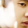
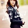

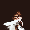

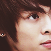
DOWNPOUR » If downpour isn't on your icon radar already, she very well should be; her icons are refreshing and really break the mold. Her dark, high-contrast, vivid coloring is incredibly bold and unique, and she favors big crops that are always well-executed.
GRECIANS » I have very few words to describe grecians' icons because "perfection" only has so many synonyms. She works well with both negative space and cutouts as well as creative big crops and eyeless crops. Her icons are brilliantly colored, while avoiding over-contrast or over-saturation.

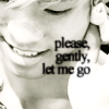



WOODPECK » Sharp, vivid and bold. These are only a few adjectives that describe this icon maker's beautiful style. It's a simplistic style, yet works so well. Her cropping and use of texture are well presented. The posts just keep getting better and better!
BSSYBUSE » This icon maker is a master at what she does. Her icons are well colored and well textured. She has mastered the ways of the iconing yet lack the recognition. Behind this unrecognized rock is a gem, full of surprises and creativity as well as too-awesome-for-words composition!



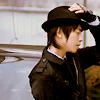
ENCONTRE » lili doesn't post icons as often as she does with her layouts but just by skimming her icon posts, you can see that her icons have been improving and the colouring she progresses with are also rather captivating to the human eye. post more, lili!
FAUXFLAIR » faana's compositions aren't very complicated and thats what i really enjoy about her icons. colouring seems to be her forte and her crops are also clean and sharp. her multifandom posts are plus points. she seems to be able to come up with something fresh after every post and that's something i envy and like about her.


THE TARTS


KIPLING » How can I wax poetic about JJ's work? Her icons are gorgeous, bright, soft, muted, minimalistic, simple, and just the clean and fresh break in between heavy meaty icon posts that you need to keep going on. She may claim to be new at iconning, but her inexperience certainly doesn't show in her icons.
KYUPPLES » Feel the Jayness. Darry's icons are sharp and brilliant, and her use of text and font choices makes her stand out. Her coloring is never sub-par, and her crops are always perfect. She claims to hate textures but is in reality a texture queen, always experimenting with different styles.
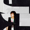


VOWEL » How do you describe her icons? Too amazing and inspiring for words; she manages to awe us with her beautiful crops, bold coloring, fantastic texture use and composition. Acire is not afraid to stand out, yet bold enough to keep it simple too. Creativity just oozes out of her, even if she says otherwise!
REALVOIX » other than how mary needs to get her ass back to tortes, there's nothing to hate :P i love her icons; there are always colours that seem to shout at you like bam! in the really good way. her colouring is really strong and bold and textures, they seem to come naturally as well. her variety in style and fandoms in every post is a feast for all.
KIPLING » AOZA, BIDE, CLARIONS, DOWNPOUR, ENGINEDRIVEN, GOLDENMELISANDE, GRECIANS, HONEYMELLOW, HUONGLE, INSTANTDAZZLE, KEEPTHELIGHTS, KYUPPLES, LEETEUK, MILKYAIR, PUCCACHAN, SUSHIKABOB89, TOKYOBIRDS
KYUPPLES » AIRFLIGHTS, CHIBI_BIJUTSU, CRANES, DISCS, ENCONTRE, EPIKISH, FAUXFLAIR, KOKOROMONSTER, LOOKINGAT, LOOSENING, MURASAKI_FIVE, PETERSBURGS, REALVOIX, REDCHEMISTRY, SALAZARS, WITISOVERRATED
REALVOIX » 5254, AKIHITO, BSSYBUSE, IKU, JOYFULS, LIGHT_FLOWER, ONEW, PERSONIFIED, SAMURAIBLUES, SCANKY_CHOPS, STICKERBOX, STRZYGA, THEHEAVEN, THRUX, VOWEL, WOODPECK, X_MOMOLICIOUS_X
VOWEL » CALIXA, CAMBRIDGE, DILLSPOND, DISSUADE, EPICALLY, GLASSTAINED, KIPLING, KOREANS, MIDNITEXSONATA, MINOLTA, MYRASIS, NOKONCHAN, PAINTABLE, ROONZIL, SHIXON, STARSURFER, THRIFT, TOASTANDTEA, WINGSHOPPE, ZANAO, ZO_CAT
« PART ONE