R01-C01-Results
Excellent first week everyone! Gorgeous icons and wonderful participation, not only with the icons but with the voting, thanks so much to everyone who voted! I was pleasantly surprised to see how many comments we had too!
I hope everyone can understand how I did the voting, each 1st place vote is worth 3 votes, each 2nd place votes is worth 2 votes and each 3rd place votes is worth 1 vote. Take a look at the voting tallies and if I've messed something up don't be afraid to point it out :-)
1st amberguini
2nd dana_pants
3rd nervous__girl


SPECIAL CATEGORY

Congrats to the winners! Everyone was very deserving, and a huge thanks again to everyone who voted and entered, this community is starting off on a very good leg :-)
All points have been updated so you can go check to see your point tally.
VOTING
You can find your icon number here.
1st Place Votes - worth 3 votes
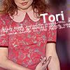
01 - nice crop for placement of tori in icon, great colouring overall, love tori's hair brightening and shine on her lips.
01 - over all coloration is awesome - nice reds
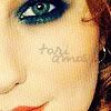
02 - amazing coloring and textures! The color of her eyeliner stands out very nicely, gorgeous icon!
02 - A very sexy-looking icon with great text.
02 - I like the contrast of the colors. It's very simple but effective, also for the faded text on the cheek.
02 - gorgeous coloring and love the text and the position of it and the crop
02- Lovely coloring & the close up crop on Tori's eye looks great.
02 - she did what I was trying to do, but couldn't. Heh.
07 - Creepy coloring, but in a good way! Seems very grungy and atmospheric, but very expressive.
09
11 - excellent crop, great use of text brushes.
12 - The quality of the photo has been enhanced perfectly, and the text really seems to fit this icon well.
14 - very excellent sharpening and colouring.
15 - Goes beautifully with the choosen lyrics!
2nd Place Votes - worth 2 votes
01 - I love the coloring. The red is fantastic.
01 - effective use of the colors of the image. Another simple but very good work.
01 - great bright colors, interesting crop of her face.
01 - very cool burn effect.
01 - I like the bright coloring the use of red hues.
01
02 - I love the textured canvas effect you've used, and her name is prominent without being obtrusive. Great work!
03 - different look and feel from the others - matte look
05 - The desaturation, combined with coloured lips, definately makes the text stand out
10 - Very smooth and clean looking. Nice, sharp, clear, and crisp, with a good design.
10 - coloring is great and love the texture and the tiny text
11 - I love the subtlety of this icon, text and placement works very well here.
11 - I like how she cut off the face, yet you can still tell who it is with the text.
15 - adore the blue hue accented on her eyes, great quote/lyric chosen to coordinate with the crop used, shadowing a bit harsh though overall; makes for negative space
3rd Place votes - worth 1 vote
01 - good crop and the coloring is beautiful
05 - good b/w look with purple lip accent
06 - nice texture used to distract from that odd space that was in the original image, like the sharpening of tori- makes her pop for the icon.
06- The rough textures/brushes adds a cool effect.
08 - Great coloring! Good crop. Simple but pretty.
08 - this one really stands out among the others.
09 - I love the way the framing highlights her face and turns it into the perfect subject for the flavor text.
09 - I love the brush used on this picture.
09 - awesome masking.
10 - nice and simple, nothing is overpowering and the attention goes right to Tori, excellent composition.
11
12 - I love how in this it's been enhanced the sweetness in Tori's glance.
12 - love the soft, natural colors; great use of text, and lovely crop of her face.
13 - The colors are so vivid, especially the purpley blue in the background, and it really stands out from the crowd because of it.
Special Category votes - worth 1 vote
02 - The crop here really brings the focus to Tori's eyes which are amazing in this image, very different from the rest of the icons, this one really stands out.
02 - getting her eye and a touch of those lips - that's just sexy
02 - usually I don't like cut eyes, but this cut is really good. Tori's eye is decentered but attracts the look on it and the lips "hint" helps tha image appear more varied and light. Good work IMHO.
02 - gorgeous coloring and love the text and the position of it and the crop
02
08- The crop looks interesting & unique.
09 - The crop definately adds new life to the picture! You can't tell it came from that picture at all.
09 - like the crop effect even though the text added isn't very visable
10 - funky cropping with the texture without distorting the actual picture.
11 - This was a hard crop to work with - I tried it and ditched it! - and I admire how well you executed the crop, it feels intentional and well executed.
11 - I think the crop was very unique in the way that it ignored tori's face and focused more on her body. I like how it came out. Great job.
12 - great centering on her face captures that evil-esque look she has in the image. the honey takes away from the icon in its size with the orange/tan box around it though, get the idea you were going for but perhaps with it translucent it would have worked better.
12 - focus on her funny lip shape is cool.
13 - Focuses on Tori without any one part being overwhelming. Looks balanced but interesting.
01 - 19
02 - 20
03 - 2
05 - 3
06 - 2
07 - 3
08 - 2
09 - 6
10 - 5
11 - 8
12 - 5
13 - 1
14 - 3
15 - 5
Don't forget to enter in CHALLENGE 02!