Icon Tutorial 02 - Band of Brothers
NOW WITH FIXED, COHERENT HTML!
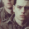
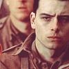
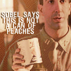
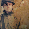
Going from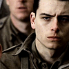
to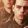
in thirteen steps. Uses selective colouring, curves, the whole Photoshop shebang, so not translatable. :)
eins
Crop to 100x100, sharpen/blur, make it look nice.
zwei
Duplicate your base and set to screen at 50% (this is a varied step, if your image is dark you may want to set the opacity higher.)
drei
Create a new layer and fill with #331f09 and set it to exclusion at 100%
vier
Create another new layer and fill will #0d082f and also set it to exclusion at 100%
fünf
Create a new adjustment layer > selective colouring and set it as follows:
Reds -100 +30 +100 0
Yellows -100 +100 +100 0
Whites -50 -15 +18 -10
Neutrals -5 -2 -12 +6
sechs
Duplicate your base and set to lighten at 100% (again, if it is too dark, set it to screen at 50% or so)
seiben
Create a new layer and fill with #c2a98f and set to overlay. If need be, erase the parts over the face with a low opacity eraser (I used 64% opacity)
acht
Create a new adjustment layer > curves and set it as follows:
RGB - one: 70 60 two: 190 185
RED - one: 30 35 two: 188 185
neun
Create a new adjustment layer > hue/saturation and lower the saturation to -20.
zehn
Create a new adjustment layer > colour balance and set it as follows:
MIDTONES +28 0 0
SHADOWS +19 +11 +6

elf
Create a new layer and fill with #a9631b and set to saturation at 30%.
zwölf
Duplicate your base again and set it to pin light at 100%.
Now, you can stop there or you may add a texture to your icon.
dreizehn
Crop this texture by (source to be specified) to your liking and set it to lighten at 100%. Erase over the face. Depending on your texture, you may need to set it to multiply)
And you're done! ♥
other icons made with this colouring:

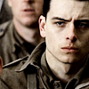
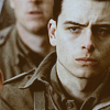
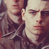
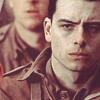
Going from
to
in thirteen steps. Uses selective colouring, curves, the whole Photoshop shebang, so not translatable. :)
eins
Crop to 100x100, sharpen/blur, make it look nice.
zwei
Duplicate your base and set to screen at 50% (this is a varied step, if your image is dark you may want to set the opacity higher.)
drei
Create a new layer and fill with #331f09 and set it to exclusion at 100%
vier
Create another new layer and fill will #0d082f and also set it to exclusion at 100%
fünf
Create a new adjustment layer > selective colouring and set it as follows:
Reds -100 +30 +100 0
Yellows -100 +100 +100 0
Whites -50 -15 +18 -10
Neutrals -5 -2 -12 +6
sechs
Duplicate your base and set to lighten at 100% (again, if it is too dark, set it to screen at 50% or so)
seiben
Create a new layer and fill with #c2a98f and set to overlay. If need be, erase the parts over the face with a low opacity eraser (I used 64% opacity)
acht
Create a new adjustment layer > curves and set it as follows:
RGB - one: 70 60 two: 190 185
RED - one: 30 35 two: 188 185
neun
Create a new adjustment layer > hue/saturation and lower the saturation to -20.
zehn
Create a new adjustment layer > colour balance and set it as follows:
MIDTONES +28 0 0
SHADOWS +19 +11 +6
elf
Create a new layer and fill with #a9631b and set to saturation at 30%.
zwölf
Duplicate your base again and set it to pin light at 100%.
Now, you can stop there or you may add a texture to your icon.
dreizehn
Crop this texture by (source to be specified) to your liking and set it to lighten at 100%. Erase over the face. Depending on your texture, you may need to set it to multiply)
And you're done! ♥
other icons made with this colouring: