R01-C06 Results
This is way late but school has just been very hectic for me, school and the holidays coming up I just haven't had much time to for livejournal at all. So now, the results...
THE ELIMINATION
iikhushi86ii tabettha thereal_anabel garnet_sunrise


tabettha, and thereal_anabel have been eliminated.
iikhushi86ii, and garnet_sungrise are down to one icon.
PEOPLE'S CHOICE
Image Challenge
garnet_sunrise

Special Challenge
garnet_sunrise

VOTING RESULTS
You can find your icon number here.
NEGATIVE VOTES
01 - nice icon, i think there could have been more done with the colors, its a bit dull.
01 - Its mine, but I just realized the colors should have been a little brighter.
01 - I feel it could be sharper, and/or cropped in a more dynamic way.
01 - The color looks faded.. I always think of children's art to be bright and colorful.
01 - The color seems a bit faded.
01 - the saying doesn't fit well
03 - I do not see the point in those four lines on top. The dotted-line could have been a little lighter, like greyish.
03 - too sharp
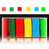
04 - nice use of color but its difficult to make out the image, composition could have been better, too much white area.
04 - Its hard to tell that those are crayons.
04 - It's hard to see what the crayons are.
04 - If I didn't know the competition was for crayons, I don't think I'd know what I was looking at...
04 - I don't see how the icon relates to "crayons." If anything, the image looks more like marker caps than crayons.
04 - I like the colors but I can't figure out what the items in the icon are...
04 - it doesn't transmit something
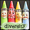
05 - very cute idea, image is adorable but the composition could have been better. the colors are a bit dull and it might be sharpened a bit too much.
05 - Cute, but the "diversity" and its greenish background looks a little off place.
05 - I think the idea is cute, but the colors are bothering me.
05 - The colors seem very washed out and just don't seem very eye-catching.
05 - I feel like the faces make the icon seem very odd.
05 - the faces are scary
05 - image is too grainy
06 - The main focus of the icon should be the child, but you can't see any details on the child - he/she is almost just a silhouette.
06 - the texture used to make the grid doesn't fit to me.
06 - the background looks very apart from the child
07 - it's like the boy were writing a story but he is drawing
08 - i love the unconventional crayons, very cute, but i feel like not much was done as far as coloring goes, a bit dull.
08 - The image has been brightened up nicely from the original, but I feel the cropping could be more interesting.
08 - It's a bit too basic for me to think it other than just a base.
08 - some text or a border of some sort would help
POSITIVE VOTES
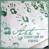
02 - lovely color, very bold. text works very well, composition of the icon is great.
02 - Well, I'm not only picking it because its the only one I can comment on, but it really IS a pretty icon. The fonts go very well, and the handprints look so distinct -- not too pixelated.
02 - Beautiful composition and the border matches the icon.
02 - I like the vibrant green, and the border makes it look complete.
02 - Good color, good quote.
02 - I like the concept
02 - the saying and the image compliments each other
03 - I like the cropping and the dotted line.
03 - This is what I wanted to do, but just couldn't make it work. Great job!
06 - cute icon! nice use of image, good crop and color. text is cute.
07 - nice, bright with a simple text & wording
08 - It's something new, and cute. And they still look like crayons!
08 - Fun icon!
08 - the types of crayons are nice