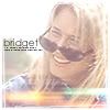
brakspants ofvaldezicons (as reviewed by _fleur)
[01] First Impression Poo, I started to review the journal before realising it was shared. Should have pointed that one out. So I shall just review brakspants. Lovely layout- simple and calm colours, and teasers! Also, memory function is gooood.
[02] Prominent Subjects TV and Film
[03] Style faded, gradiented icons, with complimentary text
[04] Text lots of different fonts going on, which is good because people can get hooked on overusing one. The text colour really goes with the image colours too, for example in the third of my favourites below.
[05] Miscellaneous Just to point out to others again that this is a shared icon journal *headdesk*
[06] Overall Impression Lovely icons that are in the middle of simple and over the top. I like it how you havn't tended to use too many brushes, and the skin tones you have achieved through the lighting and layers. I also admire how you havn't gone along with the current icon trends :)
[07] Constructive Criticism (if any at all) Sharpen! Lots of people under-sharpen, but it can usually improve the icon by 100%. Also try experimenting with bolder gradients and harsher layer settings. Overall you are producing lovely icons though.
[08](three) Personal Favourites