dogwasstar
in
theimc
_illustrated (as reviewed by dogwasstar)
[01] First Impression Well, I followed the trail of discarded icon journals, from silkicons to randomcookie to _illustrated, where I finally settled. It was a bit of a bother, but all the layouts were nice. The final layout has a simple brown and cream color scheme, very easy on the eyes. There are only three icon posts, but the first two have at least 30 icons each. The latest has only 3.
[02] Prominent Subjects The jetsetting young hollywood (Ashlee and Jessica Simpson, the Olsen twins, etc), and various actresses (Marilyn Monroe, Keira Knightley).
[03] Style In the second set, all of the icons look like bases of paparazzi photographs, usually with a subtle exclusion effect and a pixel border. However, in the first set [and the small third set], there are lots of gradients, light textures, and brilliant colors. The icons have a clean, clear cut, about as far from grungey as one can get.
[04] Text You use small text effectively as decoration, but the larger text tends to look slightly out of place. Some of the text looks a bit blurry, so make good use of the sharpen effect!
[05] Miscellaneous The memories are organized by actress, and the userinfo is clear and informative.
[06] Overall Impression This is a good journal for girly icons! I especially like the use of color here; you aren't afraid to make a bright icon.
[07] Constructive Criticism (if any at all) I'd suggest testing out some texture brushes. You do fantastically with the light effects, and i think some different textures (perhaps splatters or grunge) would do nicely on your icons. It also might be good to branch out a bit in subject matter; you only have two icons that have males in them! Don't be afraid to experiment with different fonts and text effects, and test out some new textures, but all in all, keep up the good work. You clearly know what you are doing.
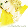
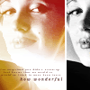
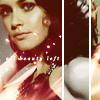
[08](three) Personal Favourites
[02] Prominent Subjects The jetsetting young hollywood (Ashlee and Jessica Simpson, the Olsen twins, etc), and various actresses (Marilyn Monroe, Keira Knightley).
[03] Style In the second set, all of the icons look like bases of paparazzi photographs, usually with a subtle exclusion effect and a pixel border. However, in the first set [and the small third set], there are lots of gradients, light textures, and brilliant colors. The icons have a clean, clear cut, about as far from grungey as one can get.
[04] Text You use small text effectively as decoration, but the larger text tends to look slightly out of place. Some of the text looks a bit blurry, so make good use of the sharpen effect!
[05] Miscellaneous The memories are organized by actress, and the userinfo is clear and informative.
[06] Overall Impression This is a good journal for girly icons! I especially like the use of color here; you aren't afraid to make a bright icon.
[07] Constructive Criticism (if any at all) I'd suggest testing out some texture brushes. You do fantastically with the light effects, and i think some different textures (perhaps splatters or grunge) would do nicely on your icons. It also might be good to branch out a bit in subject matter; you only have two icons that have males in them! Don't be afraid to experiment with different fonts and text effects, and test out some new textures, but all in all, keep up the good work. You clearly know what you are doing.
[08](three) Personal Favourites