tutorial #01
Hello! I've got my first tutorial here. Nothing too fancy, just some coloring. I hope you like it!
Go from this:
to this: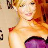
.
Made in Paint Shop Pro 8, but it's translatable.
1) Take a picture of your choosing and crop it down to 100x100. Duplicate the base, set it to screen and decrease opacity to 70.

⇒
2) Next go to Layers → New Adjustment Layer → Curves. Enter these settings:
RGB
Input: 108
Output: 158.
Decrease opacity of this layer to 40.

⇒
3) Next we'll up the saturation. Go to Layers → New Adjustment Layer → Hue/Saturation/Lightness. Up the saturation to 17. Decrease the opacity of this layer to 70.

⇒
4) Next create a new raster layer and fill with #A1A1A1. Set the layer to Burn and decrease the opacity to 86.

⇒
5) Sometimes adding contrast can really make an icon stand out. With this picture the effect is subtle, but in some it really makes the difference.
Go to Layers → New Adjustment Layer → Brightness/Contrast. Increase the contrast to 7.

⇒
6) And finally go to Layers → New Adjustment Layer → Curves. Enter these settings:
RGB
Input: 148
Output: 169

⇒
And you're done! Feel free to mess around with the layers. I've found this works better for images that are lighter to begin with. But if you have a dark image try duplicating and screening the base more than once. That should help. ;) If you have any questions just ask! And I hope you found it useful!
Go from this:

to this:

.
Made in Paint Shop Pro 8, but it's translatable.
1) Take a picture of your choosing and crop it down to 100x100. Duplicate the base, set it to screen and decrease opacity to 70.

⇒

2) Next go to Layers → New Adjustment Layer → Curves. Enter these settings:
RGB
Input: 108
Output: 158.
Decrease opacity of this layer to 40.

⇒

3) Next we'll up the saturation. Go to Layers → New Adjustment Layer → Hue/Saturation/Lightness. Up the saturation to 17. Decrease the opacity of this layer to 70.

⇒

4) Next create a new raster layer and fill with #A1A1A1. Set the layer to Burn and decrease the opacity to 86.

⇒

5) Sometimes adding contrast can really make an icon stand out. With this picture the effect is subtle, but in some it really makes the difference.
Go to Layers → New Adjustment Layer → Brightness/Contrast. Increase the contrast to 7.

⇒

6) And finally go to Layers → New Adjustment Layer → Curves. Enter these settings:
RGB
Input: 148
Output: 169

⇒

And you're done! Feel free to mess around with the layers. I've found this works better for images that are lighter to begin with. But if you have a dark image try duplicating and screening the base more than once. That should help. ;) If you have any questions just ask! And I hope you found it useful!