Tutorial #2 (Battlestar Galactica)
I've been meaning to write up a tutorial for awhile now mostly because I think it helps me to remember what I did. Anyways, here it is. Not the best icon ever but whatever. :)
Icon made in PSPX but it should probably be easy to translate as long as you know your program. This icon was made for starttheclock.

-->
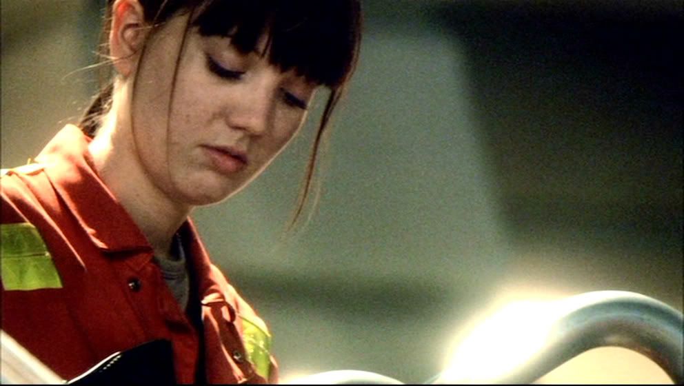
1. Original cap.
2. Cropped. Open in a new document (Shift+D). Resize to 100x100.
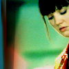
3. Duplicate base. Set to screen. Merge.
-->
4. I decided I preferred it mirrored (Ctrl+M). Or Image >> Mirror.
-->
5. (You don't have to do this step.) After I started adding textures I decided I wanted to change my crop. So using the Move Tool, I moved the original crop to the right. And then using the flood fill tool I filled the blank space to the left with a non-obtrusive color from the image.
-->
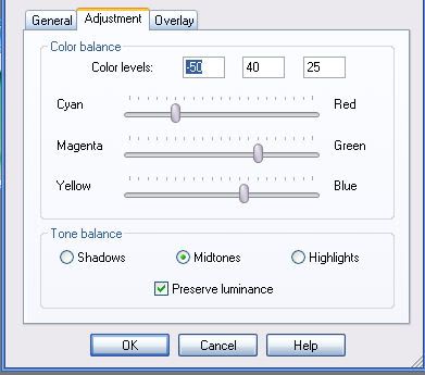
6. Layers >> New Adjustment Layer >> Color Balance. Midtones with color levels set to -50, 40, 25.
Looks like this.
-->
7. Layers >> New Adjustment Layer >> Hue/Saturation/Lightness. Saturation: 40.
-->
8. Layers >> New Adjustment Layer >> Brightness/Contrast. Contrast: 25.
-->
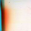
9. Using a large texture by peoplemachines. I cropped it into a square and then resized it to 100x100. Paste it on top of all the layers (Ctrl+L). Blend mode: Multiply. I later adjusted the opacity to 50.
+
=
10. Using another large texture by peoplemachines. Again, cropped what I wanted, resized, and pasted on top (Ctrl+L). Blend mode: Multiply. Opacity: 100. I think I also blurred this texture where it disrupted her face. I didn't erase it like I sometimes do because I wanted the color to be consistent.
+
=
Most importantly: Don't copy this tutorial entirely. Use your own image and adjust accordingly. This won't work for every picture.
Comments? I'd love to see what you've done with this if you use it. :)
Icon made in PSPX but it should probably be easy to translate as long as you know your program. This icon was made for starttheclock.
-->
1. Original cap.
2. Cropped. Open in a new document (Shift+D). Resize to 100x100.
3. Duplicate base. Set to screen. Merge.
-->
4. I decided I preferred it mirrored (Ctrl+M). Or Image >> Mirror.
-->
5. (You don't have to do this step.) After I started adding textures I decided I wanted to change my crop. So using the Move Tool, I moved the original crop to the right. And then using the flood fill tool I filled the blank space to the left with a non-obtrusive color from the image.
-->
6. Layers >> New Adjustment Layer >> Color Balance. Midtones with color levels set to -50, 40, 25.
Looks like this.
-->
7. Layers >> New Adjustment Layer >> Hue/Saturation/Lightness. Saturation: 40.
-->
8. Layers >> New Adjustment Layer >> Brightness/Contrast. Contrast: 25.
-->
9. Using a large texture by peoplemachines. I cropped it into a square and then resized it to 100x100. Paste it on top of all the layers (Ctrl+L). Blend mode: Multiply. I later adjusted the opacity to 50.
+
=
10. Using another large texture by peoplemachines. Again, cropped what I wanted, resized, and pasted on top (Ctrl+L). Blend mode: Multiply. Opacity: 100. I think I also blurred this texture where it disrupted her face. I didn't erase it like I sometimes do because I wanted the color to be consistent.
+
=
Most importantly: Don't copy this tutorial entirely. Use your own image and adjust accordingly. This won't work for every picture.
Comments? I'd love to see what you've done with this if you use it. :)