Results Challenge 06
The following icon makers are eliminated from this round of challenges. Sorry to see you go. :)
1. boni_bon with 5 points.

2. ctofine with 4 points.
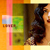
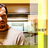


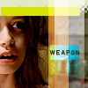
3. paperwirexit with 4 votes.


Member's Choice:
clearthe_area with 3 favorite votes. (Thank you!)
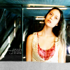
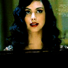
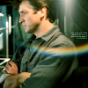
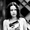
Moderator's Hall of Fame (Plus Hall of Fame for Challenge 4 and 5.)
Lesser Votes:
1. 1
2. 1
4. 3
5. 5
6. 1
8. 5
10. 1
11. 4
12. 2
13. 1
Best Votes:
1. 1
2. 1
4. 2
5. 1
6. 1
9. 1
13. 3
Totals:
(Lesser Votes - Best Votes = Total)
1. 0
2. 0
3. 0
4. 1
5. 4
6. 0
7. -2
8. 5
9. -1
10. 1
11. 4
12. 2
13. -2
Comment with your set number. If you don't receive comment notifications from LJ, leave your e-mail address.
Comments for favorite sets:
Please note that everyone didn't leave reasons for their favorite.
1: so pretty and glowy.
2: love the colouring, love the light, love the cropping, love the contrast. so awesome set.
4: Colouring, cropping, and composition are all just gorgeous. Well done!
5: This is a clean, polished set with a bold and unified style. Very nice.
6: the icons are all quite different and unusual, good use of brushes and good creativity. :)
7: I think this set did a lot of things right -- like the high contrast, the brightness and colouring -- that the other sets did wrong. There aren't a lot of icons I'd use here but I really love E and overall this was probably one of the best if not the best set submitted.
7: The cropping makes them the best.
13: They all have a crispness and clarity to them that's beautiful, but the third icon is what won me over. Just beautiful-- shading, colouring, not blurry but not too sharp. A rare good example of the center crop.
(I know we don't do this but singular brilliant icons I love: set 3 icon 5, set 7 icon 1, set 9 icon 3, set 10 icon 2, set 13 icon 1)
1. boni_bon with 5 points.


2. ctofine with 4 points.
3. paperwirexit with 4 votes.


Member's Choice:
clearthe_area with 3 favorite votes. (Thank you!)


Moderator's Hall of Fame (Plus Hall of Fame for Challenge 4 and 5.)
Lesser Votes:
1. 1
2. 1
4. 3
5. 5
6. 1
8. 5
10. 1
11. 4
12. 2
13. 1
Best Votes:
1. 1
2. 1
4. 2
5. 1
6. 1
9. 1
13. 3
Totals:
(Lesser Votes - Best Votes = Total)
1. 0
2. 0
3. 0
4. 1
5. 4
6. 0
7. -2
8. 5
9. -1
10. 1
11. 4
12. 2
13. -2
Comment with your set number. If you don't receive comment notifications from LJ, leave your e-mail address.
Comments for favorite sets:
Please note that everyone didn't leave reasons for their favorite.
1: so pretty and glowy.
2: love the colouring, love the light, love the cropping, love the contrast. so awesome set.
4: Colouring, cropping, and composition are all just gorgeous. Well done!
5: This is a clean, polished set with a bold and unified style. Very nice.
6: the icons are all quite different and unusual, good use of brushes and good creativity. :)
7: I think this set did a lot of things right -- like the high contrast, the brightness and colouring -- that the other sets did wrong. There aren't a lot of icons I'd use here but I really love E and overall this was probably one of the best if not the best set submitted.
7: The cropping makes them the best.
13: They all have a crispness and clarity to them that's beautiful, but the third icon is what won me over. Just beautiful-- shading, colouring, not blurry but not too sharp. A rare good example of the center crop.
(I know we don't do this but singular brilliant icons I love: set 3 icon 5, set 7 icon 1, set 9 icon 3, set 10 icon 2, set 13 icon 1)