Tutorial for the lovely Ty tyson_foxflame :D
My first icon tutorial :D
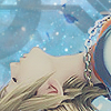
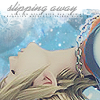
Learn to make this icon!
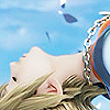
>>
This icon was made using PSP7. I'm pretty sure this can be made on other programs. A basic knowledge on how your program works is needed.
-Step 1-
Start with your base. In this case, it's Sora. Prep it however you like. For this icon, I copied the background twice to make 2 layers. The first layer at Screen 40% and the second layer at Soft Light 90%. Do whatever works best for your icon. When that's done, merge your layers and sharpen once or twice.
-Step 2-
>
I'm in love with exclusion layers right now. So, here you are going to add in this fill
(#242638) in a new layer. Leave it at Exclusion 100%.
-Step 3-

>
Then we use this lovely texture made by strawbrrygashs and put it on Screen 100%. Erase all the parts that cover Sora.
-Step 4-

>
Now we are going to use this black and white texture by soulspring. From there, put it on Multiply and mess around with the opacity till it's what you need. For this icon, I put it on Multiply 25%. When that's done, erase any part of the texture that is covering Sora's face or body.
-Step 5-
>
Place this masking brush by meleada and put it on Screen 100%. The little leaves on the top left corner just weren't working for me, so I grabbed the airbrush. There, I chose the color white with a round on size 7 at the opacity 10%. Carefully, I went over the part I didn't want.
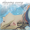
-Step 6-
>
Now here is the fun/horrible part, whatever you think it is. Text! For this icon, I chose the words "Slipping away" in the font Alako-Bold, pt. 10, italic, and the color black. Since black didn't go with the icon, I lowered the opacity. This can also be messed around with to fit what you want. Mine ended up being Normal 36%.
-Step 7-
>
I felt that the icon was missing something, so I added this tiny text brush by artistjosie, put it on Multiply, and placed it under my text. Once again, you can mess around with the opacity till it's to your liking. Mine is at Multiple 60%.
-Step 8-
>
The icon is fine the way it is now, but I like to add borders to my icons. So for this border, I took a random blue color from the icon(#7EC2E0) and made a border on the sides and bottom of the icon. Since I like the top the way it is, there is no need for a border there. Then I grabbed my eraser and lowered the opacity and erased a little part of the sides going down. I slightly lowered the opacity and got another spot on both lines. I did this once more and then I'm done!
To see my layers, click here! :D
If you're using this tutorial, make sure not to copy everything step by step. You're never going to grow as an icon maker if you don't try to do your own things. So experient with colors and different textures and if you want, even add in some gradients.
So let me see what you make out of this tutorial! Remember, have fun!
Warning: Picture Heavy
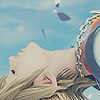
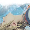
Learn to make this icon!
>>
This icon was made using PSP7. I'm pretty sure this can be made on other programs. A basic knowledge on how your program works is needed.
-Step 1-
Start with your base. In this case, it's Sora. Prep it however you like. For this icon, I copied the background twice to make 2 layers. The first layer at Screen 40% and the second layer at Soft Light 90%. Do whatever works best for your icon. When that's done, merge your layers and sharpen once or twice.
-Step 2-
>
I'm in love with exclusion layers right now. So, here you are going to add in this fill
(#242638) in a new layer. Leave it at Exclusion 100%.
-Step 3-
>
Then we use this lovely texture made by strawbrrygashs and put it on Screen 100%. Erase all the parts that cover Sora.
-Step 4-
>
Now we are going to use this black and white texture by soulspring. From there, put it on Multiply and mess around with the opacity till it's what you need. For this icon, I put it on Multiply 25%. When that's done, erase any part of the texture that is covering Sora's face or body.
-Step 5-
>
Place this masking brush by meleada and put it on Screen 100%. The little leaves on the top left corner just weren't working for me, so I grabbed the airbrush. There, I chose the color white with a round on size 7 at the opacity 10%. Carefully, I went over the part I didn't want.
-Step 6-
>
Now here is the fun/horrible part, whatever you think it is. Text! For this icon, I chose the words "Slipping away" in the font Alako-Bold, pt. 10, italic, and the color black. Since black didn't go with the icon, I lowered the opacity. This can also be messed around with to fit what you want. Mine ended up being Normal 36%.
-Step 7-
>
I felt that the icon was missing something, so I added this tiny text brush by artistjosie, put it on Multiply, and placed it under my text. Once again, you can mess around with the opacity till it's to your liking. Mine is at Multiple 60%.
-Step 8-
>
The icon is fine the way it is now, but I like to add borders to my icons. So for this border, I took a random blue color from the icon(#7EC2E0) and made a border on the sides and bottom of the icon. Since I like the top the way it is, there is no need for a border there. Then I grabbed my eraser and lowered the opacity and erased a little part of the sides going down. I slightly lowered the opacity and got another spot on both lines. I did this once more and then I'm done!
To see my layers, click here! :D
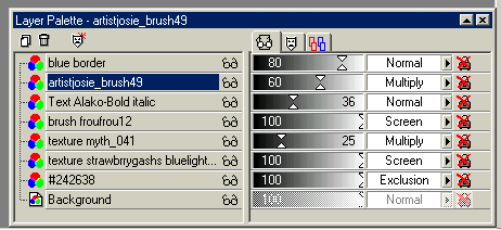
If you're using this tutorial, make sure not to copy everything step by step. You're never going to grow as an icon maker if you don't try to do your own things. So experient with colors and different textures and if you want, even add in some gradients.
So let me see what you make out of this tutorial! Remember, have fun!
Warning: Picture Heavy