{Round 04: Challenge 02} Results
It was an open theme to see if people prefer banners that had the original icon on them or not.... ^_^' It turned out very interestingly.... Ah well. W/e.
In any chance I would like to first announce that this will be the last LIMS for a very-very long time. The community will be closed after I announce the winners, due to lack of participation. It may reopen during September, but that is very tentative. I hope you all have had fun voting and participating. Peace out kiddies~
LAST ICON MAKER STANDING
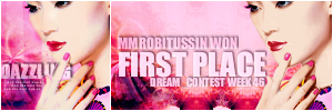
[#1] by xx_lotus_xx (+7 points)
Runner Up
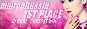
[#2] by illeistic (-7 points)
RESULTS TALLY
#01: -1 points, +8 points (+7 overall points)
#02: -8 points, +1 points (-7 overall points)
Link to voting table.
Comments for eliminations: (remember don't take them personally, they are merely to help you grow as an icon arist)
01 - The white strip doesn't make it blend like you'd want a banner to blend. However, it does match well.
02 - As much as I enjoy this banner, the banner didn't show a whole lot of "coloring". Your textures and colors were nicely done and the text is great, but your connection with the theme wasn't as clear.
02 - It's nice that the banner looked like a continuation of the icon but why did the banner maker edited the icon? I think one of the most important element in banner-making is to make something that will highlight the icon...something that will support it and not really overwhelm it. However, in this banner, the icon was changed...
02 - The banner has a nice use of the texture, but the cardinal rule of banner-making is not to alter the original icon. Actually, now that I look closer, it looks like the original icon was left off completely.
02 - Doesn't look like it actually has the real icon involved at all even though it does have nice coloringa and a similar crop.
02 - It flows really well, but I can't tell where the original icon is. So It's hard to tell what part the banner is showcasing.
02 - Although the banner effect itself is well done, it seems a bit rough of a transition from the icon to the banner, since the icon itself is a tad darker.
02 - I think the font choices could've been different instead of the same, and also centered a bit more in the banner. The current placing for 'mmrobitussin' is a little off the edge to the left side, and it looks a little cut off; the text seems slightly randomly placed. The tiny text is a bit hard to see, so it almost looks as if it's empty there.
02- I like the typography of this one, and it's a good banner really, but I'm judging based on the colouring and I think the other banner does it better.
Comments for members choice: ^^ we all love comments.
01 - Nice work on the coloring. You really got hte colors down. It was hard to tell that it wasn't the original icon until you look really hard. Also, your large text [that isn't overlly large] works really nicely with the icon. However, the background isn't as matching as it should be.... XD
01 - I think of the two, the colouring of this one is closer to the original icon. I like how the background doesn't look duplicated either.
01 - The color matching isn't perfect, but the typography is, and the colors are close enough.
01 - Lovely colors. I like how the banner-maker tried to make the banner look the same as the icon but not really overwhelm it...
01 - Nice use of the image matching in the banner itself. The text is easily readable while still matching the rest of the overall coloring.
01 - Very pretty, matches well. I like this one a lot.
01 - The text effect of the icon is duplicated very well, as is the general background of the icon.
01 - I really like how the banner seems extremely similar to the icon, right down to the cropping of the person's image. The texture was used really well and continues very flowingly through the banner. The text matches very well with the text in the original icon; I do wish that there was tiny text included in the banner itself, though. The text is very easy to see and read, and everything seems to flow very well in the banner.
02 - I love the text work and the blending. It flows together well.
Other comments:
01 - I think you did a great job at duplicating the icon! The banner looks really good and the typography is nicely done. The background isn't quite what the original icon had, but it's really a close match. Good job~
02 -- Interesting choice to not include the icon, but the extra space was well filled with the text. I like how the texture fades into the background; this really makes the text stand out and easy to read. The recoloring of the image was done well, though there are little bits of blue still showing on some edges.
In any chance I would like to first announce that this will be the last LIMS for a very-very long time. The community will be closed after I announce the winners, due to lack of participation. It may reopen during September, but that is very tentative. I hope you all have had fun voting and participating. Peace out kiddies~
LAST ICON MAKER STANDING
[#1] by xx_lotus_xx (+7 points)
Runner Up
[#2] by illeistic (-7 points)
RESULTS TALLY
#01: -1 points, +8 points (+7 overall points)
#02: -8 points, +1 points (-7 overall points)
Link to voting table.
Comments for eliminations: (remember don't take them personally, they are merely to help you grow as an icon arist)
01 - The white strip doesn't make it blend like you'd want a banner to blend. However, it does match well.
02 - As much as I enjoy this banner, the banner didn't show a whole lot of "coloring". Your textures and colors were nicely done and the text is great, but your connection with the theme wasn't as clear.
02 - It's nice that the banner looked like a continuation of the icon but why did the banner maker edited the icon? I think one of the most important element in banner-making is to make something that will highlight the icon...something that will support it and not really overwhelm it. However, in this banner, the icon was changed...
02 - The banner has a nice use of the texture, but the cardinal rule of banner-making is not to alter the original icon. Actually, now that I look closer, it looks like the original icon was left off completely.
02 - Doesn't look like it actually has the real icon involved at all even though it does have nice coloringa and a similar crop.
02 - It flows really well, but I can't tell where the original icon is. So It's hard to tell what part the banner is showcasing.
02 - Although the banner effect itself is well done, it seems a bit rough of a transition from the icon to the banner, since the icon itself is a tad darker.
02 - I think the font choices could've been different instead of the same, and also centered a bit more in the banner. The current placing for 'mmrobitussin' is a little off the edge to the left side, and it looks a little cut off; the text seems slightly randomly placed. The tiny text is a bit hard to see, so it almost looks as if it's empty there.
02- I like the typography of this one, and it's a good banner really, but I'm judging based on the colouring and I think the other banner does it better.
Comments for members choice: ^^ we all love comments.
01 - Nice work on the coloring. You really got hte colors down. It was hard to tell that it wasn't the original icon until you look really hard. Also, your large text [that isn't overlly large] works really nicely with the icon. However, the background isn't as matching as it should be.... XD
01 - I think of the two, the colouring of this one is closer to the original icon. I like how the background doesn't look duplicated either.
01 - The color matching isn't perfect, but the typography is, and the colors are close enough.
01 - Lovely colors. I like how the banner-maker tried to make the banner look the same as the icon but not really overwhelm it...
01 - Nice use of the image matching in the banner itself. The text is easily readable while still matching the rest of the overall coloring.
01 - Very pretty, matches well. I like this one a lot.
01 - The text effect of the icon is duplicated very well, as is the general background of the icon.
01 - I really like how the banner seems extremely similar to the icon, right down to the cropping of the person's image. The texture was used really well and continues very flowingly through the banner. The text matches very well with the text in the original icon; I do wish that there was tiny text included in the banner itself, though. The text is very easy to see and read, and everything seems to flow very well in the banner.
02 - I love the text work and the blending. It flows together well.
Other comments:
01 - I think you did a great job at duplicating the icon! The banner looks really good and the typography is nicely done. The background isn't quite what the original icon had, but it's really a close match. Good job~
02 -- Interesting choice to not include the icon, but the extra space was well filled with the text. I like how the texture fades into the background; this really makes the text stand out and easy to read. The recoloring of the image was done well, though there are little bits of blue still showing on some edges.