{Round 03: Challenge 02} Elimination
Interesting week we got here.
ELIMINATIONS

[#3] by wicked_enough (-6 points)
Thank you so much for participating and please don't be discouraged! Hopefully we'll see you in round 2! Please continue to vote, because we could really use it ♥
PEOPLE'S CHOICE

[#4] by moon_stone787 (+5 points)
RESULTS TALLY
#01: -4 points, +6 points (+2 overall points)
#02: -8 points, +5 points (-3 overall points)
#03: -8 points, +2 points (-6 overall points)
#04: -0 points, +5 points (+5 overall points)
Link to voting table.
Comments for eliminations: (remember don't take them personally, they are merely to help you grow as an icon arist)
01 - While the general idea is good, thelines going in a spiral in the icon don't seem to match with the horizontal lines in the banner.
01 - The even stripes of the banner area don't match very well with the swirl of the icon. The white text on a light blue background is very difficult to read. Since the banner background uses colors from the icon, it would probably have worked better to use one of the greens for the text instead of white.
01 - The background isn't very appealing to me and if the colours had been darker, maybe there would have been a more of an effect
01 - Cute colours and idea, but plain compared to all the other banners. Typography is hard to read as well.
02 - The banner seems quite empty due to the white space, which also draws attention to itself and away from everything else. The text is a bit hard to read due to the colouring, and it seems to be rather shaky. The edged corners of the banner also seems slightly awkward, since the icon has rounded edges. Also, I believe "the_lbms" is spelled wrong.
02 - There's too much white space, overall. That's my only complaint.
02 - There's an excessive amount of white space which creates a lot of emptiness and it makes the banner look unbalanced. I think you should've darkened the text too to make it stand out.
02 - This one seems very simple and plain, which isn't necessarily a drawback, but doesn't really look right with the busy theme of the icon itself. The colors chocsen, while they do match the icon, are so light that they're difficult to read and tend to blend in with the background rather than standing out.
02 - This seemed like a really lazy banner, with just a bit of connection between the original icon and the white space on the side. It didn't help that the pieces for the top and bottom were nearly identical.
02 - The banner doesn't have enough elements in common with the icon, and so it looks out of place. The border around all the white is a clashing technique to the colorful icon.
02 - Not only does the banner looks unmatching, it also looks empty and the placement of text seems to be unbalanced.
02 - Love the creative banner! I like how there's a border and those lines of the original icon, or at least something that looks like it. Really nice small text that's simple, but still stands out.
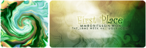
03 - Although it is very nicely colored and chosen, it has absolutely no relation to the icon at all. The colors could have been better matched with the blues.
03 - I don't think it's a bad banner, per se, but the colours don't exactly match (no aqua hues). I do like the smaller text a lot, but the text you used for the placing doesn't seem to suit.
03 - I can't read the text because of the lighting texture behind "first".
03 - although the font is nice and creative, the fog seems a bit out of place and the colors match but perhaps some blue to make it match even more.
03 - The indefinite colour of the background doesn't really fit the icon, and the whole looks kind of messy
03 - I really like the font you've used here, but the icon and the banner section seem ill-matched and the brown colours are a bit overpowering.
03 - I think the banner doesn't really match the icon. Perhaps it's the color. While I like the font face used for 'First Place', I think the smaller text at the bottom is quite difficult to read.
03 - The colors used in the banner are kind of murky and don't really match the icon, and the white light in the middle covers part of the "first" text which makes it look sloppy.
Comments for members choice: ^^ we all love comments.
01 - The background for your banner is really nice. EVen though it's simple it matches the icon really well. The text is also nice, large, and legible, but could have probably been better placed.
01 - The banner's colors match the icon without distracting from the icon itself, which is a good look, and the text is simple but easily readable and the size variation creates some interest.
01 - This is probably the best you could have done with this kind of icon. The typography is easy to read and the background compliments the icon colors.
01 - I like the simplicity of this banner's text and background. Though a darker, more saturated background would've made it even nicer.
01 - I enjoyed how the two icons were able to connect with each other even though they were very different. The typography is clear and easy to read.
01 - the colors are pretty and easy on the eyes and the font and is simple yet great and the placement is wonderful.
02 - I like this one a lot. Creative, easy to read, and it matches the icon.
02 - I like the border and the text. It goes really well with the icon
02 - I really like the way pieces of the icon are used as borders for the text and banner areas. The text work is fairly good, but the light blue text is a bit difficult to read on the white background.
02 - I love the simple and clean look you've gone for your banner, it matches the image well and the white space looks fantastic. Great work!
02 - I like the idea of the white banner with neat text and just a tiny part of the original icon, which makes a simple banner that fits the icon but doesn't add more ugliness to it :)
03 - Using a different image altogether, the lighting is done well and the text is done well too.
03 - I love how complementary the colours on your banner are to the icon. Although it isn't a direct duplication, the texture (and its colours) fit well.
04 - Wow. The colors and blurring match really well. The text work looks good as well.
04 - Of all the banners, I feel this one matches the icon the best of them, from the swirled image design and the colors used to the rounded corners. The text is easily readable without detracting from either the icon or the banner.
04 - I am impressed at how matching this is xD But text are a bit uncler, do work on your text placement.
04 - This is just lovely! The banner is symmetrical to the icon (both don't look ugly at all with the banner there) and the font used rather suits it (although curly fonts would also look nice, I think). Great placing of the text as well.
04 - I really like how the banner has a similiar look to the icon; it's really close to how the icon is and it matches the icon pretty well. The text is placed where it doesn't get in the way of anything, and I think the font choice is quite fitting. I like how the banner has rounded edges to match the icon, and I think the thought of trying to follow how the icon looks was a really creative idea, especially since the participants weren't told how the icon was made to look like that.
Other comments:
01 - I like the general idea for this one. The text itself is what really stands out to me. The only problem I have with it is that the colors focus only on a select lighter color scheme from the icon itself and the lines are detracting compared to the swirled design in the icon. Otherwise it's a good design.
02 - I really like the idea of this one. I think the use of white background also worked and definitely highligthed the icon. However, there's really no need to put that extra square outside, I think. ^^
03 - The background texture is wonderful, but the light texture over the "first" makes that word very hard to see.
04 - I think that with an icon like this it's better not to try to reproduce it in the banner. For a "normal" icon this would be a perfect image banner.
ELIMINATIONS

[#3] by wicked_enough (-6 points)
Thank you so much for participating and please don't be discouraged! Hopefully we'll see you in round 2! Please continue to vote, because we could really use it ♥
PEOPLE'S CHOICE

[#4] by moon_stone787 (+5 points)
RESULTS TALLY
#01: -4 points, +6 points (+2 overall points)
#02: -8 points, +5 points (-3 overall points)
#03: -8 points, +2 points (-6 overall points)
#04: -0 points, +5 points (+5 overall points)
Link to voting table.
Comments for eliminations: (remember don't take them personally, they are merely to help you grow as an icon arist)
01 - While the general idea is good, thelines going in a spiral in the icon don't seem to match with the horizontal lines in the banner.
01 - The even stripes of the banner area don't match very well with the swirl of the icon. The white text on a light blue background is very difficult to read. Since the banner background uses colors from the icon, it would probably have worked better to use one of the greens for the text instead of white.
01 - The background isn't very appealing to me and if the colours had been darker, maybe there would have been a more of an effect
01 - Cute colours and idea, but plain compared to all the other banners. Typography is hard to read as well.
02 - The banner seems quite empty due to the white space, which also draws attention to itself and away from everything else. The text is a bit hard to read due to the colouring, and it seems to be rather shaky. The edged corners of the banner also seems slightly awkward, since the icon has rounded edges. Also, I believe "the_lbms" is spelled wrong.
02 - There's too much white space, overall. That's my only complaint.
02 - There's an excessive amount of white space which creates a lot of emptiness and it makes the banner look unbalanced. I think you should've darkened the text too to make it stand out.
02 - This one seems very simple and plain, which isn't necessarily a drawback, but doesn't really look right with the busy theme of the icon itself. The colors chocsen, while they do match the icon, are so light that they're difficult to read and tend to blend in with the background rather than standing out.
02 - This seemed like a really lazy banner, with just a bit of connection between the original icon and the white space on the side. It didn't help that the pieces for the top and bottom were nearly identical.
02 - The banner doesn't have enough elements in common with the icon, and so it looks out of place. The border around all the white is a clashing technique to the colorful icon.
02 - Not only does the banner looks unmatching, it also looks empty and the placement of text seems to be unbalanced.
02 - Love the creative banner! I like how there's a border and those lines of the original icon, or at least something that looks like it. Really nice small text that's simple, but still stands out.
03 - Although it is very nicely colored and chosen, it has absolutely no relation to the icon at all. The colors could have been better matched with the blues.
03 - I don't think it's a bad banner, per se, but the colours don't exactly match (no aqua hues). I do like the smaller text a lot, but the text you used for the placing doesn't seem to suit.
03 - I can't read the text because of the lighting texture behind "first".
03 - although the font is nice and creative, the fog seems a bit out of place and the colors match but perhaps some blue to make it match even more.
03 - The indefinite colour of the background doesn't really fit the icon, and the whole looks kind of messy
03 - I really like the font you've used here, but the icon and the banner section seem ill-matched and the brown colours are a bit overpowering.
03 - I think the banner doesn't really match the icon. Perhaps it's the color. While I like the font face used for 'First Place', I think the smaller text at the bottom is quite difficult to read.
03 - The colors used in the banner are kind of murky and don't really match the icon, and the white light in the middle covers part of the "first" text which makes it look sloppy.
Comments for members choice: ^^ we all love comments.
01 - The background for your banner is really nice. EVen though it's simple it matches the icon really well. The text is also nice, large, and legible, but could have probably been better placed.
01 - The banner's colors match the icon without distracting from the icon itself, which is a good look, and the text is simple but easily readable and the size variation creates some interest.
01 - This is probably the best you could have done with this kind of icon. The typography is easy to read and the background compliments the icon colors.
01 - I like the simplicity of this banner's text and background. Though a darker, more saturated background would've made it even nicer.
01 - I enjoyed how the two icons were able to connect with each other even though they were very different. The typography is clear and easy to read.
01 - the colors are pretty and easy on the eyes and the font and is simple yet great and the placement is wonderful.
02 - I like this one a lot. Creative, easy to read, and it matches the icon.
02 - I like the border and the text. It goes really well with the icon
02 - I really like the way pieces of the icon are used as borders for the text and banner areas. The text work is fairly good, but the light blue text is a bit difficult to read on the white background.
02 - I love the simple and clean look you've gone for your banner, it matches the image well and the white space looks fantastic. Great work!
02 - I like the idea of the white banner with neat text and just a tiny part of the original icon, which makes a simple banner that fits the icon but doesn't add more ugliness to it :)
03 - Using a different image altogether, the lighting is done well and the text is done well too.
03 - I love how complementary the colours on your banner are to the icon. Although it isn't a direct duplication, the texture (and its colours) fit well.
04 - Wow. The colors and blurring match really well. The text work looks good as well.
04 - Of all the banners, I feel this one matches the icon the best of them, from the swirled image design and the colors used to the rounded corners. The text is easily readable without detracting from either the icon or the banner.
04 - I am impressed at how matching this is xD But text are a bit uncler, do work on your text placement.
04 - This is just lovely! The banner is symmetrical to the icon (both don't look ugly at all with the banner there) and the font used rather suits it (although curly fonts would also look nice, I think). Great placing of the text as well.
04 - I really like how the banner has a similiar look to the icon; it's really close to how the icon is and it matches the icon pretty well. The text is placed where it doesn't get in the way of anything, and I think the font choice is quite fitting. I like how the banner has rounded edges to match the icon, and I think the thought of trying to follow how the icon looks was a really creative idea, especially since the participants weren't told how the icon was made to look like that.
Other comments:
01 - I like the general idea for this one. The text itself is what really stands out to me. The only problem I have with it is that the colors focus only on a select lighter color scheme from the icon itself and the lines are detracting compared to the swirled design in the icon. Otherwise it's a good design.
02 - I really like the idea of this one. I think the use of white background also worked and definitely highligthed the icon. However, there's really no need to put that extra square outside, I think. ^^
03 - The background texture is wonderful, but the light texture over the "first" makes that word very hard to see.
04 - I think that with an icon like this it's better not to try to reproduce it in the banner. For a "normal" icon this would be a perfect image banner.