(no subject)
This is the first of a few tutorials that I'm working on at the moment because I'm in an icon funk and I'm avoiding studying for my exams. I hope they'll be of use to someone.

to
Made with PS CS2. Selective Colours but NO curves.
This tutorial will try you how to show how you can extend the height of an image and not be confined by the content of the picture that you're using. Also shows how to use scratchy textures and selective colour layers for super bright colours. wow!
I'm using a picture from Shaun of the Dead using a cap made by whirringblender { HERE}
These caps are quite light so there's no need to lighten them although, in most cases, a capture may need between 1 to 4 duplicated screen layers at this stage in order to get them to a good level to work with.
1. I'm resizing the cap so the height is 53 pixels.

2. I copy the cap onto a 100 x 100px base and position it so it's on the bottom of the base.
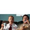
3. Using the Eyedropper tool, pick a matching colour to the wall in the cap. Fill the base with the Bucket tool. Merge all layers.
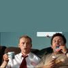
4. Blend the edges of the cap into the background using the Smudge tool.
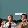
5. Select the paint tool in the background colour if you need to cover any intrusive objects, in this case, the white picture behind the guys.
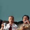
6. Now for the exciting part! Select a new selective colour layer (Layers:New Adjustment Layer:Selective Colour) Enter the following:
Red: C = -61 | M = +39 | Y = +83 | B = 0
Yellow: C = -64 | M = 0 | Y = +100 | B = -41
Neutral: C = +46 | M = 0 | Y = -31 | B = -14
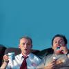
Merge all layers.
7. Go to Image:Exposure and set the exposure level to +0.21, leave the other options. Now you can sharpen the faces a little if you need to.
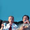
8. Now, copy a texture from peoplemachines which I've altered a little {HERE}. and set to screen 100%.
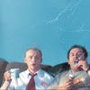
9. Erase texture from the faces to bring back the colour depth.
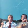
10. Create a new texture layer (using the same texture as used in step 9) and set to screen as before. Alter the position of this layer to create a more even background.
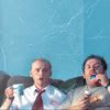
11. Erase the last texture layer around the edges and the area over the faces to blend it all together. Merge all layers.
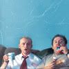
12. At this point you can use the sharpening tool to define the scratches on the background.
If you do, it would look a little like this (using the sharpening tool set to 26%) -
13. Go to Layers:Adjustment Layers:Hue/Saturation and set the saturation level to +21.
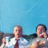
(if you choose not to sharpen the background, the icon will look like this -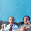
)
14. When finished, you can slap on some text if you want. I've used Perpetua, size 10, in white, for the "Shaun" with spaces set between each letter.
"of the Dead" - Perpetua, size 9, in black, with the opacity level set at 25%
I also slapped on some tiny text underneath.

to
Made with PS CS2. Selective Colours but NO curves.
This tutorial will try you how to show how you can extend the height of an image and not be confined by the content of the picture that you're using. Also shows how to use scratchy textures and selective colour layers for super bright colours. wow!
I'm using a picture from Shaun of the Dead using a cap made by whirringblender { HERE}
These caps are quite light so there's no need to lighten them although, in most cases, a capture may need between 1 to 4 duplicated screen layers at this stage in order to get them to a good level to work with.
1. I'm resizing the cap so the height is 53 pixels.
2. I copy the cap onto a 100 x 100px base and position it so it's on the bottom of the base.
3. Using the Eyedropper tool, pick a matching colour to the wall in the cap. Fill the base with the Bucket tool. Merge all layers.
4. Blend the edges of the cap into the background using the Smudge tool.
5. Select the paint tool in the background colour if you need to cover any intrusive objects, in this case, the white picture behind the guys.
6. Now for the exciting part! Select a new selective colour layer (Layers:New Adjustment Layer:Selective Colour) Enter the following:
Red: C = -61 | M = +39 | Y = +83 | B = 0
Yellow: C = -64 | M = 0 | Y = +100 | B = -41
Neutral: C = +46 | M = 0 | Y = -31 | B = -14
Merge all layers.
7. Go to Image:Exposure and set the exposure level to +0.21, leave the other options. Now you can sharpen the faces a little if you need to.
8. Now, copy a texture from peoplemachines which I've altered a little {HERE}. and set to screen 100%.
9. Erase texture from the faces to bring back the colour depth.
10. Create a new texture layer (using the same texture as used in step 9) and set to screen as before. Alter the position of this layer to create a more even background.
11. Erase the last texture layer around the edges and the area over the faces to blend it all together. Merge all layers.
12. At this point you can use the sharpening tool to define the scratches on the background.
If you do, it would look a little like this (using the sharpening tool set to 26%) -
13. Go to Layers:Adjustment Layers:Hue/Saturation and set the saturation level to +21.
(if you choose not to sharpen the background, the icon will look like this -
)
14. When finished, you can slap on some text if you want. I've used Perpetua, size 10, in white, for the "Shaun" with spaces set between each letter.
"of the Dead" - Perpetua, size 9, in black, with the opacity level set at 25%
I also slapped on some tiny text underneath.