Tutorial #1
Here is my first official attempt at writing a tutorial. I was working on an icon set that I'm hoping to have up soon, and decided that this base would make a very good tutorial icon. So, of course, I got all distracted and this is the result!
Any feedback on the tutorial would be lovely. I want to know what I can do better next time :)
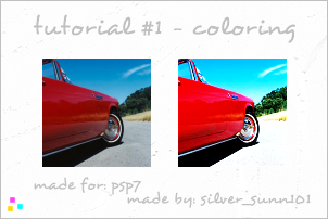
Level: Medium (some knowledge of PSP is needed)
Step 1 - Cropping and Brightness/Contrast
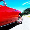
This is the original image. Crop out the area that you want and resize it to 100x100. Here's the image that I'm starting with:
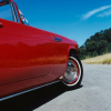
Normally I sharpen at this point, but on this one I decided to play with the brightness/contrast first. Press shift + b to open the Brightness/Contrast window, and set both to 20.
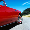
I'm still not happy with how dark the image is. To get some better color to the image, we're going to switch modes. Instead of Brightness/Contrast, we're going to play with blending modes.
Duplicate your image twice, so that you have three layers. Set the top layer to Soft Light and the middle layer to Screen. Leave your original image alone, and leave all three at 100% opacity.
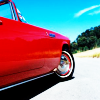
At this point, it's really up to you as to how to increase or decrease the levels of the two layers. I ended up with 70% opacity on the Soft Light layer, and 100% opacity on the Screen layer.
(It still wasn't bright enough for me, so I duplicated the Screen layer and set it on 12% opacity just for that extra boost.)


To finish this step, right-click any of your layers and click Merge > Merge All (Flatten) to give your image a single layer.
Step 2 - Sharpening and Blurring
With the brightness settled, it's finally time to sharpen.
Duplicate your image, and Sharpen the top layer once.

Personally, I think that the jagged lines around the hood, winshield, tire rim, bottom of the door, and around the edge of the picture were sharpened a bit too much.
Click your Eraser and set it to 50% opacity on size 5. Do a quick once-over on the overly-sharpened areas, and go back to the ones that still look too sharpened. Repeat in the same area until it either looks okay, or you've erased all you can on the top layer.
There are larger areas that still look rather pixelated (the sky around the windshield and the car door). Using your Lasso tool, highlight the inside of the windshield.
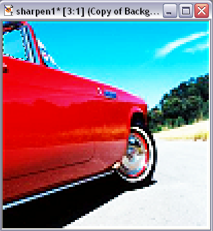
Under the Blur menu, open the Gaussian Blur window, and set the blur to a .45 radius. (Try to stay within the .4-.5 range for pictures like this).
Repeat this on all the areas that look pixelated until they look smooth and blend in with the rest of the image.

Step 3 - Coloring Effects
Now we're ready for what I think is the best part of doing stock images - coloring.
Note: The point in coloring is to add to the colors that are already in the image and to give the brightness a fuller look.
It doesn't really matter where you start, but let's go with the car first. Using your Lasso tool, highlight all of the red on the car.
Open the Color Balance window (Colors >> Adjust >> Color Balance). I usually ignore the number boxes and play with the dials until I find something I like. For the red on the car, I ended with these color levels:
Cyan/Red: 25
Magenta/Green: -6
Yellow/Blue: -5
It's best if you move all three, so that your colors don't look obviously edited. I added some yellow to balance the red out, for example.
After you hit 'Okay'... Repeat the beginning of this step with the same color levels. It should be red enough now.
Now, see that pale red bit at the bottom of the door? It doesn't blend quite right. Highlight just that area, and apply the same color levels to that area to try and help it blend in. If you need to, do it twice on that area.

Next, increase the green on the trees, like so:
Cyan/Red: 0
Magenta/Green: 17
Yellow/Blue: -12
I know I said to balance all of them, but the trees had so much blue already that I left that dial alone.
The yellow ground follows next, with the following levels:
Cyan/Red: 10
Magenta/Green: -3
Yellow/Blue: -22
And lastly, I want the sky to be a deeper summer blue instead of the lighter winter blue it looks like now. All I need is for it to be a deeper blue, so my levels ended like this:
Cyan/Red: 0
Magenta/Green: 0
Yellow/Blue: 20

It's a lot of work just for some subtle coloring, but it really does make a difference.
Step 4 - Final Touches
This is where I usually look over the image and see if anything needs to be tweaked. And where I do my usual last step.
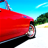
Open the Brightness/Contrast menu (shift + b) and add 5 brightness and 5 contrast to the image. And now you're done!

=
I know this is said a lot, but I'm going to reiterate it...
This is meant for guideline purposes only, and not to be followed exactly. The best way to find what works for your picture is to play around with settings until you find something you like. ♥
Any feedback on the tutorial would be lovely. I want to know what I can do better next time :)

Level: Medium (some knowledge of PSP is needed)
Step 1 - Cropping and Brightness/Contrast
This is the original image. Crop out the area that you want and resize it to 100x100. Here's the image that I'm starting with:

Normally I sharpen at this point, but on this one I decided to play with the brightness/contrast first. Press shift + b to open the Brightness/Contrast window, and set both to 20.

I'm still not happy with how dark the image is. To get some better color to the image, we're going to switch modes. Instead of Brightness/Contrast, we're going to play with blending modes.
Duplicate your image twice, so that you have three layers. Set the top layer to Soft Light and the middle layer to Screen. Leave your original image alone, and leave all three at 100% opacity.

At this point, it's really up to you as to how to increase or decrease the levels of the two layers. I ended up with 70% opacity on the Soft Light layer, and 100% opacity on the Screen layer.
(It still wasn't bright enough for me, so I duplicated the Screen layer and set it on 12% opacity just for that extra boost.)


To finish this step, right-click any of your layers and click Merge > Merge All (Flatten) to give your image a single layer.
Step 2 - Sharpening and Blurring
With the brightness settled, it's finally time to sharpen.
Duplicate your image, and Sharpen the top layer once.

Personally, I think that the jagged lines around the hood, winshield, tire rim, bottom of the door, and around the edge of the picture were sharpened a bit too much.
Click your Eraser and set it to 50% opacity on size 5. Do a quick once-over on the overly-sharpened areas, and go back to the ones that still look too sharpened. Repeat in the same area until it either looks okay, or you've erased all you can on the top layer.

There are larger areas that still look rather pixelated (the sky around the windshield and the car door). Using your Lasso tool, highlight the inside of the windshield.

Under the Blur menu, open the Gaussian Blur window, and set the blur to a .45 radius. (Try to stay within the .4-.5 range for pictures like this).
Repeat this on all the areas that look pixelated until they look smooth and blend in with the rest of the image.

Step 3 - Coloring Effects
Now we're ready for what I think is the best part of doing stock images - coloring.
Note: The point in coloring is to add to the colors that are already in the image and to give the brightness a fuller look.
It doesn't really matter where you start, but let's go with the car first. Using your Lasso tool, highlight all of the red on the car.
Open the Color Balance window (Colors >> Adjust >> Color Balance). I usually ignore the number boxes and play with the dials until I find something I like. For the red on the car, I ended with these color levels:
Cyan/Red: 25
Magenta/Green: -6
Yellow/Blue: -5
It's best if you move all three, so that your colors don't look obviously edited. I added some yellow to balance the red out, for example.
After you hit 'Okay'... Repeat the beginning of this step with the same color levels. It should be red enough now.
Now, see that pale red bit at the bottom of the door? It doesn't blend quite right. Highlight just that area, and apply the same color levels to that area to try and help it blend in. If you need to, do it twice on that area.

Next, increase the green on the trees, like so:
Cyan/Red: 0
Magenta/Green: 17
Yellow/Blue: -12
I know I said to balance all of them, but the trees had so much blue already that I left that dial alone.
The yellow ground follows next, with the following levels:
Cyan/Red: 10
Magenta/Green: -3
Yellow/Blue: -22
And lastly, I want the sky to be a deeper summer blue instead of the lighter winter blue it looks like now. All I need is for it to be a deeper blue, so my levels ended like this:
Cyan/Red: 0
Magenta/Green: 0
Yellow/Blue: 20

It's a lot of work just for some subtle coloring, but it really does make a difference.
Step 4 - Final Touches
This is where I usually look over the image and see if anything needs to be tweaked. And where I do my usual last step.
Open the Brightness/Contrast menu (shift + b) and add 5 brightness and 5 contrast to the image. And now you're done!

=

I know this is said a lot, but I'm going to reiterate it...
This is meant for guideline purposes only, and not to be followed exactly. The best way to find what works for your picture is to play around with settings until you find something you like. ♥