Icon Guide: Fixing Screentones
I promised some people a guide on this a while ago and then forgot the next day. A few times. BUT I REMEMBERED EVENTUALLY and so here it is.
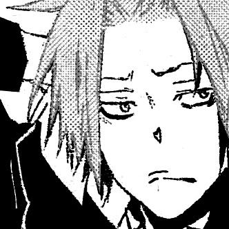
Okay, for this guide we'll be working with the following image. I've already fixed up the blacks in it (just make a solid black layer over the b/w image, set to overlay, then make a regular layer over that to color in any white spots that shouldn't be there on the blacks) but you can see how gross and spotty the toning for Dera's hair is in this image. 8|
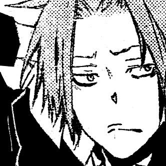
SPOTTY. If we were to make an icon directly from this, it'd turn out like so:

Ewwww. I am not using that for an icon. So, back to the original image! Our first step is finding a screentone that'll roughly match what it looks like got used for Dera's hair originally. Make a completely new file, at least a little bigger than the size of the canvas you're working with. The size of the one I'm using for this is about 330x330, so I made the new one 660x660. In this new file, you're gonna make a pattern fill layer. Go over to your layer window and find the little dual-colored circle thing! I even circled it for you. |D
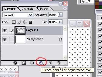
THIS THING IS AMAZING. Check out all the different kinds of layers you can make with it.
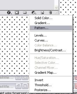
So amazing. This is my favorite photoshop feature ever. You can make a layer for basically anything and then use black (erase) or white (...un-erase/color) to choose what parts of the image you're working with it will effect. If you erase some of this layer, you can color white back over it and it will reappear. It's really useful for working with things like patterns or gradients when you aren't sure quite where you want them, or if you've got really fine linework to color around. Saves a ton of time. 8| GO PLAY WITH THIS FEATURE.
. . . Anyway. Click on the pattern option! It will automatically fill this new layer with a pattern selection and open up a little tool box for you to browse through different patterns with. Now you can find whereever you've got your dots/screentones (if you need some, I think Aviy has a place or two linked in her second guide here. Scroll down and read the text below the cuts on the second guide.) and check through those to find one that matches. Like so:
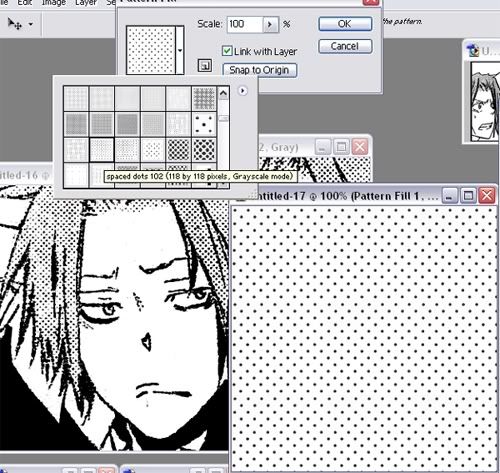
But that doesn't look quite close enough yet. So flip through a few more til you find the one that is closest. It probably will not be exact, but that's okay. Just be sure the dots are a little more widely spaced so you can resize down a bit for something closer to the original tone. When you do find one you like, hit ctrl+shift+c and then paste into a new file; if you don't the pattern will stay at the same size when you resize the image. 8| The one I settled on was this:
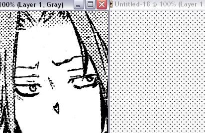
Pretty close! But still a bit too widely spaced. So I resize the whole image of dots by 80%
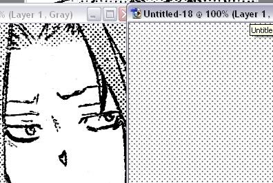
But it looks a bit too light now. So! I make a new layer over the dots, fill with black, and set it to overlay.
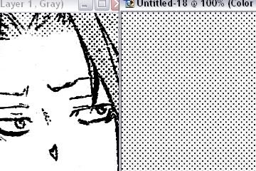
Perfect. \o/ Or close enough to it for my tastes. Now comes the tricky part. Except it's not that tricky and just involves tedious erasing and shit. Just paste the finished screentone over the whole image. Set the opacity to 50% so you can see the image below.
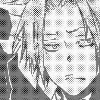
This screentoning is just for the hair, so roughly erase the dots from anywhere that isn't hair. You don't need to be perfect; it is completely fine for them to cover the lineart a bit. You just don't want them outside of the area they'll be covering.
Okay now, make a new layer! Make sure this layer is in between the original image and the new screentone. If your layers aren't arranged as below (where the highlighted layer is the new one) you are doing it wrong.
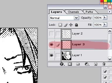
On this layer, you're going to color solid white over the old screentone. It is tedious and annoying but you have to do it. 8| You can cheat and use the lasso tool to save time. I didn't actually save a finished image of this step, but here's a half-done one.
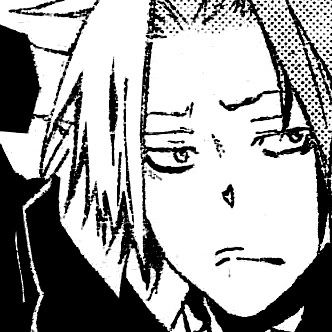
So, finish doing that. Check the linework, make sure it's good and mostly solid. Dera's was really spotty so I made another layer (still below the new screentone), did a black overlay over his hair, and then bumped the opacity on the screentone back up to 100% and set that layer to darken. Setting it to darken is why you don't need to worry if it's over the lineart a bit; it won't show at all. 8D 'course this is also why you need to color white underneath it or the old screentone will show through, but it's worth it for getting an image that looks like this:
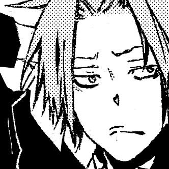
WORLDS BETTER. All that's left is resizing for the finished icon now.

huhuhu |D JUST TO BE CLEAR, THIS IS THE CHANGE WE MADE
This
to this
So there you go. Totally tedious, but worth it. And you don't even need to be perfect, man. Look at how rough the large image still looks before I resized it. All shaky and stuff. 8| But that doesn't matter when it looks fine resized. The important thing is getting an icon that looks decent enough to use.
Anywaaaay, I hope that all made sense. Feel free to harass me with questions or complaints of how confusing I am, if I am.
Okay, for this guide we'll be working with the following image. I've already fixed up the blacks in it (just make a solid black layer over the b/w image, set to overlay, then make a regular layer over that to color in any white spots that shouldn't be there on the blacks) but you can see how gross and spotty the toning for Dera's hair is in this image. 8|

SPOTTY. If we were to make an icon directly from this, it'd turn out like so:

Ewwww. I am not using that for an icon. So, back to the original image! Our first step is finding a screentone that'll roughly match what it looks like got used for Dera's hair originally. Make a completely new file, at least a little bigger than the size of the canvas you're working with. The size of the one I'm using for this is about 330x330, so I made the new one 660x660. In this new file, you're gonna make a pattern fill layer. Go over to your layer window and find the little dual-colored circle thing! I even circled it for you. |D

THIS THING IS AMAZING. Check out all the different kinds of layers you can make with it.

So amazing. This is my favorite photoshop feature ever. You can make a layer for basically anything and then use black (erase) or white (...un-erase/color) to choose what parts of the image you're working with it will effect. If you erase some of this layer, you can color white back over it and it will reappear. It's really useful for working with things like patterns or gradients when you aren't sure quite where you want them, or if you've got really fine linework to color around. Saves a ton of time. 8| GO PLAY WITH THIS FEATURE.
. . . Anyway. Click on the pattern option! It will automatically fill this new layer with a pattern selection and open up a little tool box for you to browse through different patterns with. Now you can find whereever you've got your dots/screentones (if you need some, I think Aviy has a place or two linked in her second guide here. Scroll down and read the text below the cuts on the second guide.) and check through those to find one that matches. Like so:

But that doesn't look quite close enough yet. So flip through a few more til you find the one that is closest. It probably will not be exact, but that's okay. Just be sure the dots are a little more widely spaced so you can resize down a bit for something closer to the original tone. When you do find one you like, hit ctrl+shift+c and then paste into a new file; if you don't the pattern will stay at the same size when you resize the image. 8| The one I settled on was this:

Pretty close! But still a bit too widely spaced. So I resize the whole image of dots by 80%

But it looks a bit too light now. So! I make a new layer over the dots, fill with black, and set it to overlay.

Perfect. \o/ Or close enough to it for my tastes. Now comes the tricky part. Except it's not that tricky and just involves tedious erasing and shit. Just paste the finished screentone over the whole image. Set the opacity to 50% so you can see the image below.

This screentoning is just for the hair, so roughly erase the dots from anywhere that isn't hair. You don't need to be perfect; it is completely fine for them to cover the lineart a bit. You just don't want them outside of the area they'll be covering.

Okay now, make a new layer! Make sure this layer is in between the original image and the new screentone. If your layers aren't arranged as below (where the highlighted layer is the new one) you are doing it wrong.

On this layer, you're going to color solid white over the old screentone. It is tedious and annoying but you have to do it. 8| You can cheat and use the lasso tool to save time. I didn't actually save a finished image of this step, but here's a half-done one.

So, finish doing that. Check the linework, make sure it's good and mostly solid. Dera's was really spotty so I made another layer (still below the new screentone), did a black overlay over his hair, and then bumped the opacity on the screentone back up to 100% and set that layer to darken. Setting it to darken is why you don't need to worry if it's over the lineart a bit; it won't show at all. 8D 'course this is also why you need to color white underneath it or the old screentone will show through, but it's worth it for getting an image that looks like this:

WORLDS BETTER. All that's left is resizing for the finished icon now.

huhuhu |D JUST TO BE CLEAR, THIS IS THE CHANGE WE MADE
This

to this

So there you go. Totally tedious, but worth it. And you don't even need to be perfect, man. Look at how rough the large image still looks before I resized it. All shaky and stuff. 8| But that doesn't matter when it looks fine resized. The important thing is getting an icon that looks decent enough to use.
Anywaaaay, I hope that all made sense. Feel free to harass me with questions or complaints of how confusing I am, if I am.