55 led zeppelin
Oh, what I have in store for you.
First thing. I made a few John Paul icons at rissa333's request. Not that I would never have made icons of him otherwise.. ahem. I am not obsessed with Page and Plant, I am not, I am not. Anyroad, there are only four of them but that's better than NOTHING, amirite?
Second thing. Album covers. Easiest motherfucking icons to make ever. Somehow I figured mine might be special, but even though I lied to myself I won't lie to you: they're not. I am SURE that these same ten icons have been made before. Which makes me wonder why I bothered. I also started to make lyric icons. A solid colour background with white text and that's it. Then I came to my senses. You can make icons like that with MS Paint, for chrissakes. It'd be entirely too pretentious of me to distribute such things.
But I digress. You are not here to read my babbling.
the breakdown
10 album covers (1 animated)
03 group
01 bonzo
04 john paul
08 page and plant*
11 page
18 plant (2 animated)
*Okay, I do have one more thing. One of the Page and Plant icons (number 21) may have been posted before. I made it a long time ago but couldn't find it in any of my previous Zeppelin icon posts.
HOVER FOR TEXT.
PS: No need to tell me that the text on 23 is super lame. I know it is.
1
2
3
4
5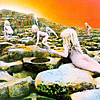
6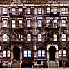
7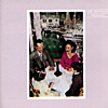
8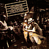
9
10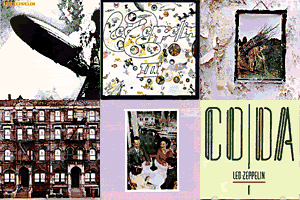
11
12
13
14
15
16
17
18
19
20
21
22
23
24
25
26
27
28
29
30
31
32
33
34
35
36
37
38
39
40
41
42
43
44
45
46
47
48
49
50
51
52
53
54
55
My favourites: 5 (bahaha), 25, 40, 43
EDIT: foolintherain00 asked me: Why do you have a lot of repeats? Like the "I Love You This Big" ones and the "All That Glitters" ones.
They're not exactly repeats, because they are all slightly different. For example, 45 has a white border and 44 doesn't. For 46-50, the colouring is different for each of them--you may have to look closely to see it. I'm sure those of you who have been here a while have noticed that I do this a lot. It's easiest to see with icons like 33-35: one is just a 'base,' one has a torn edge brush, and one has text. I make different versions like that because even though I might like an icon better when it doesn't have text, someone else might like it better with.. or because someone else might like the colouring a different way, or might want a border, and so on.