Icon Tutorial: How to Make Your Own WoW Class Icon
Alrighty, here's a quick and hopefully simple to follow tutorial on how I made this icon.
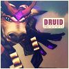
I've separated this tutorial in sections to make it easier to follow. The steps I use for this icon can be applied to any of the class icons. Only differences between them is what the text says and the background texture. I personally use photoshop CS2, but this will work with older versions of photoshop and I'm pretty sure paint shop pro. But for the sake of this tutorial I'll be using photoshop commands.
Preparing Your Image: WoW Model Viewer Ho!
First thing you you need is WoW Model Viewer which you can easily download from their site. Don't try to download it from anywhere else as some asses on the WoW forums will link you to a virus instead of the program itself. Be safe. Note you need to actually own a copy of WoW and have it installed to use this, but if you're reading this particular tutorial I'm going to assume that you have it ;p
Using the program is rather easy to figure out so I won't tell you how to do that here, but if you're confused about something then feel free to ask. At any rate create your character, dress em up, make a pose and take your screencap.
If you want to learn how to manually add items or npcs yourself to their respective links read here.
Be sure to set your background to black. This is important especially for armor sets that have those nice shiny particle effects. You should get something looking like this:
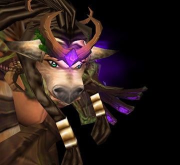
But we're not done yet. Before you move your camera position or close out of the program you need to make a mask of this image.
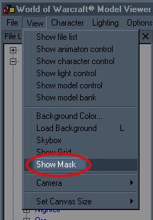
Click the option and you'll get something looking like this afterwards. Take a screencap of this along with your original image:
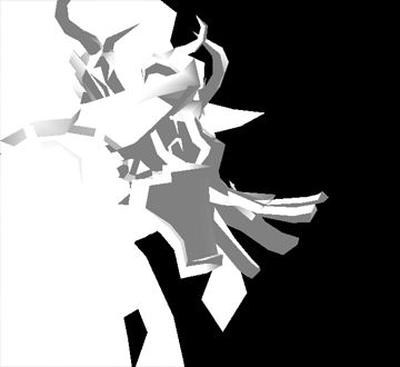
Open up photoshop and place your masked image as a new layer over your original image. Duplicate your original image underneath the mask. One will be for the particle effects, the other for the character. Go to the select menu and click on the color range option (Select -> Color Range...). Use the eyedropper tool to select the color black on your masked image. This will select the black background only and nothing else.
Go to your 2 layers of you've duplicated beneath the mask and create a layer mask for both layers while your black background is selected. Invert (Ctrl+I) the colors of a layer mask for one of your layers. Be sure the layer mask is selected before you invert.
Apply the layer masks to each respective layer. The result should create 2 layers. One with your image and another with the black background and particle effects:
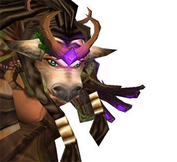
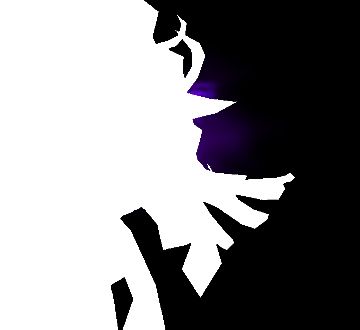
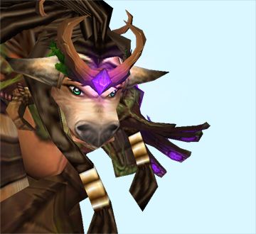
Alternatively, if you find for certain other armor sets/races that the masked image is too general and not accurate enough there is one other method. Instead of making a mask of the image, change the color of the background again. It doesn't matter what color it is so long as you can't associate it with your main image. This is important as you will be using the color select tool (Select -> Color Range...) again to select the background color only and hopefully nothing else. This may take a bit of practice to pick the right color as WoW is a very colorful game in general. Before taking a screenshot, bring up the model control panel. In the drop-down list pick the models with particle effects and toggle them off. Here's an example of a colored background that will work fine for this image in particular:
Iconing Rawr!
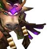
Now your image is ready for iconing. You can delete the masked image layer now. You don't need it anymore. Resize and crop your image to fit into the standard 100x100 pixels like so:
There will mostly likely be an annoying visual 'space' between your particle effects layer and original image when you resize. This is an exaggerated example:
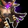
To fix this simply duplicate the particle effects layer and merge (Ctrl+E) them 'til the 'space' closes up. DO NOT merge to the original image. When you're done place your particle effects layer above the original image and turn it off for now.
Duplicate your original image 2 times. De-saturate (Shift+CTRL+U) the first duplicated layer, set it to soft light and sharpen the image (Filter -> Sharpen -> Sharpen). Set the second duplicated layer to hard light.
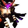
Go back to your original image layer. Select it, right click it and hit the select layer transparency option. Under your original image create a new layer and set it to soft light. Select that new layer and fill it with a dark color. I personally filled it with a nice blue gradient I downloaded a long time ago from drave. You can download them here. De-select (CTRL+D) and Gaussian blur it by 2 pts (Filter -> Blur -> Gaussian Blur). Should have something looking like this:
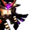
Go to your desaturated, soft light of your original image. Above it create a new layer. Using a drave gradient, I set my gradient option to diamond and created a layer looking like this:
I set this to hard light and it's opacity to 56%. Duplicate the gradient layer. Set the duplicated layer to lighten and it's opacity to 40%. Go back to your particle effects layer. Turn it on and set it to screen. You should have something like this now:
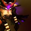
Pick a texture for your background. This will go on the bottom under all the layers. For this particular icon, I used this texture I got from ...of the sky/trex-tures and rotated it to where I liked it.
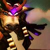
The Text
Almost done. Next we need to make a background for our text so we can read it. Create a new layer above the particle effects layer. Use the rectangular marque tool (M) to make a small box. Fill it with white.
Above your white text box layer, use the text tool (T) type in 'druid'. The font I used was Dirty Headline. Set the font to size 14pt, kerning to 100, small caps on and the color to 88070b for the font. Alternatively, if you're making an alliance icon the color blue I used was 25386b.
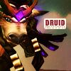
Create another layer above the white text box. Set your brush color to 88070b and load ewanism's small text brushes which you can download from here. Pick any of the small text brushes and paint it underneath your 'druid' text. Refine your text box by deleting any excess small text deco and rounding the sharp corners of your white text box. The end result should look like this:
The Finishing Touches
Create new layer above all the text. I used drave's blue gradient again to make this and set it to screen.

Create a new layer and make a simple 1px white border. Above this white border make a new layer. Fill it with the color 00041e and set it to exclusion. Now you're done and it should be looking something like the final image!

Yay! Hopefully that wasn't too convoluted 0_0
If you think you got your layer order messed up or something along the way here's a screenshot I took of all the my layers conveniently re-labeled. For those who are curious or completely lost can download the original psd files used to make this icon. If there's something you still don't understand after all this feel free to ask! I only hope that this tutorial was of some use ^^;;
Last updated: October 06, 2009 Updated the download link for the model viewer. Again. This will work with WoW version 3.2 and up.
Added download links for text brushes and gradients. I did not make these I'm just putting up download mirrors. I repeat, I did not make these.
I've separated this tutorial in sections to make it easier to follow. The steps I use for this icon can be applied to any of the class icons. Only differences between them is what the text says and the background texture. I personally use photoshop CS2, but this will work with older versions of photoshop and I'm pretty sure paint shop pro. But for the sake of this tutorial I'll be using photoshop commands.
Preparing Your Image: WoW Model Viewer Ho!
First thing you you need is WoW Model Viewer which you can easily download from their site. Don't try to download it from anywhere else as some asses on the WoW forums will link you to a virus instead of the program itself. Be safe. Note you need to actually own a copy of WoW and have it installed to use this, but if you're reading this particular tutorial I'm going to assume that you have it ;p
Using the program is rather easy to figure out so I won't tell you how to do that here, but if you're confused about something then feel free to ask. At any rate create your character, dress em up, make a pose and take your screencap.
If you want to learn how to manually add items or npcs yourself to their respective links read here.
Be sure to set your background to black. This is important especially for armor sets that have those nice shiny particle effects. You should get something looking like this:

But we're not done yet. Before you move your camera position or close out of the program you need to make a mask of this image.

Click the option and you'll get something looking like this afterwards. Take a screencap of this along with your original image:

Open up photoshop and place your masked image as a new layer over your original image. Duplicate your original image underneath the mask. One will be for the particle effects, the other for the character. Go to the select menu and click on the color range option (Select -> Color Range...). Use the eyedropper tool to select the color black on your masked image. This will select the black background only and nothing else.
Go to your 2 layers of you've duplicated beneath the mask and create a layer mask for both layers while your black background is selected. Invert (Ctrl+I) the colors of a layer mask for one of your layers. Be sure the layer mask is selected before you invert.
Apply the layer masks to each respective layer. The result should create 2 layers. One with your image and another with the black background and particle effects:


Alternatively, if you find for certain other armor sets/races that the masked image is too general and not accurate enough there is one other method. Instead of making a mask of the image, change the color of the background again. It doesn't matter what color it is so long as you can't associate it with your main image. This is important as you will be using the color select tool (Select -> Color Range...) again to select the background color only and hopefully nothing else. This may take a bit of practice to pick the right color as WoW is a very colorful game in general. Before taking a screenshot, bring up the model control panel. In the drop-down list pick the models with particle effects and toggle them off. Here's an example of a colored background that will work fine for this image in particular:

Iconing Rawr!
Now your image is ready for iconing. You can delete the masked image layer now. You don't need it anymore. Resize and crop your image to fit into the standard 100x100 pixels like so:

There will mostly likely be an annoying visual 'space' between your particle effects layer and original image when you resize. This is an exaggerated example:

To fix this simply duplicate the particle effects layer and merge (Ctrl+E) them 'til the 'space' closes up. DO NOT merge to the original image. When you're done place your particle effects layer above the original image and turn it off for now.
Duplicate your original image 2 times. De-saturate (Shift+CTRL+U) the first duplicated layer, set it to soft light and sharpen the image (Filter -> Sharpen -> Sharpen). Set the second duplicated layer to hard light.

Go back to your original image layer. Select it, right click it and hit the select layer transparency option. Under your original image create a new layer and set it to soft light. Select that new layer and fill it with a dark color. I personally filled it with a nice blue gradient I downloaded a long time ago from drave. You can download them here. De-select (CTRL+D) and Gaussian blur it by 2 pts (Filter -> Blur -> Gaussian Blur). Should have something looking like this:

Go to your desaturated, soft light of your original image. Above it create a new layer. Using a drave gradient, I set my gradient option to diamond and created a layer looking like this:

I set this to hard light and it's opacity to 56%. Duplicate the gradient layer. Set the duplicated layer to lighten and it's opacity to 40%. Go back to your particle effects layer. Turn it on and set it to screen. You should have something like this now:

Pick a texture for your background. This will go on the bottom under all the layers. For this particular icon, I used this texture I got from ...of the sky/trex-tures and rotated it to where I liked it.

The Text
Almost done. Next we need to make a background for our text so we can read it. Create a new layer above the particle effects layer. Use the rectangular marque tool (M) to make a small box. Fill it with white.
Above your white text box layer, use the text tool (T) type in 'druid'. The font I used was Dirty Headline. Set the font to size 14pt, kerning to 100, small caps on and the color to 88070b for the font. Alternatively, if you're making an alliance icon the color blue I used was 25386b.
Create another layer above the white text box. Set your brush color to 88070b and load ewanism's small text brushes which you can download from here. Pick any of the small text brushes and paint it underneath your 'druid' text. Refine your text box by deleting any excess small text deco and rounding the sharp corners of your white text box. The end result should look like this:

The Finishing Touches
Create new layer above all the text. I used drave's blue gradient again to make this and set it to screen.

Create a new layer and make a simple 1px white border. Above this white border make a new layer. Fill it with the color 00041e and set it to exclusion. Now you're done and it should be looking something like the final image!
Yay! Hopefully that wasn't too convoluted 0_0
If you think you got your layer order messed up or something along the way here's a screenshot I took of all the my layers conveniently re-labeled. For those who are curious or completely lost can download the original psd files used to make this icon. If there's something you still don't understand after all this feel free to ask! I only hope that this tutorial was of some use ^^;;
Last updated: October 06, 2009 Updated the download link for the model viewer. Again. This will work with WoW version 3.2 and up.
Added download links for text brushes and gradients. I did not make these I'm just putting up download mirrors. I repeat, I did not make these.