Coloring tut
Hey guys,
a friend asked me if I could make a tutorial for one of the OTH icons from my last post.
So here it is!
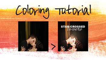
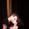
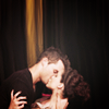
We´re going from this: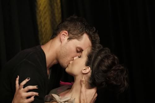
to this:
So first we resize the image like we want to have it.
I want the persons to be small on the bottom. Therefore I need to extend the background.
I mostly do that with the smugde tool or you can also do it with the Rectangular Marquee. Just mark the part you want to extend push crtl+t and extend the background. If you use this option you might use the smudge tool as well to correct the transitions.
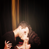
So that´s what we have now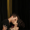
Now we start with the coloring. I usually do a little basework on all of my bases. Copy your base two times.
Set the first one to soft light 100%. This is for the contrast of the icon.It looks a little dark now and that why we set the second layer to screen 100% to bright it up.

This basework depens on your base. If you have a dark base you maybe have to add another screen layer or if the base is already bright you can set the screen layer to just 50% or so. Like I said. Depends on your base ;)
The coloring layers:
1. Add a new curves layer (Layer -> adjustment layer -> curves) with the following settings.
Input: 76 Output: 82
Input: 165 Output: 173
That brightens up their faces a little more as well as the yellow curtain in the background.
2. The faces look a little yellow now and I don´t like that so much that´s why we add a fotofilter layer. Layer -> adjustment layer -> fotofilter
As filter we take blue, frequency 30%. Luminance? yes

So now the faces got a rose color. Looks better than the yellow right?
3. The background is still kinda dark. So we need to change that. Best thing is a bright texture. I took this one. It has a little with dot in the middle, this will fit good with the faces. I set this texture layer to soft light 39% because 100% doesn´t look that pretty. No the background is lighter and the faces as well.

4. The faces are really bright now so I think we could use some more contrast in this icon. (Layer -> adjustment layer -> Brightness/Contrast)
Brightness -6
Contrast 33

5. Next we add a gradient (Layer -> adjustment layer -> Gradient)
radial White/Black 90° -> 33%
The focus is on the faces.
6. Now I want it to look like there´s a spotlight right on them. You know to get the theatre athmosphere. For that I use another Gradient. But this time just a radial white one 90° and voila we get our spotlight. -> 17%

7. Right now the faces look a little too bright and rose in my opinion. I want them to look more natural that´s why I put in this texture.
Multiply 21%
8.After we put on the texture our spotlight went a little away and I want it back.
So I added another gradient but this time no black/white because that would destroy the color of the faces. This time I added a black&beige gradient.
radial black&beige(#ffdca6) 90° -> 43%
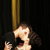
9. The icon looks a little blurry. So we need to sharpen it. Select all, copy merged and paste this layer on top of all your layers. No go to filter -> sharpen -> sharpen
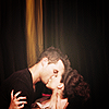
And we are done! You can leave it like this or add some text. I added a text texture by? and this is my result:
Credit for this coloring goes to infinite_angst@brazen_water . I used a coloring psd from her. Thank you, I love your stuff!
I added the base work and made some changes, so that it looks good with my picture.
PSD can be found here
a friend asked me if I could make a tutorial for one of the OTH icons from my last post.
So here it is!
We´re going from this:
to this:
So first we resize the image like we want to have it.
I want the persons to be small on the bottom. Therefore I need to extend the background.
I mostly do that with the smugde tool or you can also do it with the Rectangular Marquee. Just mark the part you want to extend push crtl+t and extend the background. If you use this option you might use the smudge tool as well to correct the transitions.
So that´s what we have now
Now we start with the coloring. I usually do a little basework on all of my bases. Copy your base two times.
Set the first one to soft light 100%. This is for the contrast of the icon.It looks a little dark now and that why we set the second layer to screen 100% to bright it up.
This basework depens on your base. If you have a dark base you maybe have to add another screen layer or if the base is already bright you can set the screen layer to just 50% or so. Like I said. Depends on your base ;)
The coloring layers:
1. Add a new curves layer (Layer -> adjustment layer -> curves) with the following settings.
Input: 76 Output: 82
Input: 165 Output: 173
That brightens up their faces a little more as well as the yellow curtain in the background.
2. The faces look a little yellow now and I don´t like that so much that´s why we add a fotofilter layer. Layer -> adjustment layer -> fotofilter
As filter we take blue, frequency 30%. Luminance? yes
So now the faces got a rose color. Looks better than the yellow right?
3. The background is still kinda dark. So we need to change that. Best thing is a bright texture. I took this one. It has a little with dot in the middle, this will fit good with the faces. I set this texture layer to soft light 39% because 100% doesn´t look that pretty. No the background is lighter and the faces as well.
4. The faces are really bright now so I think we could use some more contrast in this icon. (Layer -> adjustment layer -> Brightness/Contrast)
Brightness -6
Contrast 33
5. Next we add a gradient (Layer -> adjustment layer -> Gradient)
radial White/Black 90° -> 33%
The focus is on the faces.
6. Now I want it to look like there´s a spotlight right on them. You know to get the theatre athmosphere. For that I use another Gradient. But this time just a radial white one 90° and voila we get our spotlight. -> 17%
7. Right now the faces look a little too bright and rose in my opinion. I want them to look more natural that´s why I put in this texture.
Multiply 21%
8.After we put on the texture our spotlight went a little away and I want it back.
So I added another gradient but this time no black/white because that would destroy the color of the faces. This time I added a black&beige gradient.
radial black&beige(#ffdca6) 90° -> 43%
9. The icon looks a little blurry. So we need to sharpen it. Select all, copy merged and paste this layer on top of all your layers. No go to filter -> sharpen -> sharpen
And we are done! You can leave it like this or add some text. I added a text texture by? and this is my result:
Credit for this coloring goes to infinite_angst@brazen_water . I used a coloring psd from her. Thank you, I love your stuff!
I added the base work and made some changes, so that it looks good with my picture.
PSD can be found here