tutorial: supernatural
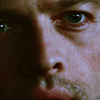
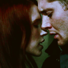
tehuberfangirl asked about the coloring of these icons.

>
Made using PSCS2.
Prepare your base, I used a cap of Supernatural by marishna .
The result of this coloring is pretty dark, so I use screen layers. I duplicated the base twice and set both to screen 100%, but this really depends on the image you use, so I suggest to add the screen layers later.
I want to achieve a muted look with this coloring, so I'll add an exclusion layer.
Fill a new layer with #2d1a00 and set it to exclusion 70%.
Next thing to do is the coloring. I also want to bring some contrast back, so I'll use selective coloring to do both.
Layer>new adjustment layer>selective color:
R: -60 10 80 70
Y: 60 50 30 50
W: 15 0 -50 -20
N: 5 0 5 20
Now I want to make the colors more defined, and replace the pinkish parts with yellow.
Layer>new adjustment layer>curves:
RGB: 93/82
B: 123/112 ; 158/176
The result is a bit to much, so lower the opacity to 50%.
I want to make the image a bit darker and make the colors even more defined.
Fill a new layer with #4c4c4c and set it to soft light 100%.
If your result is too dark, you can lower the opacity of the last layer, but I suggest adding more screen layers instead.
PSD (comment if taking)


>

Made using PSCS2.
Prepare your base, I used a cap of Supernatural by marishna .
The result of this coloring is pretty dark, so I use screen layers. I duplicated the base twice and set both to screen 100%, but this really depends on the image you use, so I suggest to add the screen layers later.
I want to achieve a muted look with this coloring, so I'll add an exclusion layer.
Fill a new layer with #2d1a00 and set it to exclusion 70%.
Next thing to do is the coloring. I also want to bring some contrast back, so I'll use selective coloring to do both.
Layer>new adjustment layer>selective color:
R: -60 10 80 70
Y: 60 50 30 50
W: 15 0 -50 -20
N: 5 0 5 20
Now I want to make the colors more defined, and replace the pinkish parts with yellow.
Layer>new adjustment layer>curves:
RGB: 93/82
B: 123/112 ; 158/176
The result is a bit to much, so lower the opacity to 50%.
I want to make the image a bit darker and make the colors even more defined.
Fill a new layer with #4c4c4c and set it to soft light 100%.
If your result is too dark, you can lower the opacity of the last layer, but I suggest adding more screen layers instead.
PSD (comment if taking)


