Tutorial | Icon #014 & Icon #015
Two very easy tutorials ;) Very easy *grins* The first one shows you how to make a b/w icon without desaturation and the second a simple coloring with a texture.
From this to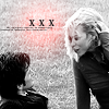
Step 01
Crop your image down to 100x100. Go to Filter -> Sharpen -> Sharpen and sharpen once. Then go to Image -> Adjustments -> Brightness/Contrast and use this setting
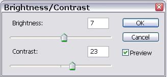
This is now your base

Step 02
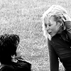
Dublicate your base (right-click on you base in the layer palette and select Dublicate Layer) and set it to Soft Light (Opacity: 100%)

Step 03
Create a new Layer (Shift+Ctrl+N) and fill it with black (#000000). Set this layer to Color (Opacity: 100%)
Step 04
Now take this light-blob texture
by sanami276 and place it over all other layers.
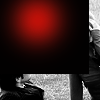
Set it to Screen (Opacity: 100%)
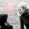
Step 05
You can't really see the red blob. On your texture, go to Image -> Adjustments -> Brightness/Contrast and use this setting
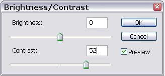

->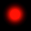
Now you can see the blob much better
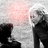
Step 06
Create again a new layer (Shift+Ctrl+N) and use the text brush by colortone in black (#000000).
Set this layer to Normal (Opacity: 100%)

My Layer Palette
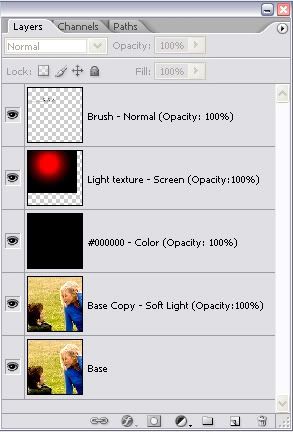
The end ^-^
From this to
Step 01
Crop your image down to 100x100. Go to Filter -> Sharpen -> Sharpen and sharpen once. Then go to Image -> Adjustments -> Brightness/Contrast and use this setting
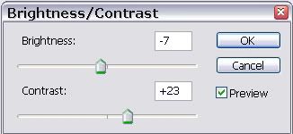
This is now your base

Step 02
Take this texture
by colorfilter. Go to Edit -> Transform -> Flip Horizontal and then again Edit -> Transform -> Flip Vertical
Step 03
Drag it over all layers and set it to Color (Opacity: 100%)

My Layer Palette
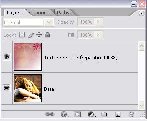
You have to look which texture looks good and which not. Warm colors are better than cold ones. Red better than blue. And your icon should be not too dark.
The end ^-^
Question are to be thrown at my door *points down*
From this to

Step 01
Crop your image down to 100x100. Go to Filter -> Sharpen -> Sharpen and sharpen once. Then go to Image -> Adjustments -> Brightness/Contrast and use this setting

This is now your base

Step 02
Dublicate your base (right-click on you base in the layer palette and select Dublicate Layer) and set it to Soft Light (Opacity: 100%)

Step 03
Create a new Layer (Shift+Ctrl+N) and fill it with black (#000000). Set this layer to Color (Opacity: 100%)

Step 04
Now take this light-blob texture

by sanami276 and place it over all other layers.

Set it to Screen (Opacity: 100%)

Step 05
You can't really see the red blob. On your texture, go to Image -> Adjustments -> Brightness/Contrast and use this setting


->

Now you can see the blob much better

Step 06
Create again a new layer (Shift+Ctrl+N) and use the text brush by colortone in black (#000000).

Set this layer to Normal (Opacity: 100%)

My Layer Palette

The end ^-^
From this to

Step 01
Crop your image down to 100x100. Go to Filter -> Sharpen -> Sharpen and sharpen once. Then go to Image -> Adjustments -> Brightness/Contrast and use this setting

This is now your base

Step 02
Take this texture

by colorfilter. Go to Edit -> Transform -> Flip Horizontal and then again Edit -> Transform -> Flip Vertical

Step 03
Drag it over all layers and set it to Color (Opacity: 100%)

My Layer Palette

You have to look which texture looks good and which not. Warm colors are better than cold ones. Red better than blue. And your icon should be not too dark.
The end ^-^
Question are to be thrown at my door *points down*