tutorial #01
Program Used: Photoshop CS3 Extended
Difficult: Easy ( I think)
Translatable: No, selective colouring used.
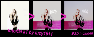
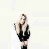
1. Resize/crop your base. For this kind of tut choose an image with a blank background, or otherwise just erase the parts you don’t wish to be seen.
2. Duplicate your base and desaturate it ( image > adjustment > desaturate). Erase the unwanted background.
3. Now Flip the Duplicated image by selecting Edit > Transfrom > Flip Horizontal.
4. Add Curves layer ( Layer > New adjustment layer > Curves).
RGB;
Output: 149
Input: 95
RED;
Output:135
Input: 113
Blue;
Output: 136
Input: 120
This will brighten the image.
5. Add Selective Colour layer( Layer > New adjustment layer > Selective Colour)
REDS;
Cyan= -100%
Magenta= +10%
Yellow= +100%
Black= 0%
YELLOWS;
Cyan= 0%
Magenta= 0%
Yellow= -40%
Black= 0%
NEUTRALS;
Cyan= +2%
Magenta= 0%
Yellow= -4%
Black= 0%
Should add a red-yellow tinge to the image
6. Add another Selective Colour ( Layer > New adjustment layer > Selective Colour)
REDS;
Cyan= -68%
Magenta= +3%
Yellow= +100%
Black= 94%
YELLOWS;
Cyan= 0%
Magenta= 0%
Yellow= +45%
Black= -40%
NEUTRALS;
Cyan= +8%
Magenta= 0%
Yellow= -7%
Black= 0%
Makes the reds and yellows brighter and more contrasted.
7. Add New fill Layer (Layer > New Fill Layer > Solid Colour)Fill with #d8d8d8 and Set it to Muliply at 100% Opacity
Adds background and help blend in the image
8. Add another Fill Layer (Layer > New Fill Layer > Solid Colour)
Fill with #e3e0dc and set it to Colour Burn at around 68% Opacity.
(remember to change the settings depending on your image)
This will add more depth to the first fill layer
9. Add a Hue/Saturation Layer (Layer > New Adjustment Layer > Hue/Saturation)
MASTER;
Hue: 0
Saturation: +1
Lightness: 0
GREENS;
Hue: 0
Saturation: -100
Lightness: 0
CYANS;
Hue: 0
Saturation: -100
Lightness: 0
BLUESS;
Hue: 0
Saturation: -100
Lightness: 0
Eliminates all green and blues from the image and strengthens red and yellows
10. Now add some text. Keep it small so it doesn’t over power the image.
We want your images to stand out in the icon.
11. Add this texture
by babliz and set it to Multiply at 100% Opacity.
Stop here to receive the first result
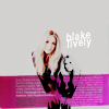
.psd
12. Add this texture
by mizzybox
and set it to Multiply at around 21% Opacity
This will give the back ground a blended blue colour
13. And last but not least
add this texture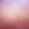
by luux_lu and set it to Multiply at around 16% Opacity
This adds light pink to the places that the blue doesn’t cover
Done!
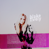
.psd
Always remember to change the settings to suit your image.
Comment if using or downloading the .psd
Credit lucy1611
Do not copy exactly and claim as own
join or watch stolen_summersfor more tutorials
pimpin' daily_jennifer, join today!
Difficult: Easy ( I think)
Translatable: No, selective colouring used.


1. Resize/crop your base. For this kind of tut choose an image with a blank background, or otherwise just erase the parts you don’t wish to be seen.
2. Duplicate your base and desaturate it ( image > adjustment > desaturate). Erase the unwanted background.
3. Now Flip the Duplicated image by selecting Edit > Transfrom > Flip Horizontal.
4. Add Curves layer ( Layer > New adjustment layer > Curves).
RGB;
Output: 149
Input: 95
RED;
Output:135
Input: 113
Blue;
Output: 136
Input: 120
This will brighten the image.
5. Add Selective Colour layer( Layer > New adjustment layer > Selective Colour)
REDS;
Cyan= -100%
Magenta= +10%
Yellow= +100%
Black= 0%
YELLOWS;
Cyan= 0%
Magenta= 0%
Yellow= -40%
Black= 0%
NEUTRALS;
Cyan= +2%
Magenta= 0%
Yellow= -4%
Black= 0%
Should add a red-yellow tinge to the image
6. Add another Selective Colour ( Layer > New adjustment layer > Selective Colour)
REDS;
Cyan= -68%
Magenta= +3%
Yellow= +100%
Black= 94%
YELLOWS;
Cyan= 0%
Magenta= 0%
Yellow= +45%
Black= -40%
NEUTRALS;
Cyan= +8%
Magenta= 0%
Yellow= -7%
Black= 0%
Makes the reds and yellows brighter and more contrasted.
7. Add New fill Layer (Layer > New Fill Layer > Solid Colour)Fill with #d8d8d8 and Set it to Muliply at 100% Opacity
Adds background and help blend in the image
8. Add another Fill Layer (Layer > New Fill Layer > Solid Colour)
Fill with #e3e0dc and set it to Colour Burn at around 68% Opacity.
(remember to change the settings depending on your image)
This will add more depth to the first fill layer
9. Add a Hue/Saturation Layer (Layer > New Adjustment Layer > Hue/Saturation)
MASTER;
Hue: 0
Saturation: +1
Lightness: 0
GREENS;
Hue: 0
Saturation: -100
Lightness: 0
CYANS;
Hue: 0
Saturation: -100
Lightness: 0
BLUESS;
Hue: 0
Saturation: -100
Lightness: 0
Eliminates all green and blues from the image and strengthens red and yellows
10. Now add some text. Keep it small so it doesn’t over power the image.
We want your images to stand out in the icon.
11. Add this texture

by babliz and set it to Multiply at 100% Opacity.
Stop here to receive the first result

.psd
12. Add this texture

by mizzybox
and set it to Multiply at around 21% Opacity
This will give the back ground a blended blue colour
13. And last but not least
add this texture

by luux_lu and set it to Multiply at around 16% Opacity
This adds light pink to the places that the blue doesn’t cover
Done!

.psd
Always remember to change the settings to suit your image.
Comment if using or downloading the .psd
Credit lucy1611
Do not copy exactly and claim as own
join or watch stolen_summersfor more tutorials
pimpin' daily_jennifer, join today!