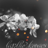
Challenge #3: Round #4 Results
Thank you to people who voted, but sadly we have to say goodbye to some pearticipants.
Eliminated:

by mayush17 with 3 votes

by kisuncha with 3 votes
People's choice:

by llean with 2 votes
Mod's choice:

by fara0
If your icon number isn't listed here, you've recived no votes. Congrats :)
1.-1/+1=0
2.+1
3.+2
4.-1/+1=0
5.-3
6.-2/+1=-1
7.-2
8.-3
- = lesser quality vote(s)
+ = favorite icon vote(s)
Eliminate:
1. poor quality, tiny text is un necessary
#04 - crop is really not so good, I think quite a lot to understand what's on the pic; also it's too blurred.
#05 - coloring is too contrasted and the icon seems oversharped; the text doesn't fit.
5: text is too big and draws attention from the flowers
#o5 - The text doesn't really blend in.
6: composition is a bit crowded and cropping could0ve been better..somehow it's hard to tell that is a flower
6. too much things on one icon. the light in the bottom and the white border are not playing togheter..
7. too dark and mute coloring
07 - origin but not so lucky composition. text font's choice isn't nice, I guess
08 - too simple and boring icon
8. poor quality, awful cut
#o8 - The coloring of this icon don't stand ou, it looks a bit dull
To keep:
1. very very nice composition and cropping and texture use :)
#02 - pretty coring and texture use.
3 - different and beautiful
3: lovely black and white coloring and use of light texture..text is superfluous but it doesn't spoil the overall look
#o4 - Really beautiful coloring, and blurry-kinda look fits great here.
06 - beautiful colouring! nice placing of duplicate
Good luck to everyone in next round :)
Eliminated:

by mayush17 with 3 votes

by kisuncha with 3 votes
People's choice:

by llean with 2 votes
Mod's choice:

by fara0
If your icon number isn't listed here, you've recived no votes. Congrats :)
1.-1/+1=0
2.+1
3.+2
4.-1/+1=0
5.-3
6.-2/+1=-1
7.-2
8.-3
- = lesser quality vote(s)
+ = favorite icon vote(s)
Eliminate:
1. poor quality, tiny text is un necessary
#04 - crop is really not so good, I think quite a lot to understand what's on the pic; also it's too blurred.
#05 - coloring is too contrasted and the icon seems oversharped; the text doesn't fit.
5: text is too big and draws attention from the flowers
#o5 - The text doesn't really blend in.
6: composition is a bit crowded and cropping could0ve been better..somehow it's hard to tell that is a flower
6. too much things on one icon. the light in the bottom and the white border are not playing togheter..
7. too dark and mute coloring
07 - origin but not so lucky composition. text font's choice isn't nice, I guess
08 - too simple and boring icon
8. poor quality, awful cut
#o8 - The coloring of this icon don't stand ou, it looks a bit dull
To keep:
1. very very nice composition and cropping and texture use :)
#02 - pretty coring and texture use.
3 - different and beautiful
3: lovely black and white coloring and use of light texture..text is superfluous but it doesn't spoil the overall look
#o4 - Really beautiful coloring, and blurry-kinda look fits great here.
06 - beautiful colouring! nice placing of duplicate
Good luck to everyone in next round :)