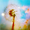
Challenge #3: Round #1 Results
Thank you to people who voted, but sadly we have to say goodbye to some pearticipants.
Eliminated:

by eternalphoenix_ with 4 votes

by gfxgurl with 4 votes
People's choice:

by t00tsy with 2 votes

by hel_lansky with 2 votes
Mod's choice:

by mariarita
i really like the pink coloring on this icon..
If your icon number isn't listed here, you've recived no votes. Congrats :)
1.-4
2.-3
3.-4
4.-1
5.-3
6.-1
7.+1
8.-3
9.-1+1
10.+2
12.-1
13.+1
14.+2
- = lesser quality vote(s)
+ = favorite icon vote(s)
Eliminate:
#01 - Textures overcome the original image, text isn't placed well
1: text is too big and there's too much contrast between the bluish coloring on top and the pink at the bottom
01 the pink blob wasn't a nice touch to it and the text makes it look too crowded
01 - too much textures are used here. text looks a bit rough
02: Too much textures are applied--looks very grainy.
02 the bg is very busy and draws to much attention away from the flower
2: The icon is too crowded: too many different decorative elements and colors are used, the original image is too small and lost in the background.
3: the oblique text is distracting
03: The text is awkwardly placed.
#03 - Cropping isn't the best as well as coloring and text placement
03 - I think there is something wrong with composition: dandelion is placed too close to right side and text doesn't work as balancer
#04 - Lightnings don't match well the rest of the icon
05 - quite simple icon -> boring. use of text isn't well done
5: text placement kinda spoils the simplicity of the icon
5: The coloring is lovely, but the text is too large and the rectangular behind it distracts attention from the original image. Lighter text without the rectangular would make the composition look much better.
06 its hard to tell what's on the image because of all the blue
8: I like the coloring and the originality of the icon, but the checked background doesn't match the delicate original image. It also seems blurry.
08: Looks oversharpened.
8 - too much texture so I can't see the pic and bad cropping also
9 - bad coloring and cropping and texture use.. it's also too blur
12 - the light texture doesn't fir
To keep:
07 - so mild and soft colour! awww... very lovely and qualitative icon
#09 - Nice cropping and pleasant use of textures and colours
10: it caught my attention right away because of the soft yellowish coloring, the light texture and the text
10: Simple, but beautiful.
13: Beautiful, creative icon. The text matches the theme of the icon, I like how the texture stands out in the black backround. The coloring is bright and natural.
14: the colors are amazing!
14 - so colorful and pretty.. nice textures and the text fits nicely!
Good luck to everyone in next round :)
Eliminated:

by eternalphoenix_ with 4 votes

by gfxgurl with 4 votes
People's choice:

by t00tsy with 2 votes

by hel_lansky with 2 votes
Mod's choice:

by mariarita
i really like the pink coloring on this icon..
If your icon number isn't listed here, you've recived no votes. Congrats :)
1.-4
2.-3
3.-4
4.-1
5.-3
6.-1
7.+1
8.-3
9.-1+1
10.+2
12.-1
13.+1
14.+2
- = lesser quality vote(s)
+ = favorite icon vote(s)
Eliminate:
#01 - Textures overcome the original image, text isn't placed well
1: text is too big and there's too much contrast between the bluish coloring on top and the pink at the bottom
01 the pink blob wasn't a nice touch to it and the text makes it look too crowded
01 - too much textures are used here. text looks a bit rough
02: Too much textures are applied--looks very grainy.
02 the bg is very busy and draws to much attention away from the flower
2: The icon is too crowded: too many different decorative elements and colors are used, the original image is too small and lost in the background.
3: the oblique text is distracting
03: The text is awkwardly placed.
#03 - Cropping isn't the best as well as coloring and text placement
03 - I think there is something wrong with composition: dandelion is placed too close to right side and text doesn't work as balancer
#04 - Lightnings don't match well the rest of the icon
05 - quite simple icon -> boring. use of text isn't well done
5: text placement kinda spoils the simplicity of the icon
5: The coloring is lovely, but the text is too large and the rectangular behind it distracts attention from the original image. Lighter text without the rectangular would make the composition look much better.
06 its hard to tell what's on the image because of all the blue
8: I like the coloring and the originality of the icon, but the checked background doesn't match the delicate original image. It also seems blurry.
08: Looks oversharpened.
8 - too much texture so I can't see the pic and bad cropping also
9 - bad coloring and cropping and texture use.. it's also too blur
12 - the light texture doesn't fir
To keep:
07 - so mild and soft colour! awww... very lovely and qualitative icon
#09 - Nice cropping and pleasant use of textures and colours
10: it caught my attention right away because of the soft yellowish coloring, the light texture and the text
10: Simple, but beautiful.
13: Beautiful, creative icon. The text matches the theme of the icon, I like how the texture stands out in the black backround. The coloring is bright and natural.
14: the colors are amazing!
14 - so colorful and pretty.. nice textures and the text fits nicely!
Good luck to everyone in next round :)