Making Of: Superheroes
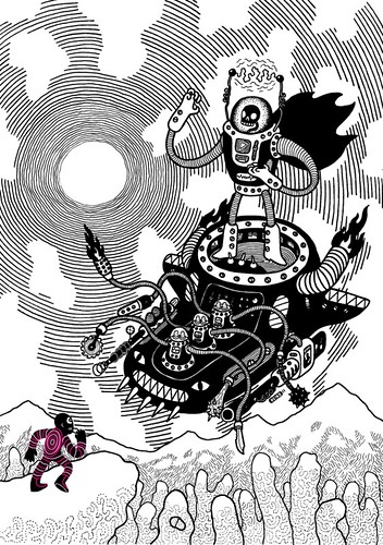
Society6 asked for entries into a Superhero-themed Collaboration, so I delivered. Here’s how I did it!
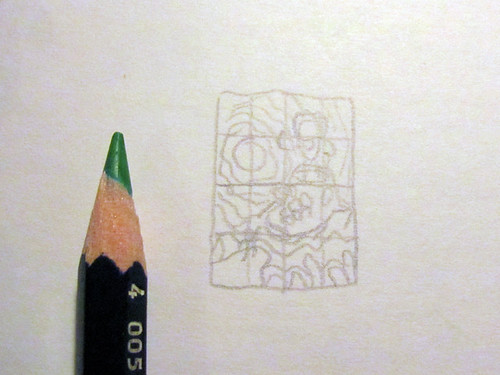
Starting off I make a tiny thumbnail sketch to set up the general composition of the image. The stamp-size scale of the sketch prevents me from getting lost in detail early on. The grid serves as an aid to bring the thumbnail sketch to the final sketch.
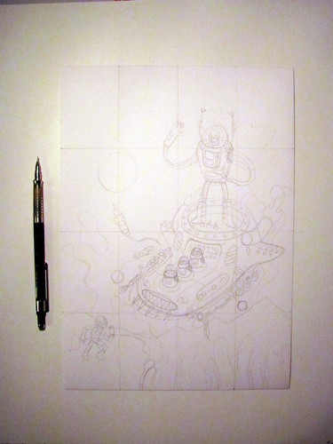
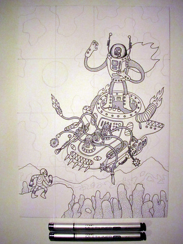
Using the grid, I transfer the thumbnail composition onto an A4 sized piece of drawing paper. I only establish the bare bones of the illustration at this stage.
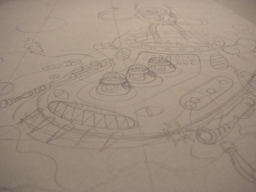
There is no need adding all the details now. The less lines you have, the less you need to erase again later. Of course, the reason I make a pencil sketch at all is that not every line I ever draw sits on the right spot at first. The pencil is forgiving, you only really commit to something at the inking stage.

The first pen I use to ink the Illustration is the .3 width pen. It’s sort of an everyday width, not too strong and not too thin. Just right to establish the structural base of the Illustration.
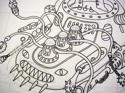
As you can see here not every pencil line is traced at this time. The .3 does not lend itself well to detail work at this scale.
In comes the .1 pen. It’s not the thinnest pen I have, but it’s perfect for most detail work.
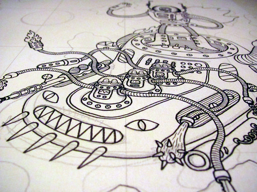
At this point I’ve had enough time to think about what to do with the background. With the .3 lines as the base and the .1 pen to add in the most important details, I’m good to continue.
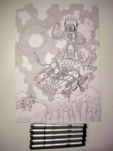
To achieve some sort of depth I use several widths to create the concentric background circles, starting at .05 in the center, working my way up to .5 on the border.
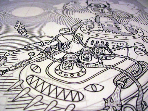
Added the background, then strengthened some outlines with the .5 or the .7 pen. Inking is done!
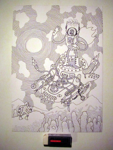
Erased the pencil lines to get a clearer view!
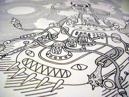
Should something still not look right, I can still add a line or two.
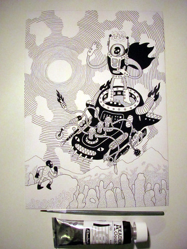
For the solid colours I’ve recently started using gouache, which is a heavily pigmented watercolour paint. It’s extremely quick - it’s very opaque upon first use and dries within seconds.

Once it dries, it has a nice chalky texture. All othe colours other than black usually appear a bit brighter once they dry. You also have to take care not to apply more than a quick wash, since it cracks if it’s applied too thickly.

If you use gouache you shouldn’t roll your artwork for transport - It’ll crack.
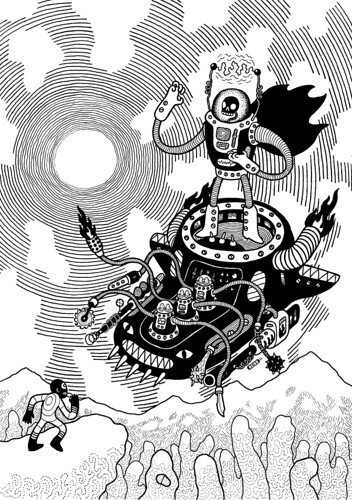
Once finished, I scan it in. Correct it in Photoshop, then send it to Illustrator to finish it up in Vector format. If I intend to sell the original, I add any other colours in gouache.
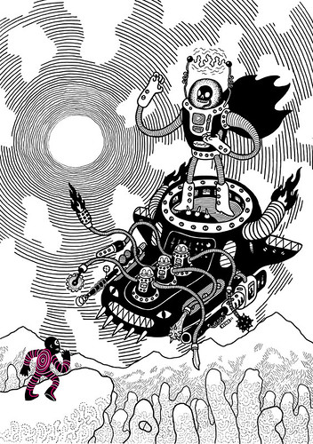
Adding colour in Illustrator, it’s good to go! Hope you enjoyed the walkthrough! Any questions? Comment!
Originally published at heiko windisch dot com blog. You can comment here or there.