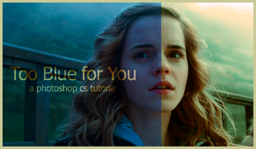
Tutorial 15: Too Blue for You!
Hello, all! It's been a while, and I've got lots to post, just haven't, ha. And I've been in a bit of a creative rut, so...I'm waiting for some real inspiration.
While waiting for inspiration, I tried to make an icon only to realize...it's blue filter was unlike any I'd ever dealt with before, so I turned it into my project and found a great way to bring out the color.
I'm going to call this an intermediate tutorial, but don't let that scare you off :)
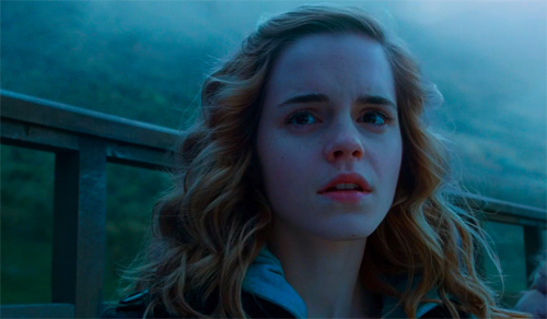
1. First, we find a blue base. They aren't my personal favorite, but sometimes you've gotta do what you've gotta do. In other words, I'm stubborn, and so are you, and we want to use that picture, dang it!
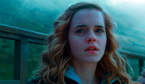
2. First things first: let's give the picture some depth. I figured the easiest way to do that was to use curves. So, create a new curves adjustments layer (layer » new adjustment layer » curves) and just hit the auto button and click okay. That is already a huge improvement.
3. We're going to side trip for me to show why we couldn't lighten this image the normal way. If I were to merge layers and, then duplicate and put a screen layer on top, it looks like this:
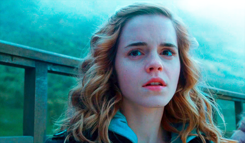
Now at first glance, it's not so bad, but I tried it at icon size...it was wretched! Look at Emma's lips, they probably glow radioactive. Her skin? She's blotchy blue and magenta. And, the image still is 80% blue. This is not a good base to build on. So, the lesson from step number 3? Don't do it.
4. Create a new layer and flood fill with #8BC8C8; this color and shade of blue is going to depend on the color blue in your image. I used the color dropper then lightened the blue to find my color. Set this layer to exclusion. You're thinking I'm crazy right now, aren't you?
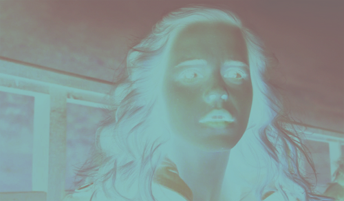
I know, I know...how is THAT better than the radioactive screen we've got going on on fake step #3? Watch this nifty trick. Go to apply image (image » apply image...) and set it to difference at 100% making sure it's on merged. Now take a look:
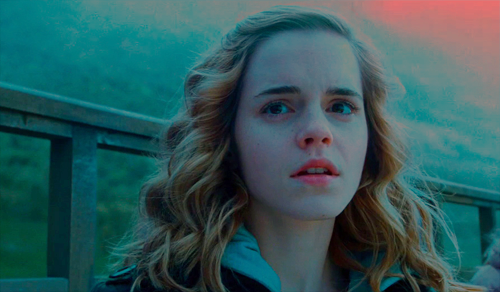
5. Remember, we're on a mission to have her face NOT be blotchy. That's our goal. So, this image needs some warming up, don't you think? Choose a beige color. In this case, I'm going to use #C9C897. Create a new layer, flood fill it, and set to multiply.
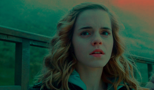
Notice how smooth Emma's face is. Those two layers took out the blotch. Amazing, yeah? But we don't want it to wash the image out so completely, so apply the image to this layer again, this time on soft light.

6. Obviously that's just not bright enough. So, create a new curves adjustment layer and set it to auto again.
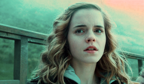
I should just call this the end of the tutorial, because from there you have a perfectly workable base.
7. However, I want to warm it up more. The blue is still just too powerful for my takes, so I'm going to use a color balance adjustment layer. Note that all my values are negative and so on the left side of the sliders.
Shadows: -5, 0, -16
Midtones: -9, -7, -30
Highlights: 0, -16, -9

And viola! You have a light warm colored base to work from for all your imaging desires :)
While waiting for inspiration, I tried to make an icon only to realize...it's blue filter was unlike any I'd ever dealt with before, so I turned it into my project and found a great way to bring out the color.
I'm going to call this an intermediate tutorial, but don't let that scare you off :)

1. First, we find a blue base. They aren't my personal favorite, but sometimes you've gotta do what you've gotta do. In other words, I'm stubborn, and so are you, and we want to use that picture, dang it!

2. First things first: let's give the picture some depth. I figured the easiest way to do that was to use curves. So, create a new curves adjustments layer (layer » new adjustment layer » curves) and just hit the auto button and click okay. That is already a huge improvement.

3. We're going to side trip for me to show why we couldn't lighten this image the normal way. If I were to merge layers and, then duplicate and put a screen layer on top, it looks like this:

Now at first glance, it's not so bad, but I tried it at icon size...it was wretched! Look at Emma's lips, they probably glow radioactive. Her skin? She's blotchy blue and magenta. And, the image still is 80% blue. This is not a good base to build on. So, the lesson from step number 3? Don't do it.
4. Create a new layer and flood fill with #8BC8C8; this color and shade of blue is going to depend on the color blue in your image. I used the color dropper then lightened the blue to find my color. Set this layer to exclusion. You're thinking I'm crazy right now, aren't you?

I know, I know...how is THAT better than the radioactive screen we've got going on on fake step #3? Watch this nifty trick. Go to apply image (image » apply image...) and set it to difference at 100% making sure it's on merged. Now take a look:

5. Remember, we're on a mission to have her face NOT be blotchy. That's our goal. So, this image needs some warming up, don't you think? Choose a beige color. In this case, I'm going to use #C9C897. Create a new layer, flood fill it, and set to multiply.

Notice how smooth Emma's face is. Those two layers took out the blotch. Amazing, yeah? But we don't want it to wash the image out so completely, so apply the image to this layer again, this time on soft light.

6. Obviously that's just not bright enough. So, create a new curves adjustment layer and set it to auto again.

I should just call this the end of the tutorial, because from there you have a perfectly workable base.
7. However, I want to warm it up more. The blue is still just too powerful for my takes, so I'm going to use a color balance adjustment layer. Note that all my values are negative and so on the left side of the sliders.
Shadows: -5, 0, -16
Midtones: -9, -7, -30
Highlights: 0, -16, -9

And viola! You have a light warm colored base to work from for all your imaging desires :)