Ask the Artist: salty-catfish
First, thank you oxoniensis for inviting me to Ask the Artist. <3 I'm a little nervous! Hey everyone! *waves*
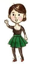
I made this GPOY for hoodie-time a while ago and it still applies ;D
I'm in my mid-twenties, from Germany, living the unexciting student life. Aaaand I like drawing fanart! If you want to know about my fandom origin story or anything like that feel free to ask - I can't believe I've been here for almost two years now!
I don't have a masterlist so my art is kind of all over the place, but you can find most of it at local_colour and under the 'my art' tag on my tumblr.
I asked my lovely f-list about what would be interesting in advance and will try to address the points that have been brought up. Most people wanted to know about how I do watercolor - actually, the funny thing is that I actually hadn't used it in ages before SPN fandom, so basically I'm still figuring shit out! But here's how I do things:
Materials the essentials:

Paint box - I have this cute, small one by Schmincke and a few loose colors I accumulated over time. I've never really tried the watercolor that comes in tubes, though I hear it's good, especially if you want to use more pigment than I generally do. Since I live in Germany I have easy access to the mostly good local brands (like also Staedtler or Faber-Castell, no, not getting paid for this), so I tend to buy those. Winsor&Newton is pretty popular abroad, afaik, and russian paints can also be really good.
Brushes - My babies are a few Series7 sable brushes by W&N. Sable brushes are very soft and springy and there is a consensus that they are best for watercolor. Well, it's true! I've also got some by daVinci but the Series7 really are the best so far. Their perfect point makes me so happy *_* My larger brushes are synthetics and they also serve just fine. I really like the red 'cat tongue' shaped one! My smallest brush is a 3/0 (though I usually go with the 0) and my largest a 10. IMO if there's one area where you want to invest in quality, it's brushes; I can't stand working with horror brushes.
Paper - In case you are unaware, since you paint with a lot of water you need special, thick paper for this medium. It's probably the biggest investment in the long run since colors and brushes last for quite a while. There are a lot of different brands and kinds of paper and they all act differently, but I won't go into that here LOL. I don't really like the strong grain most of the more paper sold here has. Maybe it's just like that in Germany but it's really hard to find something that is just smooth. For that reason my favourite paper atm is not from one the fancy, traditional brands but this one. Yeah, awesome design, I know. xD
One time I was daring and bought this pad that prides itself on having an 'extra smooth surface' but beware, this stuff almost acts like normal paper and is really unforgiving! Don't buy it!
I general I don't do any preparation of the sheet and just leave it glued to the pad. (An important feature of any watercolor pad is that the sheets are glued together on all four sides.)
supporting cast:

1) masking fluid - It's white goo that dries to a transparent film that can be rubbed off with an eraser later. It's mostly useful when you have small areas that should stay white in an area that you want to be an even wash. It can be a huge pain (means, it requires crazy speed and dexterity and also your image WILL be ruined if you botch it) to do those without leaving some drying borders when done without help. I'm mostly too lazy to use it but it comes in handy from time to time. I did the fireflies in the 'Sam/Dean in the woods' piece with it, for example! (see a close-up here)
2) tissue - or paper towel, toilet paper, something like that - super important! I always clutch it in my right hand to immediately press on the paper when something goes wrong and also use it to rub off the brushes in-between etc. I know other people don't do this but frankly, I couldn't deal with WC at all without CLUTCHING MY TISSUE LIKE A DROWNING PERSON.
3) glove - ridiculous looking, I know! When you rest you hand a lot on the paper it can become water-repellant because of the natural oiliness of the skin which leads to ugly spots in your washes, so the glove is for protection, if needed. I could also put a sheet of paper or something under my hand but I tend to forget moving it along, so I prefer this solution. I bought a a set of gloves from the drug store and cut off the tips. Trés chic!
4) testing paper - vital! To test the colour, I also tend to mix on it.
5) table salt (provided by Plato and Socrates) - only very rarely used, for effects
6) wonky sumi-e brush - mostly used to brush eraser dust from the paper, sometimes also for painting
7) white gouache - when I've really botched it this gets used to fix mistakes, though it's never as nice as the paper white! Doesn't show in a scan, though of course you can see it on the original.
8) natural sponge - I don't use it a lot but sometimes better than the brush if you want to wet larger stretches of paper.
9) tape - sometimes I tape paper to a board with it
For digital painting and graphics I mostly use Photoshop (sorry Painter, I like you but I'm just too lazy for your controls) and my good old Wacom Intuos2 tablet. I've had it forever and will definitely sob grossly, should it ever break. Look how I polished the middle area with my wrist over time! ;D
process Okay, I'll try to explain how I usually approach a painting!
1) Figuring out the general idea, brainstworming etc. Inspiration can come from everywhere etc etc, I'm sure it's the same for everyone who creates things. ;) I think I'm kind of slow though and definitely tend to sway my head and 'hmm' and 'haah' a lot while I make sketches. Sometimes I run around with an idea in the back of my mind for a year, haha.
Since someone asked about thumbnails - yes, I usually do them at this stage or during 2) ! They tend to be very basic though. If I have an idea for a picture I tend to jot down a thumbnail so I don't forget. This way I will also see whether something that works in my brain actually works on paper (often not).
Here are some thumbs that I made for Springfling, DCBB, and the recent SPNJ2BB cover:

I try to make up my mind about the composition before looking for reference because I don't want to cling too much to them which happens pretty easily. (I'm not terribly orginal!)
2) Research and reference hunt - I loooove this part since I'm a total geek and SPN fandom is full of great resources, like the clothing catalogue or the motel room picspams etc etc. (I really like SuperWiki). Apart from that reference can be anything, screenshots, very often pictures from google image search, something out of the depths of my image folders (I save a lot of images), my own photos but also books, postcards, you name it. I usually make a new folder on my desktop for every larger project and fill it with lots of pictures.
3) Actual drawing and painting
I made a step-by-step for a Claire!Castiel painting I did last year, I had good pics for it. How I do things varies a lot from picture to picture though, sometimes I don't do much of a drawing or paint much less tightly. For this painting my general idea was something along the lines of 'SPN christmas card' (no, really xD), and the inspiration came from icons and early Flemish painting. I kind of liked the idea of mixing the 'gorgeous, youthful looking angel' cliché with the horror aspect of the vessels in SPN. I really like the trompe l'oeil goldwork halos they have in some Flemish painting and wanted to paint one, so I basically just grabbed the one from this painting. I also used a screencap for the face though I don't have that at hand anymore.

(click for full size)
4) Editing - [warning, Photoshop talk ahead!] I always edit the scan in Photoshop. If the paper is larger than A4 I have to stitch the scans together. Since the raw scan is generally very washed out and has distorted colors (my scanner is not quality) what I always do is a level adjustment + color balance and cleaning.
Sometimes I also make slight corrections, color overlays and the like, it varies! Photoshop allows for so many things that you have to watch out and stop fiddling at some point though! I tend to like the effect I get when I put a layer with a dark color on 'brighten', lower opacity and substitute the darks in the pic with a slightly different tone that way. I really like playing around with the layer effects in general.
Okay, that's for lengthy introductions, now it's your turn to ask questions! (Anything about a specific painting? What is so great about Dean's nose? What is my favourite plaid shirt? What are my feelings about SPN's visuals? I'll answer!)
I made this GPOY for hoodie-time a while ago and it still applies ;D
I'm in my mid-twenties, from Germany, living the unexciting student life. Aaaand I like drawing fanart! If you want to know about my fandom origin story or anything like that feel free to ask - I can't believe I've been here for almost two years now!
I don't have a masterlist so my art is kind of all over the place, but you can find most of it at local_colour and under the 'my art' tag on my tumblr.
I asked my lovely f-list about what would be interesting in advance and will try to address the points that have been brought up. Most people wanted to know about how I do watercolor - actually, the funny thing is that I actually hadn't used it in ages before SPN fandom, so basically I'm still figuring shit out! But here's how I do things:
Materials the essentials:
Paint box - I have this cute, small one by Schmincke and a few loose colors I accumulated over time. I've never really tried the watercolor that comes in tubes, though I hear it's good, especially if you want to use more pigment than I generally do. Since I live in Germany I have easy access to the mostly good local brands (like also Staedtler or Faber-Castell, no, not getting paid for this), so I tend to buy those. Winsor&Newton is pretty popular abroad, afaik, and russian paints can also be really good.
Brushes - My babies are a few Series7 sable brushes by W&N. Sable brushes are very soft and springy and there is a consensus that they are best for watercolor. Well, it's true! I've also got some by daVinci but the Series7 really are the best so far. Their perfect point makes me so happy *_* My larger brushes are synthetics and they also serve just fine. I really like the red 'cat tongue' shaped one! My smallest brush is a 3/0 (though I usually go with the 0) and my largest a 10. IMO if there's one area where you want to invest in quality, it's brushes; I can't stand working with horror brushes.
Paper - In case you are unaware, since you paint with a lot of water you need special, thick paper for this medium. It's probably the biggest investment in the long run since colors and brushes last for quite a while. There are a lot of different brands and kinds of paper and they all act differently, but I won't go into that here LOL. I don't really like the strong grain most of the more paper sold here has. Maybe it's just like that in Germany but it's really hard to find something that is just smooth. For that reason my favourite paper atm is not from one the fancy, traditional brands but this one. Yeah, awesome design, I know. xD
One time I was daring and bought this pad that prides itself on having an 'extra smooth surface' but beware, this stuff almost acts like normal paper and is really unforgiving! Don't buy it!
I general I don't do any preparation of the sheet and just leave it glued to the pad. (An important feature of any watercolor pad is that the sheets are glued together on all four sides.)
supporting cast:
1) masking fluid - It's white goo that dries to a transparent film that can be rubbed off with an eraser later. It's mostly useful when you have small areas that should stay white in an area that you want to be an even wash. It can be a huge pain (means, it requires crazy speed and dexterity and also your image WILL be ruined if you botch it) to do those without leaving some drying borders when done without help. I'm mostly too lazy to use it but it comes in handy from time to time. I did the fireflies in the 'Sam/Dean in the woods' piece with it, for example! (see a close-up here)
2) tissue - or paper towel, toilet paper, something like that - super important! I always clutch it in my right hand to immediately press on the paper when something goes wrong and also use it to rub off the brushes in-between etc. I know other people don't do this but frankly, I couldn't deal with WC at all without CLUTCHING MY TISSUE LIKE A DROWNING PERSON.
3) glove - ridiculous looking, I know! When you rest you hand a lot on the paper it can become water-repellant because of the natural oiliness of the skin which leads to ugly spots in your washes, so the glove is for protection, if needed. I could also put a sheet of paper or something under my hand but I tend to forget moving it along, so I prefer this solution. I bought a a set of gloves from the drug store and cut off the tips. Trés chic!
4) testing paper - vital! To test the colour, I also tend to mix on it.
5) table salt (provided by Plato and Socrates) - only very rarely used, for effects
6) wonky sumi-e brush - mostly used to brush eraser dust from the paper, sometimes also for painting
7) white gouache - when I've really botched it this gets used to fix mistakes, though it's never as nice as the paper white! Doesn't show in a scan, though of course you can see it on the original.
8) natural sponge - I don't use it a lot but sometimes better than the brush if you want to wet larger stretches of paper.
9) tape - sometimes I tape paper to a board with it
For digital painting and graphics I mostly use Photoshop (sorry Painter, I like you but I'm just too lazy for your controls) and my good old Wacom Intuos2 tablet. I've had it forever and will definitely sob grossly, should it ever break. Look how I polished the middle area with my wrist over time! ;D
process Okay, I'll try to explain how I usually approach a painting!
1) Figuring out the general idea, brainstworming etc. Inspiration can come from everywhere etc etc, I'm sure it's the same for everyone who creates things. ;) I think I'm kind of slow though and definitely tend to sway my head and 'hmm' and 'haah' a lot while I make sketches. Sometimes I run around with an idea in the back of my mind for a year, haha.
Since someone asked about thumbnails - yes, I usually do them at this stage or during 2) ! They tend to be very basic though. If I have an idea for a picture I tend to jot down a thumbnail so I don't forget. This way I will also see whether something that works in my brain actually works on paper (often not).
Here are some thumbs that I made for Springfling, DCBB, and the recent SPNJ2BB cover:
I try to make up my mind about the composition before looking for reference because I don't want to cling too much to them which happens pretty easily. (I'm not terribly orginal!)
2) Research and reference hunt - I loooove this part since I'm a total geek and SPN fandom is full of great resources, like the clothing catalogue or the motel room picspams etc etc. (I really like SuperWiki). Apart from that reference can be anything, screenshots, very often pictures from google image search, something out of the depths of my image folders (I save a lot of images), my own photos but also books, postcards, you name it. I usually make a new folder on my desktop for every larger project and fill it with lots of pictures.
3) Actual drawing and painting
I made a step-by-step for a Claire!Castiel painting I did last year, I had good pics for it. How I do things varies a lot from picture to picture though, sometimes I don't do much of a drawing or paint much less tightly. For this painting my general idea was something along the lines of 'SPN christmas card' (no, really xD), and the inspiration came from icons and early Flemish painting. I kind of liked the idea of mixing the 'gorgeous, youthful looking angel' cliché with the horror aspect of the vessels in SPN. I really like the trompe l'oeil goldwork halos they have in some Flemish painting and wanted to paint one, so I basically just grabbed the one from this painting. I also used a screencap for the face though I don't have that at hand anymore.

(click for full size)
4) Editing - [warning, Photoshop talk ahead!] I always edit the scan in Photoshop. If the paper is larger than A4 I have to stitch the scans together. Since the raw scan is generally very washed out and has distorted colors (my scanner is not quality) what I always do is a level adjustment + color balance and cleaning.
Sometimes I also make slight corrections, color overlays and the like, it varies! Photoshop allows for so many things that you have to watch out and stop fiddling at some point though! I tend to like the effect I get when I put a layer with a dark color on 'brighten', lower opacity and substitute the darks in the pic with a slightly different tone that way. I really like playing around with the layer effects in general.
Okay, that's for lengthy introductions, now it's your turn to ask questions! (Anything about a specific painting? What is so great about Dean's nose? What is my favourite plaid shirt? What are my feelings about SPN's visuals? I'll answer!)