Ask the Artist: Griseldajane
Hi Everybody,
I just want to start by saying how honored I am to have been asked by to participate in this! The talent in this fandom is incredible and I'm thrilled to be able to share some of my work with all of you.
A quick about me: I live in the US, was raised in New England, but am currently living in San Francisco while I pursue a Master's Degree in 3D Character Animation. I've been hooked on Supernatural ever since I watched "Devil's Trap" and still going strong :)
I’m really excited to be here, so let’s start! :D
In the 2D realm, I consider myself to be more of a painter than anything. I am totally horrid at drawing from my imagination. Just can’t do it. There are many amazingly talented people who are able to draw wonderfully appealing, stylized Sam and Dean characters right from their mind to the page. Just check out previous editions of Ask the Artist and you will be blown away by their talent for sure.
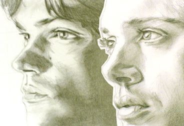
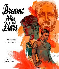
As for me, I like to try something different every single time I create a new piece, so I don't really think I have much of a style to speak of or a "method" to my madness.
So, my work goes from this:
to this:
to this:
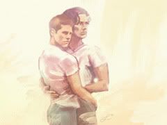
I couldn’t think of a way to talk about how I go about creating fanart when I always do something different each time... so, I've decided to create a new illustration just for this Roundtable talk :)
My process always starts with inspiration of some kind. I love research and I have a vast mental rolodex of artists whose work I find inspiring. My biggest concern is trying to evoke a certain mood or feeling. If I succeed in that, then I feel I’ve done my job. After I've decided what type of feel I want, I go get reference (which I think is a throwback to my animation studies). In this case, I tried to find photos of the boys that came out within the past year or so and that fit with the mood I wanted.
Sometimes I draw right in photoshop, but this time I decided to start with good old fashioned pencil and paper.
SKETCHING
I got nearly half way through with Dean and I realized I didn't take any pictures. Sorry about that. I remembered with Sam, though.
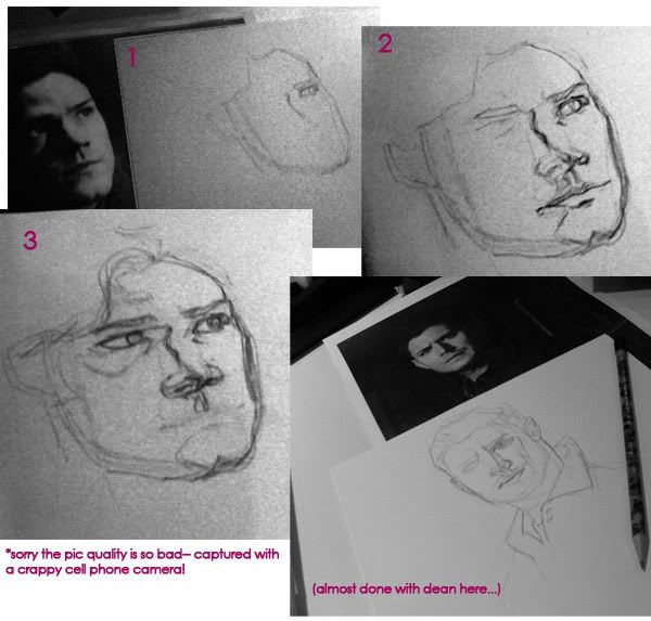
Notice how much I erase! I think I drew Sam's right eye at least four times before I'd put it in the correct spot. I try to block in detail in broad, simple shapes and once those are as close as I can get it, I add more detail. I don’t always get it right, so sometimes I edit the drawings in photoshop.
Now onto...
PHOTOSHOP!
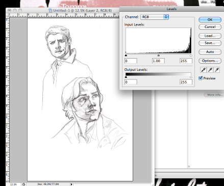
I used “levels” to make the whites white and the blacks black, basically getting rid of the paper’s texture. Then set the layers to "multiply" which basically makes the "white" pixels transparent.
Since I drew the boys separately, I was able to play with composition.
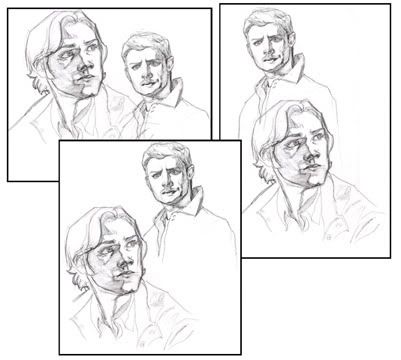
When I drew this I envisioned a different composition, but after moving things around, I liked the way the eye was led from Dean down to Sam in an interesting way (kind of like an inverted “s”), plus in my mind it feels like they’re looking at each other. (Note: watch out for tangents. I didn’t want Dean’s arm to look like it was coming out of the part in Sam’s hair.)
Let’s pause a moment and remember to SAVE. I don’t know about you, but my computer always like to crash just when I am at my most brilliant, lol. So, SAVE often, every few minutes. Quick keys are your friend.
Next, I fixed some of the proportions of the sketch before I started painting. For example, when I draw, I tend to make eyes too big and I did it again this time with Dean. So I scaled, and repositioned the eyes, which in turn led me to adjust the ear positions.
COLOR!
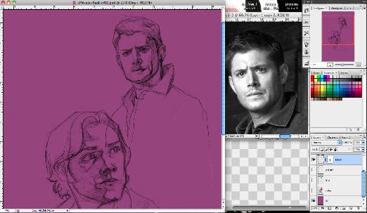
I created an empty layer (or however many I want) beneath the linework and went to town. Since this piece isn’t a straight up copy of a photo, I did not use the reference photos to pick colors from. For this painting, I was inspired by illustrator Bob Peak. I didn’t flat out copy his work, but instead tried to be inspired by his awesomeness! :D If I struggle with color, I might find a photo with the colors I want and sample them using the eyedropper tool. Sometimes I check out pre-made color palettes, like those at http://kuler.adobe.com/ I mostly just experiment a lot. Since it’s photoshop, it’s very easy to adjust colors and then change your mind and try something else.
Here’s a base color phase:
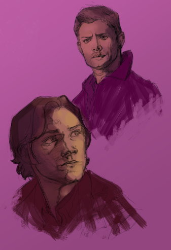
And now a phase with a more painterly color layer:
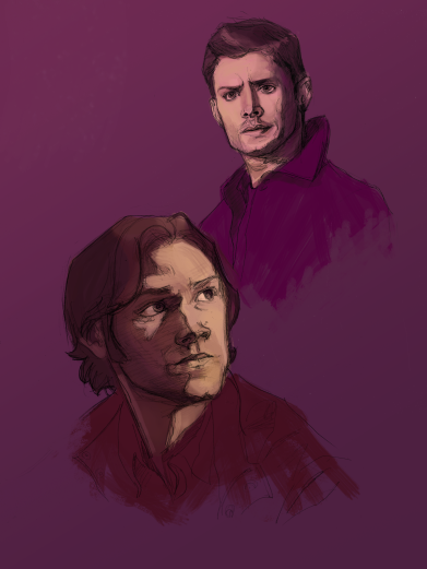
I used to think that brushes were so important, but I realize that for the most part, unless I’m painting a super-realistic portrait, I tend to use the typical round brush with the opacity pressure jitter on and the “hardness” set between 90 and 100. Sometimes I check the “watercolor” option to get a kind of hard edge, but most times I just use the boring circle brush set to pressure sensitive (you must have a stylus and tablet for this).
To get the fake brush stroke look, I do use a brush that looks like this:
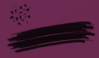
But that’s it. Now, I’m a sketchy kinda painter, I love “energy” in a piece. I’m not a huge fan of super realism. It’s perfectly wonderful and totally jaw dropping when done right, but it’s just not my thing. I love seeing digi “brush stroke” and texture, plus I’m laaaaaaaaaazy, lol. Here’s where I differ from a lot of digi-artists--> My pet-peeve is the photoshop “airbrush” (or any of those awful soft around brushes) because it often leads to mushy forms. At least in my work it does, so I avoid it like the plague. You’ve got to be judicious with the airbrush, man! Can’t go all willy-nilly on your painting with it! :D
Oh, and I value check like crazy. If it doesn’t work in in grayscale, then it probably isn’t working in color-->
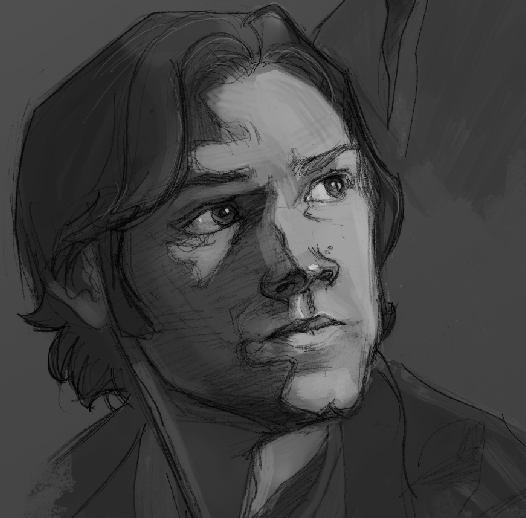
To add white highlights (or corrections), I made a layer on top of the drawing and put the highlights on that. I don’t like to paint right on my linework. That always tends to bite me later on!
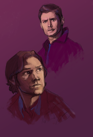
I’ve also added an accent color layer.
A word about photoshop organization--> I used to have a million layers on top of everything in case I ruined something I could go back easily, but I found this created extremely heavy ps files and was confusing to navigate and keep track of. I’m either much more bold now or much more lenient than in the past, because I tend to work with as few layers as possible! I label every layer so I know what it is that I'm painting on and I group layers quite a bit. I tend to save versions of the file, particularly if I’m about to make a massive crazy change.
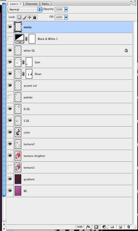
Hmm, what else can I tell you? (I feel a bit bossy, sorry folks if I’m lecturing!) I experiment a lot. I try things, then delete them, then try different things and delete those too. Whenever I make a big change, I save a version of the file before the change “just in case”, lol. Sometimes I’m working with pink and then I decide when it’s nearly all done that maybe I should have used blue and I play with the hue/saturation to change the whole thing in the 11th hour. Basically what I’m telling you is that even if I have an idea of where I want it to go, I follow it where it leads me.
And here’s the finished piece:
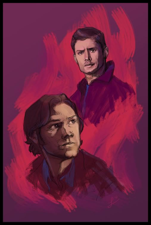
I fiddled with the background textures a lot. It just wasn’t feeling right to me. I ended up taking a day off and then the following morning I was able to “find it” really quickly. I dunno, I like it now, but I’m sure that in two days I’m going to bemoan my choices! :P Such is art!
Some close up detail (see how messy I am?):
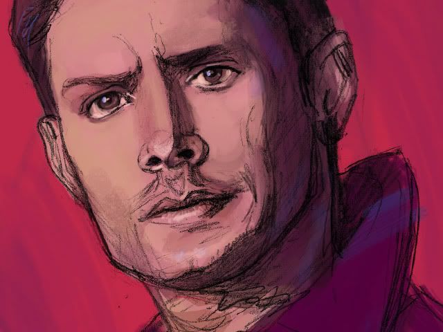
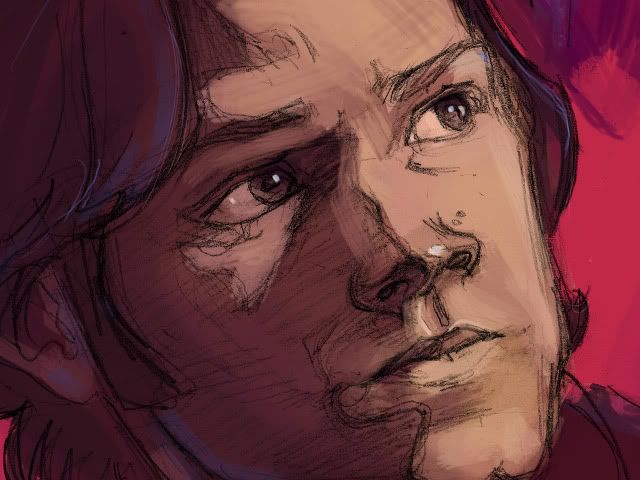
I’ve got more detail shots over on my LJ (‘cause this post is image heavy enough).
I hope this was helpful in some way :) If you have questions, please feel free to ask me!
Thanks everybody! (And special thanks to selu for asking me in the first place :D )
~ Li
I just want to start by saying how honored I am to have been asked by to participate in this! The talent in this fandom is incredible and I'm thrilled to be able to share some of my work with all of you.
A quick about me: I live in the US, was raised in New England, but am currently living in San Francisco while I pursue a Master's Degree in 3D Character Animation. I've been hooked on Supernatural ever since I watched "Devil's Trap" and still going strong :)
I’m really excited to be here, so let’s start! :D
In the 2D realm, I consider myself to be more of a painter than anything. I am totally horrid at drawing from my imagination. Just can’t do it. There are many amazingly talented people who are able to draw wonderfully appealing, stylized Sam and Dean characters right from their mind to the page. Just check out previous editions of Ask the Artist and you will be blown away by their talent for sure.
As for me, I like to try something different every single time I create a new piece, so I don't really think I have much of a style to speak of or a "method" to my madness.
So, my work goes from this:

to this:

to this:

I couldn’t think of a way to talk about how I go about creating fanart when I always do something different each time... so, I've decided to create a new illustration just for this Roundtable talk :)
My process always starts with inspiration of some kind. I love research and I have a vast mental rolodex of artists whose work I find inspiring. My biggest concern is trying to evoke a certain mood or feeling. If I succeed in that, then I feel I’ve done my job. After I've decided what type of feel I want, I go get reference (which I think is a throwback to my animation studies). In this case, I tried to find photos of the boys that came out within the past year or so and that fit with the mood I wanted.
Sometimes I draw right in photoshop, but this time I decided to start with good old fashioned pencil and paper.
SKETCHING
I got nearly half way through with Dean and I realized I didn't take any pictures. Sorry about that. I remembered with Sam, though.

Notice how much I erase! I think I drew Sam's right eye at least four times before I'd put it in the correct spot. I try to block in detail in broad, simple shapes and once those are as close as I can get it, I add more detail. I don’t always get it right, so sometimes I edit the drawings in photoshop.
Now onto...
PHOTOSHOP!

I used “levels” to make the whites white and the blacks black, basically getting rid of the paper’s texture. Then set the layers to "multiply" which basically makes the "white" pixels transparent.
Since I drew the boys separately, I was able to play with composition.

When I drew this I envisioned a different composition, but after moving things around, I liked the way the eye was led from Dean down to Sam in an interesting way (kind of like an inverted “s”), plus in my mind it feels like they’re looking at each other. (Note: watch out for tangents. I didn’t want Dean’s arm to look like it was coming out of the part in Sam’s hair.)
Let’s pause a moment and remember to SAVE. I don’t know about you, but my computer always like to crash just when I am at my most brilliant, lol. So, SAVE often, every few minutes. Quick keys are your friend.
Next, I fixed some of the proportions of the sketch before I started painting. For example, when I draw, I tend to make eyes too big and I did it again this time with Dean. So I scaled, and repositioned the eyes, which in turn led me to adjust the ear positions.

COLOR!
I created an empty layer (or however many I want) beneath the linework and went to town. Since this piece isn’t a straight up copy of a photo, I did not use the reference photos to pick colors from. For this painting, I was inspired by illustrator Bob Peak. I didn’t flat out copy his work, but instead tried to be inspired by his awesomeness! :D If I struggle with color, I might find a photo with the colors I want and sample them using the eyedropper tool. Sometimes I check out pre-made color palettes, like those at http://kuler.adobe.com/ I mostly just experiment a lot. Since it’s photoshop, it’s very easy to adjust colors and then change your mind and try something else.
Here’s a base color phase:

And now a phase with a more painterly color layer:

I used to think that brushes were so important, but I realize that for the most part, unless I’m painting a super-realistic portrait, I tend to use the typical round brush with the opacity pressure jitter on and the “hardness” set between 90 and 100. Sometimes I check the “watercolor” option to get a kind of hard edge, but most times I just use the boring circle brush set to pressure sensitive (you must have a stylus and tablet for this).
To get the fake brush stroke look, I do use a brush that looks like this:

But that’s it. Now, I’m a sketchy kinda painter, I love “energy” in a piece. I’m not a huge fan of super realism. It’s perfectly wonderful and totally jaw dropping when done right, but it’s just not my thing. I love seeing digi “brush stroke” and texture, plus I’m laaaaaaaaaazy, lol. Here’s where I differ from a lot of digi-artists--> My pet-peeve is the photoshop “airbrush” (or any of those awful soft around brushes) because it often leads to mushy forms. At least in my work it does, so I avoid it like the plague. You’ve got to be judicious with the airbrush, man! Can’t go all willy-nilly on your painting with it! :D
Oh, and I value check like crazy. If it doesn’t work in in grayscale, then it probably isn’t working in color-->

To add white highlights (or corrections), I made a layer on top of the drawing and put the highlights on that. I don’t like to paint right on my linework. That always tends to bite me later on!

I’ve also added an accent color layer.
A word about photoshop organization--> I used to have a million layers on top of everything in case I ruined something I could go back easily, but I found this created extremely heavy ps files and was confusing to navigate and keep track of. I’m either much more bold now or much more lenient than in the past, because I tend to work with as few layers as possible! I label every layer so I know what it is that I'm painting on and I group layers quite a bit. I tend to save versions of the file, particularly if I’m about to make a massive crazy change.

Hmm, what else can I tell you? (I feel a bit bossy, sorry folks if I’m lecturing!) I experiment a lot. I try things, then delete them, then try different things and delete those too. Whenever I make a big change, I save a version of the file before the change “just in case”, lol. Sometimes I’m working with pink and then I decide when it’s nearly all done that maybe I should have used blue and I play with the hue/saturation to change the whole thing in the 11th hour. Basically what I’m telling you is that even if I have an idea of where I want it to go, I follow it where it leads me.
And here’s the finished piece:

I fiddled with the background textures a lot. It just wasn’t feeling right to me. I ended up taking a day off and then the following morning I was able to “find it” really quickly. I dunno, I like it now, but I’m sure that in two days I’m going to bemoan my choices! :P Such is art!
Some close up detail (see how messy I am?):


I’ve got more detail shots over on my LJ (‘cause this post is image heavy enough).
I hope this was helpful in some way :) If you have questions, please feel free to ask me!
Thanks everybody! (And special thanks to selu for asking me in the first place :D )
~ Li