Does this mean I'm an artist now?
I completely suck at coloring. I know this and yet I still color some of my manga icons anyway. They look like crap, but I do it. A couple days ago I finally decide to check out a tutorial on how to color manga scans and put this Photoshop that takes up so much space on my harddrive to good use. For my coloring exploits I decided to use D.Gray-man chapter 199. And spent hours playing with Photoshop and forgetting about everything else. >>
Given that is the most recent chapter, these may be considered spoilers. And there's a Kanda/Alma-focus...but if you know the recent chapters...yeah.
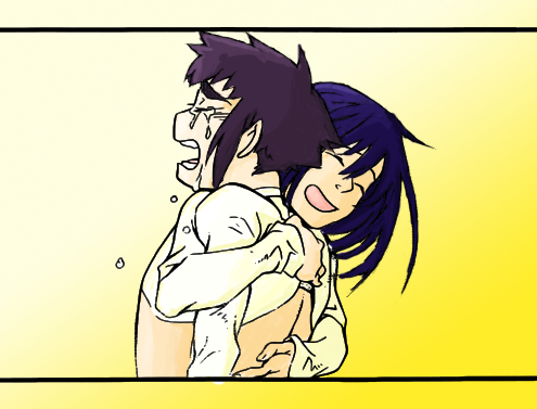
This is my first completed colored panel and when I saw the finished product I started to question why the hell I had chosen not to use Photoshop for so long. Sure it's not the most perfect colored scan ever, but I still think it looks nice. Much better than the icons I color using just basic Photofiltre.
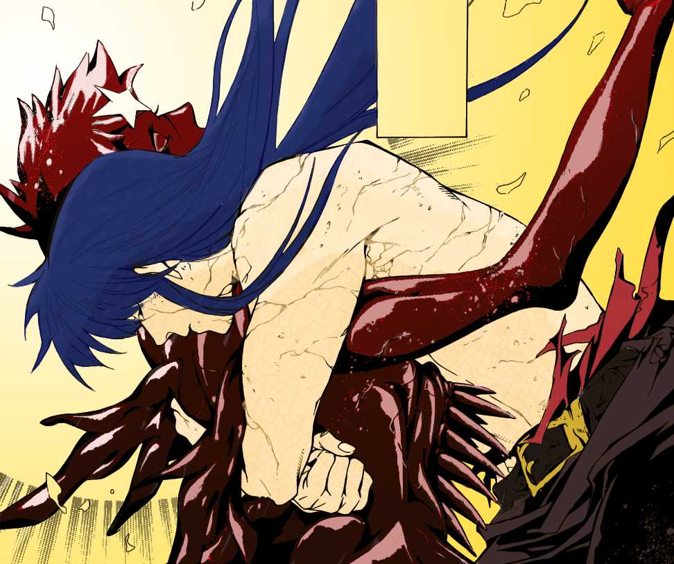
This one took a lot more work because of all that shading and I had no idea how to get rid of it without making the picture look weird. So I tried to get around it instead. Overall...I don't think I did too badly? I also changed up the image a bit more once I had turned it into a PNG file and here's the brighter version:
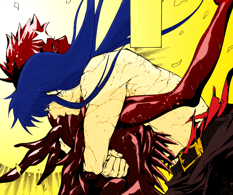
I chose yellow for all of the backgrounds because it's a bright contrast. Probably should have chosen a different color but oh well. I'm using the first scan with the hug as an icon for my Alma journal, but I have no idea what I'm going to do with the other one. *shrug* I just colored it because I love that scene.
Given that is the most recent chapter, these may be considered spoilers. And there's a Kanda/Alma-focus...but if you know the recent chapters...yeah.

This is my first completed colored panel and when I saw the finished product I started to question why the hell I had chosen not to use Photoshop for so long. Sure it's not the most perfect colored scan ever, but I still think it looks nice. Much better than the icons I color using just basic Photofiltre.

This one took a lot more work because of all that shading and I had no idea how to get rid of it without making the picture look weird. So I tried to get around it instead. Overall...I don't think I did too badly? I also changed up the image a bit more once I had turned it into a PNG file and here's the brighter version:

I chose yellow for all of the backgrounds because it's a bright contrast. Probably should have chosen a different color but oh well. I'm using the first scan with the hug as an icon for my Alma journal, but I have no idea what I'm going to do with the other one. *shrug* I just colored it because I love that scene.