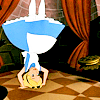
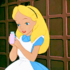
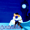
Alice in Wonderland icon tutorial!
*gasp* 2 journal entries in 1 day?! How is this possible?! Anyways, it's time for a brand new tutorial, again featuring Disney, but this time, featuring a classic Disney movie: Alice in Wonderland. This tutorial is super easy, and I got the inspiration from another tutorial I was trying out. Anyways, here we go:
From this:
to this:
Level of difficulty: Easy (no selective coloring, curves, or color balance involved)
Made in: Adobe Photoshop CS2
Translatable: Absolutely!
1. Open up your base. I used this base:
courtesy of
refuge33.
2. Duplicate your base 3 times. Set your blend modes to these, going from bottom to top: duplicate 1: soft light, 100% opacity. Duplicate 2: Soft light, 100% opacity. Duplicate 3: Screen, 100% opacity.
3. Make a levels adjustment layer (Layer+new adjustment layer+levels). These were my settings, but adjust yours accordingly. In my case, I was trying to make my icon a little more yellowy.
RGB: 13, 1.35, 255
RED: 28, 1.27, 255
GREEN: 6, 1.30, 255
BLUE: 19, 1.09, 255
4. The last step got me to where I wanted, but I thought my icon was looking a little dull. So I made a hue/saturation adjustment layer (layer+new adjustment layer+hue/saturation). Leave your blend mode and opacity alone, and incrase your saturation in the MASTER mode to 25.
That's it! It's so easy, and good for beginners! Try using dark cartoon screen caps for this tutorial. These are other icons I've made with the same coloring:


I would love to see your results using this tutorial, and I'd love to hear from you about this tutorial as well! :) Remember, always adjust your icon according to what you're working with! I don't want to see duplicates of the icons I made with this tutorial out there! Again, let me know if you have any problems or questions!
P.S. Credit for the brush I used in the Sleeping Beauty icon goes to
amethystia100
From this:
to this:
Level of difficulty: Easy (no selective coloring, curves, or color balance involved)
Made in: Adobe Photoshop CS2
Translatable: Absolutely!
1. Open up your base. I used this base:
courtesy of
refuge33.
2. Duplicate your base 3 times. Set your blend modes to these, going from bottom to top: duplicate 1: soft light, 100% opacity. Duplicate 2: Soft light, 100% opacity. Duplicate 3: Screen, 100% opacity.
3. Make a levels adjustment layer (Layer+new adjustment layer+levels). These were my settings, but adjust yours accordingly. In my case, I was trying to make my icon a little more yellowy.
RGB: 13, 1.35, 255
RED: 28, 1.27, 255
GREEN: 6, 1.30, 255
BLUE: 19, 1.09, 255
4. The last step got me to where I wanted, but I thought my icon was looking a little dull. So I made a hue/saturation adjustment layer (layer+new adjustment layer+hue/saturation). Leave your blend mode and opacity alone, and incrase your saturation in the MASTER mode to 25.
That's it! It's so easy, and good for beginners! Try using dark cartoon screen caps for this tutorial. These are other icons I've made with the same coloring:
I would love to see your results using this tutorial, and I'd love to hear from you about this tutorial as well! :) Remember, always adjust your icon according to what you're working with! I don't want to see duplicates of the icons I made with this tutorial out there! Again, let me know if you have any problems or questions!
P.S. Credit for the brush I used in the Sleeping Beauty icon goes to
amethystia100