Tutorial time!
This tutorial is different than any other I've posted. This one involves a coloring that's not going to make the icon look oversaturated, using softer coloring. This is very easy, and is translatable between Paint Shop Pro and Photoshop. I made this in Adobe Photoshop CS2, and I recommend this tutorial for a darker pic with some blue in it (as you'll see in the base I made for the tutorial). The screen cap I chose is 1 of the screen caps from the movie Hercules, from
dj43 at
dj_capslock. You can feel free to tweak anything in the tutorial for your icon, but I don't want you claiming this tutorial as your own. OK? :) Ready?
Go from this:
to this: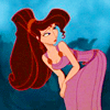
1. Open up the screen cap you want to use, crop it to your liking, and resize it to 100x100 pixels. :)
2. Duplicate that by pressing control J on your keyboard in Photoshop, and in Paint shop pro, there's no keyboard shortcut, so just do a layer, duplicate layer option. Set the opacity to 100% and the mode at screen. This is a good starting point. Sharpen this layer if you need to sharpen. My caps were in HQ so I didn't need to sharpen them. Be careful not to oversharpen or it will ruin the effect.
3. Make a new layer. Set the mode to soft light, and fill and opacity to 100%. Fill this layer with this color, a light tan: bbaf9b.
4. Repeat step 3, but fill this new layer with this grayish-blue color: 808a9a.
5. Make a new layer, set the mode to overlay, opacity to 67% (adjust it if you need to!), and fill 100% (these fill opacities I think only apply if you have anything except Paint shop pro or Photoshop Elements, so don't worry about it if you don't see it or have it). Fill the layer with this darker tan, a few shades darker than the one we used in step 3: 9f9485.
6. Make 1 more layer. Leave the opacity and fill alone at 100%, and set the mode to color burn. Fill it with this sky blue color: cae7f8.
7. It looks good, but I want to make a few slight adjustments. First, we make a new levels adjustment layer (Go to layer, new adjustment layer, and click on levels). Here are the numbers you can put in, but remember, your icon is different than mine, so adjust accordingly:
RGB: 4, 0.94, 255
RED: 10, 1.30, 255
GREEN: 6, 0.94, 255
BLUE: 12, 1.30, 255
8. We're almost there! All I want to do now is add a little saturation just to pop the colors a bit! To do that, make a hue/saturation adjustment layer, and adjust your master saturation to +25. :)
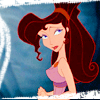
That's it! Other examples (in the 2nd example I used a brush from http://revitalizedview.com/bedazzling/):

