Round 01 - Challenge 02 - Results
Eliminated:
- fumseck_62442 [07 votes]
- lunglock [06 votes]
- 16tosvo [05 votes]
---
People's choice - tie!:
- utrose_graphics [2 votes]
- jequirity [2 votes]
---
Mod's choice:

- afairytalestory
1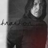
2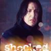
3
4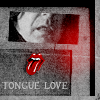
5
6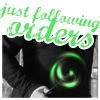
7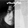
8
9
10
11
12
13
14
15
16
Votes:
[N = Negative votes & P = Positive votes]
01] - semi_subtle - N = 3/P = 0
[x] "the text is hard to read and blends in too much with the pic, would have worked better as a color to make it stand out more (just a suggestion! ^.^)"
[x] "The font is hard to read on this icon, so it kind of destroys the purpose of even having text on it. It needs to be a different color, but something that will go with the icon well."
[x] "Difficult to read the text."
02] - whiteroseofdark - N = 4/P = 0
[x] "too many different colors."
[x] "The font choice doesn't seem to fit with the icon, and the orangeish texture at the bottom is distracting since it doesn't match the colors of the icon."
[x] "The color of the font kinda clashes with the icon itself and it wouldn't hurt to make it a smaller size."
[x] "The type of text doesn't really fit the icon"
03] - crazed88 - N = 4/P = 1
[x] "the font is too crisp and there's too much lilac."
[x] "The font is choppy on this icon and needs some type of anti-alias on it."
[x] "The text brush looks too sharp."
[x] "Faded, blurry image. Misplaced text. It looks as if the anti-alias is off."
[x] Positive [No comment]
04] - ihearttoronto - N = 4/P = 1
[x] "The icon was cut down too much, the tongue was a bit on the crude side and didn't seem to fit with the icon."
[x] "the idea you're going for isn't too clear, since Snape's tongue isn't even in the picture, and the smaller image you used is distracting."
[x] "the different brush aren't in the line"
[x] "Cropping is off and use of texture over Snape makes it difficult to see what the subject is."
[x] "This icon is too freaking cool and very well put together. The texture is beautiful and the image is placed perfectly with it. The font is readable and doesn't clash with the icon. The light texture is placed in a good position and doesn't fade out any of the icon and the little tongue is such a good adding to the icon and in a nice place."
05] - 16tosvo - N = 0/P = 0
[x] "The icon is really grainy and low quality, and the text placement is distracting."
[x] "The icon is very blurry/out of focus, and the contrast with the text, which is clear, throws off the quality of the icon."
[x] "image is very grainy and the text obtrusive."
[x] "The quality of the font is choppy and the image is choppy/fuzzy a little on the face. The image could use a little sharpening, mostly around the eyes, but it needs to be softened first so that it doesn't end up more choppy."
[x] "The icon is a tad bit sharp."
06] - phistolemon_ - N = 3/P = 1
[x] "The color and font of the text don't match what the text is saying or the darkness of the icon."
[x] "The effect seems cartoony, and the text isn't flattering."
[x] "the text is too large and distracts from the image itself."
[x] "Love the font, the crop, the colours, but I especially like how the icon displays the ambiguity of Snape."
07] - chaotic_vanity - N = 1/P = 1
[x] "The cropping is poorly placed"
[x] "there are a LOT of ways this could have gone wrong, but it came out beautifully. the text is simple but effective, and where the pattern could be distracting it draws attention to Snape's face."
08] - warren61889 - N = 3/P = 1
[x] "it just looks off color-wise for some reason. o_o Like...it's scummy? I don't know how to explain it. XD"
[x] "There's not much going on in this icon. Not from what I can tell"
[x] "The colours look 'muddy' and the crop could be better."
[x] "Best coloring."
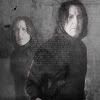
09] - neke - N = 2/P = 1
[x] "The picture was cropped and flipped. All I can say is that I like the angle, because otherwise, it looks like very little effort was put into the icon."
[x] "Not much meaning/impact with the arm, and does not look like much effort was put into colouring."
[x] "Awesome crop and great colouring and clean up of the grainy image."
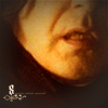
10] - utrose_graphics - N = 0/P = 2
[x] "The mist effect is cool, gives it a mysterious look. Was there a story behind the text? >.>"
[x] "gah i love that texture!"
11] - afairytalestory - N = 0/P = 0
12] - fumseck_62442 - N = 7/P = 0
[x] "skin is too yellowish and the rest is too dark."
[x] "The crop is interesting, but the picture looks grainy and the coloring is not appealing."
[x] "Icon is blurry and color is saturated."
[x] "The cropping and colouring is off on this icon. It seems a little blurry for where the focus is, and the text/brush doesn't work as an accent."
[x] "much too close up, a little pixelated and too yellow"
[x] "The crop is unflattering annd the icon's too yellow."
[x] "Very blurry and grainy image."
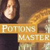
13] - jequirity - N = 4/P = 2
[x] "there is more texture and text than there is something done about the picture :-\ the tiny snape can hardly be recognized."
[x] "the coloring is too strong and the black and white parts are overcontrasted and oversharpened. If it weren't for the text (and, you know, being in the contest) you wouldn't really be able to tell who's in the icon."
[x] "the choice of texture was a bit too colourful and does not suit the original base"
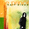
[x] "Snape is too little and the sentence "the prince" is too bigger"
[x] "Great colors, unique format."
[x] "Poster effect! The only thing I would improve on this icon is bringing Snape a little more into the icon, but very good use of texture, text, and colour."
14] - winter_kismet - N = 0/P = 1
[x] "I like the crop and the angle and the gray box on the side."
15] - houseforlife - N = 2/P = 1
[x] "blurry and almost over cropped on the right"
[x] "The colours are washed out and a different font would have been lovely."
[x] Positive [No comment]
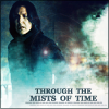
16] - lunglock - N = 6/P = 0
[x] "Icon is grainy, seems out of focus."
[x] "The icon is far too muddled with the misty tiny text layers. The details of Snape's face are blurry and lost under the effects."
[x] "plain and sort of blurry, is there text in the middle? o_o Sort of looks like it..."
[x] "you can hardly see snape, its much to faded"
[x] "I like the idea of this icon, but I think it could have been executed better. The icon's very foggy."
[x] "the icon is too fuzzy"
Participants Status
The following people are still in the contest. If you're name is not in this list, it means you have been eliminated/disqualified.
afairytalestory
brookeh777
chaotic_vanity
crazed88
crazybanana726
fille_blessee
houseforlife
ihearttoronto
jequirity
jhelardia
killjoy_jane
lovesnape
neke
phistolemon_
semi_subtle
shania_nowhere
so_severus
utrose_graphics
warren61889
whiteroseofdark
winter_kismet
Thank you to all who participated in the challenge and voting ^_^
Banner for People's Choice will be made asap!
The next challenge shall be posted soon.
- fumseck_62442 [07 votes]
- lunglock [06 votes]
- 16tosvo [05 votes]
---
People's choice - tie!:
- utrose_graphics [2 votes]
- jequirity [2 votes]
---
Mod's choice:
- afairytalestory
1
2
3
4
5
6
7
8
9
10
11
12
13
14
15
16
Votes:
[N = Negative votes & P = Positive votes]
01] - semi_subtle - N = 3/P = 0
[x] "the text is hard to read and blends in too much with the pic, would have worked better as a color to make it stand out more (just a suggestion! ^.^)"
[x] "The font is hard to read on this icon, so it kind of destroys the purpose of even having text on it. It needs to be a different color, but something that will go with the icon well."
[x] "Difficult to read the text."
02] - whiteroseofdark - N = 4/P = 0
[x] "too many different colors."
[x] "The font choice doesn't seem to fit with the icon, and the orangeish texture at the bottom is distracting since it doesn't match the colors of the icon."
[x] "The color of the font kinda clashes with the icon itself and it wouldn't hurt to make it a smaller size."
[x] "The type of text doesn't really fit the icon"
03] - crazed88 - N = 4/P = 1
[x] "the font is too crisp and there's too much lilac."
[x] "The font is choppy on this icon and needs some type of anti-alias on it."
[x] "The text brush looks too sharp."
[x] "Faded, blurry image. Misplaced text. It looks as if the anti-alias is off."
[x] Positive [No comment]
04] - ihearttoronto - N = 4/P = 1
[x] "The icon was cut down too much, the tongue was a bit on the crude side and didn't seem to fit with the icon."
[x] "the idea you're going for isn't too clear, since Snape's tongue isn't even in the picture, and the smaller image you used is distracting."
[x] "the different brush aren't in the line"
[x] "Cropping is off and use of texture over Snape makes it difficult to see what the subject is."
[x] "This icon is too freaking cool and very well put together. The texture is beautiful and the image is placed perfectly with it. The font is readable and doesn't clash with the icon. The light texture is placed in a good position and doesn't fade out any of the icon and the little tongue is such a good adding to the icon and in a nice place."
05] - 16tosvo - N = 0/P = 0
[x] "The icon is really grainy and low quality, and the text placement is distracting."
[x] "The icon is very blurry/out of focus, and the contrast with the text, which is clear, throws off the quality of the icon."
[x] "image is very grainy and the text obtrusive."
[x] "The quality of the font is choppy and the image is choppy/fuzzy a little on the face. The image could use a little sharpening, mostly around the eyes, but it needs to be softened first so that it doesn't end up more choppy."
[x] "The icon is a tad bit sharp."
06] - phistolemon_ - N = 3/P = 1
[x] "The color and font of the text don't match what the text is saying or the darkness of the icon."
[x] "The effect seems cartoony, and the text isn't flattering."
[x] "the text is too large and distracts from the image itself."
[x] "Love the font, the crop, the colours, but I especially like how the icon displays the ambiguity of Snape."
07] - chaotic_vanity - N = 1/P = 1
[x] "The cropping is poorly placed"
[x] "there are a LOT of ways this could have gone wrong, but it came out beautifully. the text is simple but effective, and where the pattern could be distracting it draws attention to Snape's face."
08] - warren61889 - N = 3/P = 1
[x] "it just looks off color-wise for some reason. o_o Like...it's scummy? I don't know how to explain it. XD"
[x] "There's not much going on in this icon. Not from what I can tell"
[x] "The colours look 'muddy' and the crop could be better."
[x] "Best coloring."
09] - neke - N = 2/P = 1
[x] "The picture was cropped and flipped. All I can say is that I like the angle, because otherwise, it looks like very little effort was put into the icon."
[x] "Not much meaning/impact with the arm, and does not look like much effort was put into colouring."
[x] "Awesome crop and great colouring and clean up of the grainy image."
10] - utrose_graphics - N = 0/P = 2
[x] "The mist effect is cool, gives it a mysterious look. Was there a story behind the text? >.>"
[x] "gah i love that texture!"
11] - afairytalestory - N = 0/P = 0
12] - fumseck_62442 - N = 7/P = 0
[x] "skin is too yellowish and the rest is too dark."
[x] "The crop is interesting, but the picture looks grainy and the coloring is not appealing."
[x] "Icon is blurry and color is saturated."
[x] "The cropping and colouring is off on this icon. It seems a little blurry for where the focus is, and the text/brush doesn't work as an accent."
[x] "much too close up, a little pixelated and too yellow"
[x] "The crop is unflattering annd the icon's too yellow."
[x] "Very blurry and grainy image."
13] - jequirity - N = 4/P = 2
[x] "there is more texture and text than there is something done about the picture :-\ the tiny snape can hardly be recognized."
[x] "the coloring is too strong and the black and white parts are overcontrasted and oversharpened. If it weren't for the text (and, you know, being in the contest) you wouldn't really be able to tell who's in the icon."
[x] "the choice of texture was a bit too colourful and does not suit the original base"
[x] "Snape is too little and the sentence "the prince" is too bigger"
[x] "Great colors, unique format."
[x] "Poster effect! The only thing I would improve on this icon is bringing Snape a little more into the icon, but very good use of texture, text, and colour."
14] - winter_kismet - N = 0/P = 1
[x] "I like the crop and the angle and the gray box on the side."
15] - houseforlife - N = 2/P = 1
[x] "blurry and almost over cropped on the right"
[x] "The colours are washed out and a different font would have been lovely."
[x] Positive [No comment]
16] - lunglock - N = 6/P = 0
[x] "Icon is grainy, seems out of focus."
[x] "The icon is far too muddled with the misty tiny text layers. The details of Snape's face are blurry and lost under the effects."
[x] "plain and sort of blurry, is there text in the middle? o_o Sort of looks like it..."
[x] "you can hardly see snape, its much to faded"
[x] "I like the idea of this icon, but I think it could have been executed better. The icon's very foggy."
[x] "the icon is too fuzzy"
Participants Status
The following people are still in the contest. If you're name is not in this list, it means you have been eliminated/disqualified.
afairytalestory
brookeh777
chaotic_vanity
crazed88
crazybanana726
fille_blessee
houseforlife
ihearttoronto
jequirity
jhelardia
killjoy_jane
lovesnape
neke
phistolemon_
semi_subtle
shania_nowhere
so_severus
utrose_graphics
warren61889
whiteroseofdark
winter_kismet
Thank you to all who participated in the challenge and voting ^_^
Banner for People's Choice will be made asap!
The next challenge shall be posted soon.