Round 01 - Challenge 11 - Results
Eliminated:
- so_severus [06 votes]
---
People's choice:
- semi_subtle [04 votes]
SET A
1
2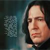
3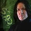
4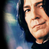
SET B
5
6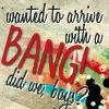
7
8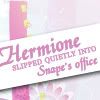
Votes:
[N = Negative votes & P = Positive votes]
01] - semi_subtle - N = 0/P = 4
[x] "I love the emotion in the picture you chose."
[x] "Beautiful crop, gorgeous color, and it looks just PERFECT and subtle and he's gorgeous. Nice work!"
[x] Positive [No Comment]
[x] Positive [No Comment]
02] - phistolemon_ - N = 3/P = 1
[x] "it's not visually interesting, the brush is just there - it's too much."
[x] "The tiny text is too bright compared to the rest of the icon."
[x] "Tiny text stands out too much since it is very bright, while the colouring is darker. Perhaps if it were more subtler this icon would be better."
[x] "Simple and clean. The coloring is lovely, but I would suggest a little decrease in the opacity of the tiny text. Otherwise, I love it."
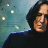
03] - shadowsong_13 - N = 4/P = 0
[x] "it looks like Snape could use more light contrast on his face (although I like the icon a lot as it is)"
[x] "The image quality looks low and the icon overall looks simultaneously blurred and oversharpened. Also, the texture and Dark Mark distract from Snape himself."
[x] "Too dark. The coloring would be beautiful and the icon would stand out a lot more if it were brighter. Also, higher contrast would help, too. The dark mark is an interesting embellishment, but so bright like that on the dark icon draws the eye too much from Snape."
[x] "there could have been something done about the colouring of the snape picture. it looks a little colourless in comparison to the striking green background."
04] - so_severus - N = 2/P = 1
[x] "background seems to end abruptly before edge"
[x] "Good colouring and crop on Snape, but this is one icon that could have been left as a nice textless icon if it had had some kind of subtle texture added instead of the the oddly blurred one that's over the background. Without anything else to accent it to offset the black burnout texture on the left side, the icon looks a little empty or unbalanced, and the colouring on the background is a little odd as well."
[x] Positive [No Comment]
***
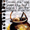
05] - so_severus - N = 6/P = 1
[x] "the ripped notebook edges take away from the cauldron & the text."
[x] "Clever, but there's too much going on in the icon and the text is difficult to read."
[x] "Too much is going on."
[x] "seems busy, distracting. hard to focus on text."
[x] "the text is a little too small. perhaps the cauldron could have been a little minimzed so the text could stand out more. and, I think, the quotation mark at the end of what snape says is missing ^_^;"
[x] "Text seems pixalated and very cramped"
[x] "I'm a big fan of how this looks. The image used fits the text, the text placement is fantastic, and it's not too saturated with effects. It looks like a story/illustration in someone's binder, which I like when it's done WELL."
06] - phistolemon_ - N = 1/P = 0
[x] "if the text was on a simpler (less colorful) background the BANG would stand out more (but this icon is awesome :x)"
07] - semi_subtle - N = 0/P = 1
[x] Positive [No Comment]
08] - shadowsong_13 - N = 2/P = 0
[x] "The background is cute, but the swath of white over it with the text arranged like that (and with those fonts!) doesn't look good... it looks awkwardly done, especially compared to the other icons. Maybe a little darker, more defined, would be better."
[x] "The texture doesn't really seem to work for the icon. The placement/positioning/font of the text is pleasing to the eye, but the texture and the girly colour just really don't have anything to do with the quote used save the fact that Hermione's... a girl. Maybe even just up the contrast a little bit, too (not too much, even though it's good the maker went with the washed out aesthetic, it's a little TOO washed out), though."
Tallies:
semi_subtle: SA: 4+ SB: 1+ = 5+
phistolemon_: SA: 3-, 1+ SB: 1- = 4-, 1+
shadowsong_13: SA: 4- SB: 2- = 6-
so_severus: SA: 2-, 1+ SB: 6-, 1+ = 8-, 2+
Participants Status
The following people are still in the contest. If you're name is not in this list, it means you have been eliminated/disqualified.
phistolemon_
semi_subtle
shadowsong_13
Thank you to all who participated in the challenge and voting.
The final challenge shall be posted soon.
- so_severus [06 votes]
---
People's choice:
- semi_subtle [04 votes]
SET A
1
2
3
4
SET B
5
6
7
8
Votes:
[N = Negative votes & P = Positive votes]
01] - semi_subtle - N = 0/P = 4
[x] "I love the emotion in the picture you chose."
[x] "Beautiful crop, gorgeous color, and it looks just PERFECT and subtle and he's gorgeous. Nice work!"
[x] Positive [No Comment]
[x] Positive [No Comment]
02] - phistolemon_ - N = 3/P = 1
[x] "it's not visually interesting, the brush is just there - it's too much."
[x] "The tiny text is too bright compared to the rest of the icon."
[x] "Tiny text stands out too much since it is very bright, while the colouring is darker. Perhaps if it were more subtler this icon would be better."
[x] "Simple and clean. The coloring is lovely, but I would suggest a little decrease in the opacity of the tiny text. Otherwise, I love it."
03] - shadowsong_13 - N = 4/P = 0
[x] "it looks like Snape could use more light contrast on his face (although I like the icon a lot as it is)"
[x] "The image quality looks low and the icon overall looks simultaneously blurred and oversharpened. Also, the texture and Dark Mark distract from Snape himself."
[x] "Too dark. The coloring would be beautiful and the icon would stand out a lot more if it were brighter. Also, higher contrast would help, too. The dark mark is an interesting embellishment, but so bright like that on the dark icon draws the eye too much from Snape."
[x] "there could have been something done about the colouring of the snape picture. it looks a little colourless in comparison to the striking green background."
04] - so_severus - N = 2/P = 1
[x] "background seems to end abruptly before edge"
[x] "Good colouring and crop on Snape, but this is one icon that could have been left as a nice textless icon if it had had some kind of subtle texture added instead of the the oddly blurred one that's over the background. Without anything else to accent it to offset the black burnout texture on the left side, the icon looks a little empty or unbalanced, and the colouring on the background is a little odd as well."
[x] Positive [No Comment]
***
05] - so_severus - N = 6/P = 1
[x] "the ripped notebook edges take away from the cauldron & the text."
[x] "Clever, but there's too much going on in the icon and the text is difficult to read."
[x] "Too much is going on."
[x] "seems busy, distracting. hard to focus on text."
[x] "the text is a little too small. perhaps the cauldron could have been a little minimzed so the text could stand out more. and, I think, the quotation mark at the end of what snape says is missing ^_^;"
[x] "Text seems pixalated and very cramped"
[x] "I'm a big fan of how this looks. The image used fits the text, the text placement is fantastic, and it's not too saturated with effects. It looks like a story/illustration in someone's binder, which I like when it's done WELL."
06] - phistolemon_ - N = 1/P = 0
[x] "if the text was on a simpler (less colorful) background the BANG would stand out more (but this icon is awesome :x)"
07] - semi_subtle - N = 0/P = 1
[x] Positive [No Comment]
08] - shadowsong_13 - N = 2/P = 0
[x] "The background is cute, but the swath of white over it with the text arranged like that (and with those fonts!) doesn't look good... it looks awkwardly done, especially compared to the other icons. Maybe a little darker, more defined, would be better."
[x] "The texture doesn't really seem to work for the icon. The placement/positioning/font of the text is pleasing to the eye, but the texture and the girly colour just really don't have anything to do with the quote used save the fact that Hermione's... a girl. Maybe even just up the contrast a little bit, too (not too much, even though it's good the maker went with the washed out aesthetic, it's a little TOO washed out), though."
Tallies:
semi_subtle: SA: 4+ SB: 1+ = 5+
phistolemon_: SA: 3-, 1+ SB: 1- = 4-, 1+
shadowsong_13: SA: 4- SB: 2- = 6-
so_severus: SA: 2-, 1+ SB: 6-, 1+ = 8-, 2+
Participants Status
The following people are still in the contest. If you're name is not in this list, it means you have been eliminated/disqualified.
phistolemon_
semi_subtle
shadowsong_13
Thank you to all who participated in the challenge and voting.
The final challenge shall be posted soon.