Process:
For Episode 3 of Work of Art on Bravo, the contestants were charged with recreating a classic Penguin published book cover. For those of us following along and recreating these challenges, I posted a healthy list of Penguin classics from which to choose inspiration. In my case, I decided upon On the Road by Jack Kerouac. It will always be one of my absolute favorite novels. I really couldn't see myself committing to any of the other books on the list.
Actually. That's a lie. Because immediately upon reviewing the list, I wanted to cheat and use an old, finished photo of mine. IT WAS PERFECT.

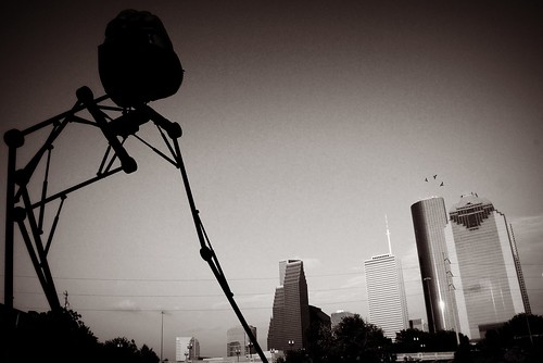
This SCREAMS War of the Worlds, right?!
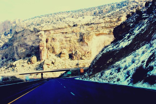
But I'm not a cheater, nor am I going to cop out of any challenges. After working up a concept in my head, I settled upon using a previously shot photo of mine. This photo was a bit of an after thought when I shot it, and it just never made the cut for final edits. I thought it was a lost cause. So I figured the work I'd have to put into creating something of interest out of this image would be a great creative push-off for this challenge. To prove my point, here's the original image:

Totally boring. Lacks depth. The composition doesn't suck, but still... meh.
After a lot of editing, I came up with this:

MUCH better lighting and contrast. Way more depth. A lot more color. And I chose tones that would give the image a bit of a vintage feel, since Kerouac wrote On the Road in 1951.
My next step was to paint a silhouetted line image of one of the main characters holding a cigarette. Nearly every moment in the book is connected to the next moment by the act of pausing for a smoke. In Kerouac's story, smoking became just as much a part of the character's persona as what shirt and shoes they wore, or the type of music they preferred. Plus, I knew in using the image of a man smoking I could have a lot of fun later, incorporating the cover text into that design.

Acrylic and ink painted directly onto a print of the edited image.
Lastly, I decided to digitally insert the cover text. My decision to do so, was to preserve the original work as an artistic image. By adding the cover text, it limits the piece in interest to only those who really, REALLY love On the Road. So after some playing around with font styles and colors, viola! The final image was born.

View it large HERE.
Actually. That's a lie. Because immediately upon reviewing the list, I wanted to cheat and use an old, finished photo of mine. IT WAS PERFECT.

This SCREAMS War of the Worlds, right?!
But I'm not a cheater, nor am I going to cop out of any challenges. After working up a concept in my head, I settled upon using a previously shot photo of mine. This photo was a bit of an after thought when I shot it, and it just never made the cut for final edits. I thought it was a lost cause. So I figured the work I'd have to put into creating something of interest out of this image would be a great creative push-off for this challenge. To prove my point, here's the original image:

Totally boring. Lacks depth. The composition doesn't suck, but still... meh.
After a lot of editing, I came up with this:

MUCH better lighting and contrast. Way more depth. A lot more color. And I chose tones that would give the image a bit of a vintage feel, since Kerouac wrote On the Road in 1951.
My next step was to paint a silhouetted line image of one of the main characters holding a cigarette. Nearly every moment in the book is connected to the next moment by the act of pausing for a smoke. In Kerouac's story, smoking became just as much a part of the character's persona as what shirt and shoes they wore, or the type of music they preferred. Plus, I knew in using the image of a man smoking I could have a lot of fun later, incorporating the cover text into that design.

Acrylic and ink painted directly onto a print of the edited image.
Lastly, I decided to digitally insert the cover text. My decision to do so, was to preserve the original work as an artistic image. By adding the cover text, it limits the piece in interest to only those who really, REALLY love On the Road. So after some playing around with font styles and colors, viola! The final image was born.

View it large HERE.