Moebius.
Saturday left us without Moebius, one of my favorite artists. Cancer, cancer... there goes Dave Stevens, Dylan Williams, Moebius, and so on.
But let's discuss the good.
CRAFT
The thing which first attracted me to Moebius's work, and which I still admire most about it, was that he combined unfettered imagination with a strong grounding in realism.
Many artists fall into one of two camps: either art is about perfecting your craft, and the subject is a trivial means to that end, or art is about expressing your personal vision, and craft is a trivial means to that end. Artists in the first camp tend to create art that's convincingly executed, but lacking imagination. Artists in the second camp are more alive to their imaginations, but their art often fails to convince. The reasoning behind this dichotomy of imagination vs. craft seems to proceed along the following lines. Either:
1. The part of a task which requires the most effort is the point of that task.
2. Mastering craft requires most of our effort in art.
Therefore:
3. Mastering craft is the point of art.
Or:
1. The part of a task which requires the most effort is the point of that task.
2. Mastering craft is not the point of art.
Therefore:
3. Most of our effort in art should not be spent on mastering craft.
I think that the minor premises (2) in both lines of reasoning are true, but that both conclusions are false, since they share a false major premise (1). I believe a correct line of reasoning could be stated as follows:
1. Mastering craft requires most of our effort in art.
2. Mastering craft is not the point of art.
Therefore:
3. The part of a task which requires the most effort is not necessarily the point of that task.
This conclusion is somewhat counterintuitive, but it frees us to master craft without being enslaved to it. More to the point, we see its truth when we look at the art of Moebius.
Moebius devoted considerable time to mastering his craft -- probably far more time than it took him to dream up his amazing visions. (He estimated once that he spent 80% of his time drawing the technically rigorous Blueberry comics, and 20% on his fanciful stuff; he also said Blueberry required more concentration and technical facility.) But he nevertheless subordinated his craft to the higher goal of expressing his fancies. To his fans, that latter claim needs no illustration, so let's take a look at his devotion to craft.
These first two images are from 1999 and 2007, respectively. I'm including the published images along with versions that I graphed to reveal Moebius's use of perspective.
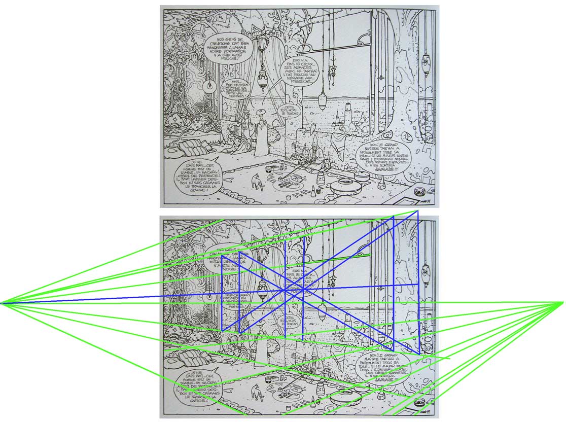
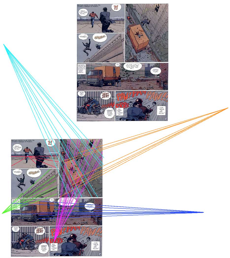
Now, when most comic book artists draw a page, they tend to guestimate the perspective lines (i.e., lines that would be parallel in reality, but that are seen from an angle which makes them appear to converge). As long as the lines converge in the vicinity of our eye level, and there aren't glaring disparities, the cartoonist figures he's on safe ground.
But when we graph Moebius's perspective lines, we see that he didn't guess. All of the parallel lines in these drawings converge on shared vanishing points, meaning that he established these points at the outset and made sure to angle every line to its appropriate point. Even that little row of sticks at the bottom center of the first image is lined up properly. Notice too, in the first image, that he established the proper distance between the columns, represented here by the blue lines. (I won't bore you with the perspective rules he's following here, but basically that big blue X proves that he accurately calculated the columns' placement.) I'll repeat that: he bothered to geometrically plot the placement of background columns in a fantasy environment. Also notice that the vanishing point on the left occupies the same horizon line (that horizontal green line stretching across the image) as the point on the right. This rule is typically violated when artists guess; Moebius wasn't guessing.
Similarly, in the second image, he repeatedly places and follows vanishing points, even when they occur way off the page and he could have gotten away with guesses. Remember folks: this was an established celebrity with nothing left to prove. He was old, he was sick, he was known for his imagination rather than for a strict commitment to realism -- in other words, he had every excuse NOT to plot out the perspective this carefully. And yet he went through with it -- not only here, in these pages I picked at random, but throughout his oeuvre and throughout his career.
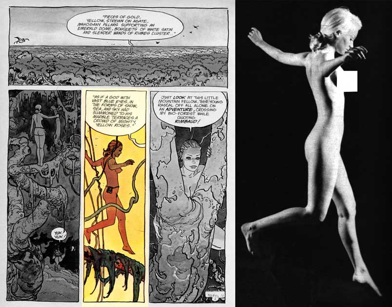
A quick look now at his figure drawing. Here are a couple of pages from a story that appeared in Heavy Metal in the '70s. At the right are the photos he used for reference, to ensure anatomical accuracy. Now consider this: the character he's drawing is a whimsical wood fairy, and in neither image do we get a close look at her. She doesn't HAVE to be 100% accurate. Moebius was a skilled pro who could easily have fudged/guessed the anatomy in these drawings... but he didn't. He dug out the reference photos and gave it that extra ten percent.

One final example of his devotion to craft. Check out this watercolor sketch of an L.A. street, and ask yourself how many fantasy artists would bother recreating so faithfully such a mundane scene:

Why did an artist who was so clearly preoccupied with UNreality devote so much time and effort to mimicking reality? I think it was because he knew that to command his audience's fanciful side, he first had to quiet their rational side, satisfying their subconscious B.S.-detector with the assurance that "this is real." ("How can anyone enter a strong man’s house and carry off his possessions unless he first ties up the strong man?" ~JC) At every opportunity he threw in a little something extra -- a well-plotted vanishing point, a well-turned arm -- to assure we dreamers that we were not dreaming. And it worked. Moebius is known worldwide for bringing fantasies to life, because he was willing to do the mundane work of bringing life to fantasy.
DEPTH INDICATORS
Another thing I appreciate in the work of Moebius is his use of depth. He was able to indicate depth in a scene by including depth indicators: objects and textures that alert our minds to the fact that distances are being represented.
Below is a prime example of Moebius's approach to depth, along with a rough diagram of how a viewer sees the image. The depth indicators -- rocks, boats, ripples in the water, birds, overlapping clouds of mist -- each read as occupying a different plane in the drawing, thereby alerting the viewer to the existence of those otherwise invisible planes. The viewer pictured at the left in my diagram can imagine the space in the scene because the depth indicators (here stacked roughly in the order of their nearness to her, like a diorama) give her clues to the layers of space between her and the horizon.
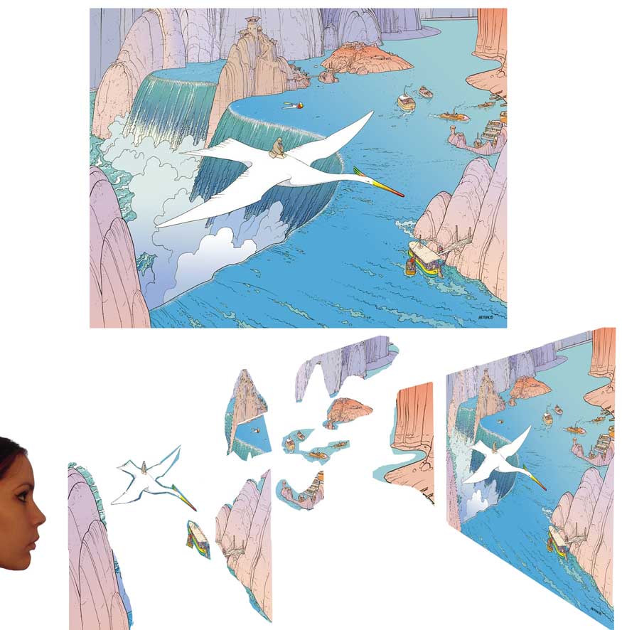
Here's a version I made of the above image, but with most of the depth indicators removed. (Their absence here mimics a similar absence of depth indicators in the work of most artists who aren't Moebius.) Make no mistake: the amount of depth pictured here -- that is, the distance from the viewer to farthest object in the background, as indicated by the size and placement of the bird-riding human and the horizon -- is the same amount of depth that we see in the original version of the image. The only difference is that the depth indicators are missing. The result is diagrammed farther below, where the girl is looking at the image. One depth indicator -- the large bird -- suggests one plane of depth, but since the other depth indicators are absent, the girl has no impetus to imagine/acknowledge the planes of depth which they represented.
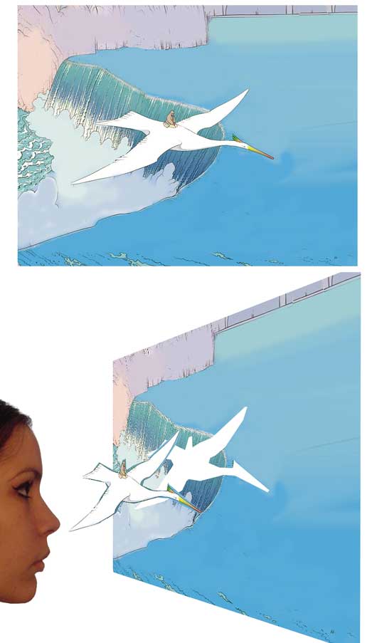
Minus the boats, ripples, and overlapping cliffs, the expanse of water reads as a flat blue wall.
LOCATION STAGING
Moebius's approach to depth was also uncommon in that he avoided the "television" approach to entering and exiting scenes.
In television, and often in movies, it's budget-friendly to film interior scenes and exterior scenes at separate times and locations. The first camera unit shoots a scene between two actors on a set representing the inside of a farmhouse; meanwhile, the second unit goes out to get exterior shots of a real farmhouse and the land surrounding it. Later, the shots are edited together, such that you begin the scene with a wide shot of the farm, and then cut to medium shots of the characters speaking, inside the house. The problem with this approach, aesthetically, is that it creates a subtle disconnect in the mind of the viewer between the characters and their exterior location. Even without realizing it, viewers sense that the characters don't TRULY occupy the world outside their window.
The economic advantages outweigh this disadvantage for most film productions, but unfortunately cartoonists have also adopted this approach (perhaps unwittingly) to no advantage whatsoever. Again and again in comics, we see exterior shots of buildings and landscapes, followed by waist-up shots of characters who seem oddly separated from their surroundings. But Moebius overcame this tendency, successfully integrating his characters into their world with shots of varying distances that show them moving through their environments:
The result is that the worlds in his stories feel real and whole in a way that's rare in comics. They're uncommonly immersive.
That's all I have time for today. I'm hoping for a chance later to draw a tribute pic of Arzach. (Cliché?)
But let's discuss the good.
CRAFT
The thing which first attracted me to Moebius's work, and which I still admire most about it, was that he combined unfettered imagination with a strong grounding in realism.
Many artists fall into one of two camps: either art is about perfecting your craft, and the subject is a trivial means to that end, or art is about expressing your personal vision, and craft is a trivial means to that end. Artists in the first camp tend to create art that's convincingly executed, but lacking imagination. Artists in the second camp are more alive to their imaginations, but their art often fails to convince. The reasoning behind this dichotomy of imagination vs. craft seems to proceed along the following lines. Either:
1. The part of a task which requires the most effort is the point of that task.
2. Mastering craft requires most of our effort in art.
Therefore:
3. Mastering craft is the point of art.
Or:
1. The part of a task which requires the most effort is the point of that task.
2. Mastering craft is not the point of art.
Therefore:
3. Most of our effort in art should not be spent on mastering craft.
I think that the minor premises (2) in both lines of reasoning are true, but that both conclusions are false, since they share a false major premise (1). I believe a correct line of reasoning could be stated as follows:
1. Mastering craft requires most of our effort in art.
2. Mastering craft is not the point of art.
Therefore:
3. The part of a task which requires the most effort is not necessarily the point of that task.
This conclusion is somewhat counterintuitive, but it frees us to master craft without being enslaved to it. More to the point, we see its truth when we look at the art of Moebius.
Moebius devoted considerable time to mastering his craft -- probably far more time than it took him to dream up his amazing visions. (He estimated once that he spent 80% of his time drawing the technically rigorous Blueberry comics, and 20% on his fanciful stuff; he also said Blueberry required more concentration and technical facility.) But he nevertheless subordinated his craft to the higher goal of expressing his fancies. To his fans, that latter claim needs no illustration, so let's take a look at his devotion to craft.
These first two images are from 1999 and 2007, respectively. I'm including the published images along with versions that I graphed to reveal Moebius's use of perspective.
Now, when most comic book artists draw a page, they tend to guestimate the perspective lines (i.e., lines that would be parallel in reality, but that are seen from an angle which makes them appear to converge). As long as the lines converge in the vicinity of our eye level, and there aren't glaring disparities, the cartoonist figures he's on safe ground.
But when we graph Moebius's perspective lines, we see that he didn't guess. All of the parallel lines in these drawings converge on shared vanishing points, meaning that he established these points at the outset and made sure to angle every line to its appropriate point. Even that little row of sticks at the bottom center of the first image is lined up properly. Notice too, in the first image, that he established the proper distance between the columns, represented here by the blue lines. (I won't bore you with the perspective rules he's following here, but basically that big blue X proves that he accurately calculated the columns' placement.) I'll repeat that: he bothered to geometrically plot the placement of background columns in a fantasy environment. Also notice that the vanishing point on the left occupies the same horizon line (that horizontal green line stretching across the image) as the point on the right. This rule is typically violated when artists guess; Moebius wasn't guessing.
Similarly, in the second image, he repeatedly places and follows vanishing points, even when they occur way off the page and he could have gotten away with guesses. Remember folks: this was an established celebrity with nothing left to prove. He was old, he was sick, he was known for his imagination rather than for a strict commitment to realism -- in other words, he had every excuse NOT to plot out the perspective this carefully. And yet he went through with it -- not only here, in these pages I picked at random, but throughout his oeuvre and throughout his career.
A quick look now at his figure drawing. Here are a couple of pages from a story that appeared in Heavy Metal in the '70s. At the right are the photos he used for reference, to ensure anatomical accuracy. Now consider this: the character he's drawing is a whimsical wood fairy, and in neither image do we get a close look at her. She doesn't HAVE to be 100% accurate. Moebius was a skilled pro who could easily have fudged/guessed the anatomy in these drawings... but he didn't. He dug out the reference photos and gave it that extra ten percent.
One final example of his devotion to craft. Check out this watercolor sketch of an L.A. street, and ask yourself how many fantasy artists would bother recreating so faithfully such a mundane scene:
Why did an artist who was so clearly preoccupied with UNreality devote so much time and effort to mimicking reality? I think it was because he knew that to command his audience's fanciful side, he first had to quiet their rational side, satisfying their subconscious B.S.-detector with the assurance that "this is real." ("How can anyone enter a strong man’s house and carry off his possessions unless he first ties up the strong man?" ~JC) At every opportunity he threw in a little something extra -- a well-plotted vanishing point, a well-turned arm -- to assure we dreamers that we were not dreaming. And it worked. Moebius is known worldwide for bringing fantasies to life, because he was willing to do the mundane work of bringing life to fantasy.
DEPTH INDICATORS
Another thing I appreciate in the work of Moebius is his use of depth. He was able to indicate depth in a scene by including depth indicators: objects and textures that alert our minds to the fact that distances are being represented.
Below is a prime example of Moebius's approach to depth, along with a rough diagram of how a viewer sees the image. The depth indicators -- rocks, boats, ripples in the water, birds, overlapping clouds of mist -- each read as occupying a different plane in the drawing, thereby alerting the viewer to the existence of those otherwise invisible planes. The viewer pictured at the left in my diagram can imagine the space in the scene because the depth indicators (here stacked roughly in the order of their nearness to her, like a diorama) give her clues to the layers of space between her and the horizon.
Here's a version I made of the above image, but with most of the depth indicators removed. (Their absence here mimics a similar absence of depth indicators in the work of most artists who aren't Moebius.) Make no mistake: the amount of depth pictured here -- that is, the distance from the viewer to farthest object in the background, as indicated by the size and placement of the bird-riding human and the horizon -- is the same amount of depth that we see in the original version of the image. The only difference is that the depth indicators are missing. The result is diagrammed farther below, where the girl is looking at the image. One depth indicator -- the large bird -- suggests one plane of depth, but since the other depth indicators are absent, the girl has no impetus to imagine/acknowledge the planes of depth which they represented.
Minus the boats, ripples, and overlapping cliffs, the expanse of water reads as a flat blue wall.
LOCATION STAGING
Moebius's approach to depth was also uncommon in that he avoided the "television" approach to entering and exiting scenes.
In television, and often in movies, it's budget-friendly to film interior scenes and exterior scenes at separate times and locations. The first camera unit shoots a scene between two actors on a set representing the inside of a farmhouse; meanwhile, the second unit goes out to get exterior shots of a real farmhouse and the land surrounding it. Later, the shots are edited together, such that you begin the scene with a wide shot of the farm, and then cut to medium shots of the characters speaking, inside the house. The problem with this approach, aesthetically, is that it creates a subtle disconnect in the mind of the viewer between the characters and their exterior location. Even without realizing it, viewers sense that the characters don't TRULY occupy the world outside their window.
The economic advantages outweigh this disadvantage for most film productions, but unfortunately cartoonists have also adopted this approach (perhaps unwittingly) to no advantage whatsoever. Again and again in comics, we see exterior shots of buildings and landscapes, followed by waist-up shots of characters who seem oddly separated from their surroundings. But Moebius overcame this tendency, successfully integrating his characters into their world with shots of varying distances that show them moving through their environments:
The result is that the worlds in his stories feel real and whole in a way that's rare in comics. They're uncommonly immersive.
That's all I have time for today. I'm hoping for a chance later to draw a tribute pic of Arzach. (Cliché?)