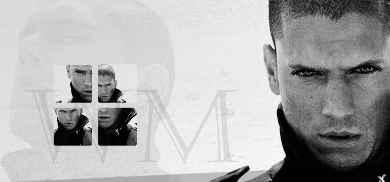
Header Tutorial #01
I am so proud of my selfmade header at my personal journal, I decided to make a tutorial about it. Don't know if anyone is interested, but I had fun making this tutorial!
Make
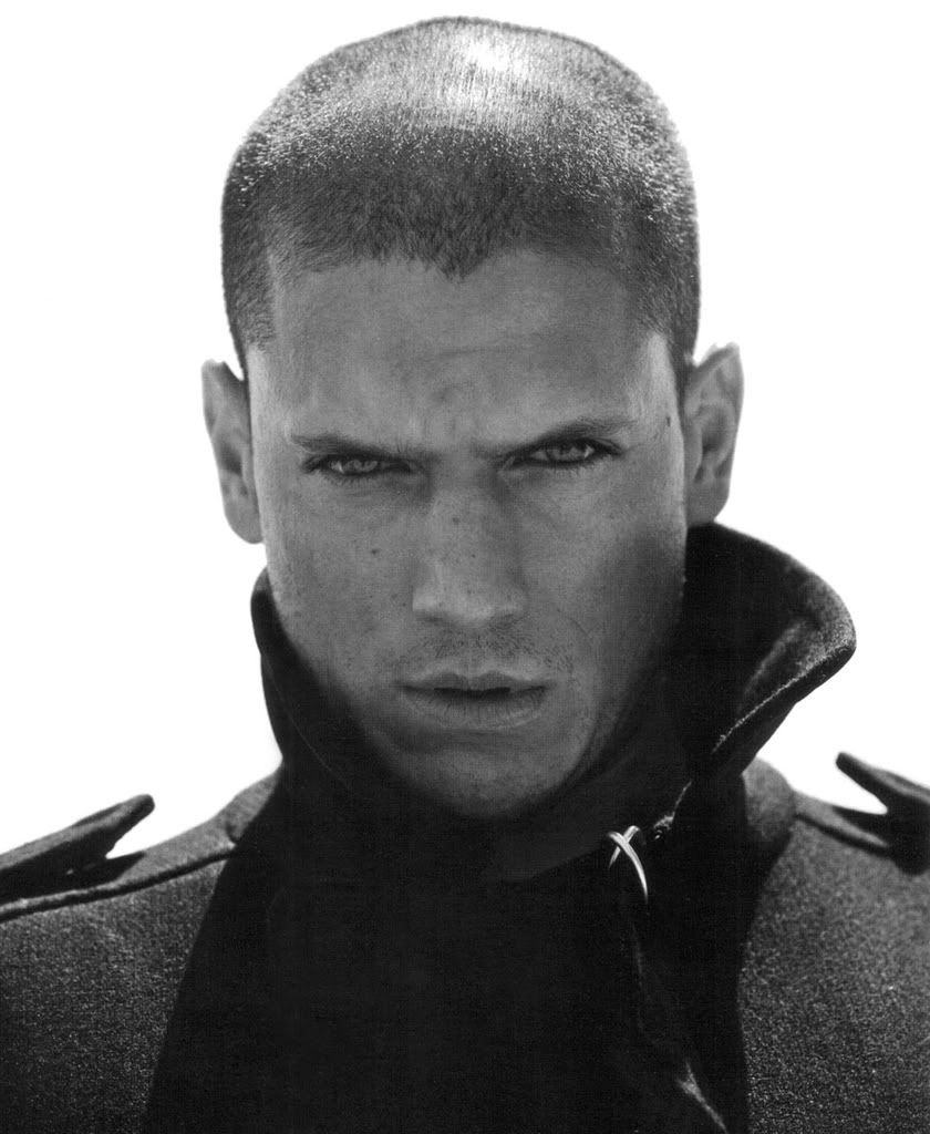
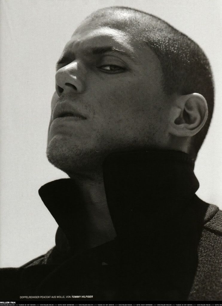
from This and This.
Program used: Photoshop CS2
Translatable: YES, if you leave out the 1 selective color + curves layer...
Difficulty: Easy
Psd: Yes
Open a new canvas File->New (Ctrl+N) (mine was 770X360 pixels), and fill it with White #ffffff.
Take your first picture and crop it to your desired size. I wanted it to really pop out of the canvas, so I left it rather big ( I believe at about 630px in height). Because I needed the coloring for the icons later, I first colored my cropped image instead of first dragging it onto my header.
1. Sharpen once: Filter->Sharpen->Sharpen.
2. Create a Brightness/Contrast layer: Layer->New Adjusment Layer->Brightness/contrast. Settings; brightness +10
Contrast +5
3. The grey looked a little washed out, so I wanted to reduce that. Create a Curves layer: Layer->New Adjusment Layer->Curves. Settings;
RGB 184 - 194 (input-output)
Red 147 - 144
Blue 199 - 187
4. Still not contrasted enough, so I tried a color balance layer: Layer->New Adjusment Layer->Color Balance. I left midtones and highlights alone after fiddling around for a gazillion years and only changed the shadows. Make sure ‘preserve luminosity’ is checked.
Cyan/Red -33
Yellow/Blue +15
5. Merge the layers. Then duplicate your new image and set to Soft Light 50%.
6. Create a Levels layer: Layer->New Adjusment Layer->Levels. It only makes a tiny difference, so this is an optional step, you can leave it out if you want.
Input: 0 2,00 255
Output: Leave as it is.
7. Still not contrasted enough to my liking. Create a selective color layer: Layer->New Adjusment Layer->Selective coloring.
Blacks: 0 0 0 +8
8. Merge layers again. Then drag your photo onto your header.
9. Once on the header canvas, I thought it was too blue after all. Create a new fill layer: Layer->New Fill Layer->Solid color. Fill it with White (#ffffff). Then set it to Color 100%.
10. Take your second picture and color it like the first picture. I only changed the Soft Light layer into a Screen layer because the second picture is a little darker. Drag this picture onto your header as well. Please note: This picture goes BELOW the white Color layer (all pictures to come as well). I changed the opacity to 10%.
11. Go all the way back to your first cropped and colored picture. Open 4 new canvasses at 100x100 pixels (icons sized). Crop the picture 4 times to your liking and make icons.
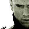
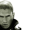
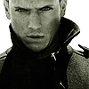
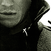
12. 100x100 px was too big for my taste. Adjust the image size: Image->Image size->80x80 px. Drag them all onto your header in order of your preference.
13. Round the edges of the small images using this tutorial: Depiction. (I adjusted the pixel size from 6 to 2 pixels cause they were small images and left out the last step.)
14. Take this texture by onlyabreath and set it to Multiply 40%. Don’t resize it, simply drag it around your canvas until you like the position. It should be above the color fill layer.
15. Slap on some text. I only used his initials in ‘Castellar’ font at size 200. Moved it beneath the white Color layer and changed opacity to 15%. Now you are finished! (Unless you want to add more to your own liking, of course ;) )
♦ Feedback is love
♦ This is just a guideline, adjust to your own personal taste
♦ Feel free to ask if you don't understand
♦ Picture .Psd
♦ Header .Psd
Make
from This and This.
Program used: Photoshop CS2
Translatable: YES, if you leave out the 1 selective color + curves layer...
Difficulty: Easy
Psd: Yes
Open a new canvas File->New (Ctrl+N) (mine was 770X360 pixels), and fill it with White #ffffff.
Take your first picture and crop it to your desired size. I wanted it to really pop out of the canvas, so I left it rather big ( I believe at about 630px in height). Because I needed the coloring for the icons later, I first colored my cropped image instead of first dragging it onto my header.
1. Sharpen once: Filter->Sharpen->Sharpen.
2. Create a Brightness/Contrast layer: Layer->New Adjusment Layer->Brightness/contrast. Settings; brightness +10
Contrast +5
3. The grey looked a little washed out, so I wanted to reduce that. Create a Curves layer: Layer->New Adjusment Layer->Curves. Settings;
RGB 184 - 194 (input-output)
Red 147 - 144
Blue 199 - 187
4. Still not contrasted enough, so I tried a color balance layer: Layer->New Adjusment Layer->Color Balance. I left midtones and highlights alone after fiddling around for a gazillion years and only changed the shadows. Make sure ‘preserve luminosity’ is checked.
Cyan/Red -33
Yellow/Blue +15
5. Merge the layers. Then duplicate your new image and set to Soft Light 50%.
6. Create a Levels layer: Layer->New Adjusment Layer->Levels. It only makes a tiny difference, so this is an optional step, you can leave it out if you want.
Input: 0 2,00 255
Output: Leave as it is.
7. Still not contrasted enough to my liking. Create a selective color layer: Layer->New Adjusment Layer->Selective coloring.
Blacks: 0 0 0 +8
8. Merge layers again. Then drag your photo onto your header.
9. Once on the header canvas, I thought it was too blue after all. Create a new fill layer: Layer->New Fill Layer->Solid color. Fill it with White (#ffffff). Then set it to Color 100%.
10. Take your second picture and color it like the first picture. I only changed the Soft Light layer into a Screen layer because the second picture is a little darker. Drag this picture onto your header as well. Please note: This picture goes BELOW the white Color layer (all pictures to come as well). I changed the opacity to 10%.
11. Go all the way back to your first cropped and colored picture. Open 4 new canvasses at 100x100 pixels (icons sized). Crop the picture 4 times to your liking and make icons.
12. 100x100 px was too big for my taste. Adjust the image size: Image->Image size->80x80 px. Drag them all onto your header in order of your preference.
13. Round the edges of the small images using this tutorial: Depiction. (I adjusted the pixel size from 6 to 2 pixels cause they were small images and left out the last step.)
14. Take this texture by onlyabreath and set it to Multiply 40%. Don’t resize it, simply drag it around your canvas until you like the position. It should be above the color fill layer.
15. Slap on some text. I only used his initials in ‘Castellar’ font at size 200. Moved it beneath the white Color layer and changed opacity to 15%. Now you are finished! (Unless you want to add more to your own liking, of course ;) )
♦ Feedback is love
♦ This is just a guideline, adjust to your own personal taste
♦ Feel free to ask if you don't understand
♦ Picture .Psd
♦ Header .Psd