Icon Tutorial ~ Dr. Horrible
I know, I know - I've been pretty much dead on LJ for a pretty decent amount of time (and haven't updated Follow the Nightingale in almost a year... :/ )...
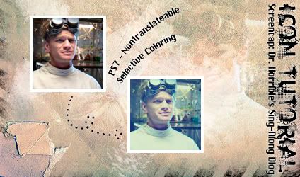
But regardless, I bring an icon tutorial for all of you! <3 and it comes with a PSD! :)
This coloring is for my current obsession, Dr. Horrible's Sing-Along Blog. Which you all should watch. Now.
But watch out! - some of the example icons in the tutorial below contain spoilers. :P
(And, for the record, there will be icons from this in my next dump. :D )

Before we begin, do whatever you want to your base. Resize, sharpen, etc... Personally, I just added a screen layer to the screencap at 100% opacity, but it's different for everything.

1 - Things get crazy as of now.
Make a new Selective Coloring Layer (Layer > New Adjustment Layer > Selective Coloring):
Reds: +41, +5, -29, -7
Yellows: +24, 0, +100, -14
Greens: +100, -100, -100, +100
Whites: +100, +20, 0, -18
Neutrals: -10, 0, -12, +9
Blacks: +15, 0, -19, -7

2 - Make a new Curves Layer (Layer > New Adjustment Layer > Curves):
RGB -
Input: 107
Output: 175
Red -
(Point 1)
Input: 120
Output: 77
(Point 2)
Input: 209
Output: 165
Green -
Input: 125
Output: 132
This is what makes the icon predominantly blue (Without it, the final icon would look...kind of crappy.)
You could stop here, really. But it seems...too blue. Later layers will help to balance the blueness out a bit, and make the icon a little more orange-ish.

3 - Create a new fill layer with either this subtle gradient,

or any reddish color like #AF0A0A. Set the layer to Screen at 20% opacity.

4 - Create a new fill layer with #905F00 and set it to Multiply with 10% opacity.

5 - Create a new fill layer with #000A57 and set it to Exclusion at 30% opacity.
Both this and the previous fill layer give the icon a more brownish tint - this layer, in particular, can be removed if you prefer your white to be a little whiter.

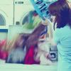
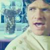
Congrats! You're done! :D Here are some other examples:


And, since I love the world and all who inhabit it, here's the gradient and a PSD in one convenient .zip archive! (NOTE: you'll need to have a program that can unzip .zip archives. :P )
PSD and Gradient .zip archive at Mediafire.com - Click to Download!
Please comment if you download the PSD~ You don't have to credit me for the tutorial or anything, but please credit me if you actually use one of the example icons. :3
I hope you guys enjoy the tutorial! I'd love to see your results.
But regardless, I bring an icon tutorial for all of you! <3 and it comes with a PSD! :)
This coloring is for my current obsession, Dr. Horrible's Sing-Along Blog. Which you all should watch. Now.
But watch out! - some of the example icons in the tutorial below contain spoilers. :P
(And, for the record, there will be icons from this in my next dump. :D )
Before we begin, do whatever you want to your base. Resize, sharpen, etc... Personally, I just added a screen layer to the screencap at 100% opacity, but it's different for everything.
1 - Things get crazy as of now.
Make a new Selective Coloring Layer (Layer > New Adjustment Layer > Selective Coloring):
Reds: +41, +5, -29, -7
Yellows: +24, 0, +100, -14
Greens: +100, -100, -100, +100
Whites: +100, +20, 0, -18
Neutrals: -10, 0, -12, +9
Blacks: +15, 0, -19, -7
2 - Make a new Curves Layer (Layer > New Adjustment Layer > Curves):
RGB -
Input: 107
Output: 175
Red -
(Point 1)
Input: 120
Output: 77
(Point 2)
Input: 209
Output: 165
Green -
Input: 125
Output: 132
This is what makes the icon predominantly blue (Without it, the final icon would look...kind of crappy.)
You could stop here, really. But it seems...too blue. Later layers will help to balance the blueness out a bit, and make the icon a little more orange-ish.
3 - Create a new fill layer with either this subtle gradient,
or any reddish color like #AF0A0A. Set the layer to Screen at 20% opacity.
4 - Create a new fill layer with #905F00 and set it to Multiply with 10% opacity.
5 - Create a new fill layer with #000A57 and set it to Exclusion at 30% opacity.
Both this and the previous fill layer give the icon a more brownish tint - this layer, in particular, can be removed if you prefer your white to be a little whiter.
Congrats! You're done! :D Here are some other examples:
And, since I love the world and all who inhabit it, here's the gradient and a PSD in one convenient .zip archive! (NOTE: you'll need to have a program that can unzip .zip archives. :P )
PSD and Gradient .zip archive at Mediafire.com - Click to Download!
Please comment if you download the PSD~ You don't have to credit me for the tutorial or anything, but please credit me if you actually use one of the example icons. :3
I hope you guys enjoy the tutorial! I'd love to see your results.