Round 02 Challenge 07 Results
Sorry this took a while, there were still not enough votes.
Eliminated


riyuji
#03: [-04+00=-04]
#08: [-02+00=-02]
total: -06
Congratulations on making it this far!
you've placed 4th in this competition, if you'd like a banner simply reply to this entry.

reggie_icons
Mod's Choice

onlyforsale
background looks nice, and the composition is original among these icons
[ VOTING]
01: -02+01= -01
02: -01+01= 00
03: -04+00= -04
04: -00+03= +03
05: -03+00= -03
06: -02+00= -02
07: -01+00= -01
08: -02+00= -02
BY SETS:
#06: -02+00= -02
#07: -01+00= -01
[TOTAL: -03]
#03: -04+00=-04
#08: -02+00=-02
[total: -06]
#01: -02+01= -01
#04: -00+03= +03
[TOTAL: +02]
#02: -01+01= 00
#05: -03+00= -03
[TOTAL: -03]
COMMENTS
-
#01 - Interesting method, with watercolor over the face. The light texture on the side is gorgeous, but the problem here is the rest of the icon, typography and embellishments, do not go with the style, and they seem to stand out badly. The icon elements are also poorly arranged. Try adding in text first in a complementary font before adding embellishment.
#01 - Image gets lost in the color and "effects" on the icons.
#02 - The same, the image gets lost in the coloring. Too faded.
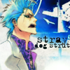
#03 - Icon is a little too blurry and the textures used made the icon looks messy. The way Grimmjow's hair got cropped off looks weird and I think it would be better to move the text a bit lower too.
#03 - The colors are lovely and watercolory, but some of the lines seem to be a little too bold for the style, and they draw the eye to the bold places, and not to the coloring. The typography, too, draws the eye, and the font was a very poor choice for the icon, as the style does not match or blend well, annd black was a poor color choice, as it doesn't GO with the icon as a whole.
#03 - The background, the image and the text don't seem to blend together.
#03 - The color of the texture clashes with Grimmjow. The text also feels a little bit like an after-thought.
#05 - The yellow at the side seems to clash with the icon and it's hard to figure out what's going on, with the colouring eating too much into the lineart.
#05 - The colors look watercolory, but the icon itself is fairly flat, and lacks contrast on the subject and the bits on the sides. The texture dichotomy confuses the eye and makes the untextured and uncontrasted parts seem blurry.
#05 - The bright colours at the edges stand out more than the image itself.
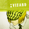
#06 - The colouring is too flat, neither the image nor the text stand out.
#06 - The icon is too green and could have benefited from being balanced out by a different color.
#07 - The cropping is awkward and the black box placed in the upper right-hand corner feels out of place.
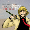
#08 - The text seems a bit out of place.
#08 - The colours of the text makes the icon looks distracting and the design seems bland.
+
#01 - The text and the cropping of the image work very well together.
#02 - The composition is just great.
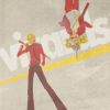
#04 - Nice color and crop of image.
#04 - It's really hard to make lime green work on icons, but this is gorgeous, and all of the colors are so textured and dynamic that this icon is fascinating to look at but not blinding whatsoever. GREAT job.
#04 - I love your use of textures and colours. Also, the simple typography ♥
Banners will be given at the end of the round, and the next challenge will be posted tomorrow morning.
Congratulations 07_cents, onlyforsale, and reggie_icons. You guiz made it to the top 3 :D
Eliminated
riyuji
#03: [-04+00=-04]
#08: [-02+00=-02]
total: -06
Congratulations on making it this far!
you've placed 4th in this competition, if you'd like a banner simply reply to this entry.
reggie_icons
Mod's Choice
onlyforsale
background looks nice, and the composition is original among these icons
[ VOTING]
01: -02+01= -01
02: -01+01= 00
03: -04+00= -04
04: -00+03= +03
05: -03+00= -03
06: -02+00= -02
07: -01+00= -01
08: -02+00= -02
BY SETS:
#06: -02+00= -02
#07: -01+00= -01
[TOTAL: -03]
#03: -04+00=-04
#08: -02+00=-02
[total: -06]
#01: -02+01= -01
#04: -00+03= +03
[TOTAL: +02]
#02: -01+01= 00
#05: -03+00= -03
[TOTAL: -03]
COMMENTS
-
#01 - Interesting method, with watercolor over the face. The light texture on the side is gorgeous, but the problem here is the rest of the icon, typography and embellishments, do not go with the style, and they seem to stand out badly. The icon elements are also poorly arranged. Try adding in text first in a complementary font before adding embellishment.
#01 - Image gets lost in the color and "effects" on the icons.
#02 - The same, the image gets lost in the coloring. Too faded.
#03 - Icon is a little too blurry and the textures used made the icon looks messy. The way Grimmjow's hair got cropped off looks weird and I think it would be better to move the text a bit lower too.
#03 - The colors are lovely and watercolory, but some of the lines seem to be a little too bold for the style, and they draw the eye to the bold places, and not to the coloring. The typography, too, draws the eye, and the font was a very poor choice for the icon, as the style does not match or blend well, annd black was a poor color choice, as it doesn't GO with the icon as a whole.
#03 - The background, the image and the text don't seem to blend together.
#03 - The color of the texture clashes with Grimmjow. The text also feels a little bit like an after-thought.
#05 - The yellow at the side seems to clash with the icon and it's hard to figure out what's going on, with the colouring eating too much into the lineart.
#05 - The colors look watercolory, but the icon itself is fairly flat, and lacks contrast on the subject and the bits on the sides. The texture dichotomy confuses the eye and makes the untextured and uncontrasted parts seem blurry.
#05 - The bright colours at the edges stand out more than the image itself.
#06 - The colouring is too flat, neither the image nor the text stand out.
#06 - The icon is too green and could have benefited from being balanced out by a different color.
#07 - The cropping is awkward and the black box placed in the upper right-hand corner feels out of place.
#08 - The text seems a bit out of place.
#08 - The colours of the text makes the icon looks distracting and the design seems bland.
+
#01 - The text and the cropping of the image work very well together.
#02 - The composition is just great.
#04 - Nice color and crop of image.
#04 - It's really hard to make lime green work on icons, but this is gorgeous, and all of the colors are so textured and dynamic that this icon is fascinating to look at but not blinding whatsoever. GREAT job.
#04 - I love your use of textures and colours. Also, the simple typography ♥
Banners will be given at the end of the round, and the next challenge will be posted tomorrow morning.
Congratulations 07_cents, onlyforsale, and reggie_icons. You guiz made it to the top 3 :D