6 psd files!
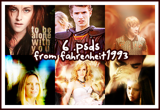
6 psds to share! 5 requested from sarisafari, one is uploaded before for lims.
Well, hope you guys like them!
I use PHOTOSHOP CS2.
You're going to hate me, but well, you'll have to comment to get the links, because the icons are not plainly made for colouring, but really icons, and all of them took me so much time to make. So I'd like to know who really wants them. Just comment and I'll give you the links.
Make sure to say which one you want, or you want all of them.
And please make sure you have E-MAIL NOTIFICATION.
*Top left(Kristen Stewart) as no.1, top right(Ron Weasley) as no.3, bottom right(stefan&elena) as no.6
Some extra information about the icons for you, because I think you can't know everything from the psds. BTW, I have put down who made the textures that used in the icons, I have tried my best to find out who made the textures, but I can't find all.
>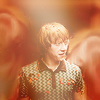
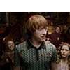
From the psd I give you, you could only see a well prepared base, because I apparently deleted all the useless layers, which I kind of want to punch myself for doing that. So, it's easy to achieve that base. All you have to do is use the SMUDGE TOOL to SMUDGE around Ron, and most importantly, smudge out Lavender BrownLOL Just smudge in a circle and you'll get the effect. Then, you most probably can't have the same blurry circle at the left, so just copy the 'smudged Lavender', reversed it and paste it on the left. Easy-peasy!

>>
Okay, this is going to be a bit difficult to explain, I'll try.
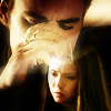
1. There're two layers that're quite blurry. Use the Gaussian Blur, with 5-8 radius, depending yourself, and set the layer to soft light/screen will do. (Oh, to have that whole coloured image, click ctrl+a, then shift+ctrl+c then ctrl+v/select whole canvas, then copy merged then paste.)
2. See that Layer 12? Set that layer to Multiply, then use the same technique(click ctrl+a, shift+ctrl+c then ctrl+v) to add a new layer. Then copy that layer twice, set them to Screen to lighten up the image. Disable or delete the brown colour filled layer, because that's of no use now.(Well, you can see the three brownish layers are of different levels of brown, guess I used different brown before, but I definitely deleted the colour layer, so experiment the colour yourself!XD)
3. You can see I didn't have any colouring layers of Elena in the psd, because I did the colouring in another new file, avoiding the crash of colouring(the colouring'll be affected if I did the colouring directly in the Stefan icon). I don't have that file, but just do something similar in step 2 above with Elena, I used the same technique. After finishing the colouring, just drag Elena to Stefan and it'll do.
Okay, I guess I've explained all the complicated parts, hope you understand and they'll help you on your icons!
Last but not least...
Please do NOT REDISTRIBUTED by any means.
Please do NOT copy any of them to your icons directly or use all the layers entirely in your icons. They're shared for you to get inspirations and learn some tricks(hopefully).
Like what you see? watch for updates!
PIMPING: battlecalling, a community for posting icon/graphc battles and call for one!
Well, hope you guys like them!

I use PHOTOSHOP CS2.
You're going to hate me, but well, you'll have to comment to get the links, because the icons are not plainly made for colouring, but really icons, and all of them took me so much time to make. So I'd like to know who really wants them. Just comment and I'll give you the links.
Make sure to say which one you want, or you want all of them.
And please make sure you have E-MAIL NOTIFICATION.
*Top left(Kristen Stewart) as no.1, top right(Ron Weasley) as no.3, bottom right(stefan&elena) as no.6
Some extra information about the icons for you, because I think you can't know everything from the psds. BTW, I have put down who made the textures that used in the icons, I have tried my best to find out who made the textures, but I can't find all.

>
From the psd I give you, you could only see a well prepared base, because I apparently deleted all the useless layers, which I kind of want to punch myself for doing that. So, it's easy to achieve that base. All you have to do is use the SMUDGE TOOL to SMUDGE around Ron, and most importantly, smudge out Lavender BrownLOL Just smudge in a circle and you'll get the effect. Then, you most probably can't have the same blurry circle at the left, so just copy the 'smudged Lavender', reversed it and paste it on the left. Easy-peasy!

>>

Okay, this is going to be a bit difficult to explain, I'll try.
1. There're two layers that're quite blurry. Use the Gaussian Blur, with 5-8 radius, depending yourself, and set the layer to soft light/screen will do. (Oh, to have that whole coloured image, click ctrl+a, then shift+ctrl+c then ctrl+v/select whole canvas, then copy merged then paste.)
2. See that Layer 12? Set that layer to Multiply, then use the same technique(click ctrl+a, shift+ctrl+c then ctrl+v) to add a new layer. Then copy that layer twice, set them to Screen to lighten up the image. Disable or delete the brown colour filled layer, because that's of no use now.(Well, you can see the three brownish layers are of different levels of brown, guess I used different brown before, but I definitely deleted the colour layer, so experiment the colour yourself!XD)
3. You can see I didn't have any colouring layers of Elena in the psd, because I did the colouring in another new file, avoiding the crash of colouring(the colouring'll be affected if I did the colouring directly in the Stefan icon). I don't have that file, but just do something similar in step 2 above with Elena, I used the same technique. After finishing the colouring, just drag Elena to Stefan and it'll do.
Okay, I guess I've explained all the complicated parts, hope you understand and they'll help you on your icons!
Last but not least...
Please do NOT REDISTRIBUTED by any means.
Please do NOT copy any of them to your icons directly or use all the layers entirely in your icons. They're shared for you to get inspirations and learn some tricks(hopefully).
Like what you see? watch for updates!
PIMPING: battlecalling, a community for posting icon/graphc battles and call for one!