tutorial @4
Okay, I finally make thisOTL
I can't list out all the steps because I can't really remember. I try to, but I failed, that's why this takes so long. I'm really really sorry this takes extremely long:(
Um, this time I don't use any images, because I'm so lazy and I don't know how to redo itOTL So this is an only-texts-tutorial! Take your time!
Requested by yorleni
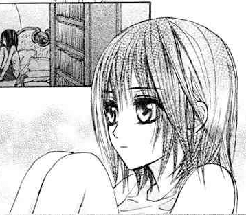
from this to
Using Photoshop CS2. But I'm sure other versions are also available.
Icon part involves Selective Colour, Channel Mixer, Colour Balance, Hue/Saturation. But these are not necessary.
First of all, you have to get your base. The clear the best. If you think it's difficult to colour because of a lot of black areas, use your brush tool to paint it white.
Well, I'm not going to show you each step how I colour, but I will tell you what method I used.
I think it's better to colour the biggest part of the character, so I started with Yuuki's skin. I used Pen Tool to sketch out the area, so that I could just use the Paint Bucket Tool to pour the colour. The selection area doesn't have to be accurate, you could use the erase tool to erase the part you don't want afterwards.
Remember, everytime you start to colour a new area/add more colour on some parts, ADD A NEW LAYER. It's up to you whether you name the layers:)
Choose the skin colour, you might not know exactly what should be the colour, but just choose a similar one, you could adjust the opacity of the layer to get your ideal skin colour later. So after colouring the skin, I set the layer to Linear Burn 60%.
In order to get some shade to make the skin more realistic, I added a new layer, used the soft round brush to colour some part. Go Filter>Blur>Gaussian Blur, radius 2-5 to soften the shade. Set the layer to Linear Burn 56%(decide the opacity on your own).
Use the same method to colour the remaining parts.
Normally, the base colour layer set to Linear Burn, opacity decided on your own.
Then add new layer to add some shadings. Use Gaussian Blur when necessary.
For the hair part, I used Colour Burn to darken some part, and Colour Dodge to lighten some part.
After all, I painted all the useless part around Yuuki, in order to crop the whole image to make an icon.
ICON PART STARS FROM HERE
Okay, I'm not going to give the detail colouring here as well.
You could download the .psd to have a look what I messed with the iconXD
Just a brief summary with the icon.
I'm not quite satisfied with the colour, so I stressed the colour by adding Hue/Saturation layer and Selective Colour layers. I always play around with selective colour, it's really useful! Then I also add Colour Balance and Channel Mixer. To add some background, I use several textures. If you want them, feel free to ask me! I will try my best to figure them out which is whichXDDD"
If you want the .psds, please leave a comment here and I will reply you with the links♥ State clear which one you want, the yuuki colouring or the icon. And make sure you have e-mail notification!
You are more than welcome to ask questions here♥
;like what you see? WATCH this community!
I can't list out all the steps because I can't really remember. I try to, but I failed, that's why this takes so long. I'm really really sorry this takes extremely long:(
Um, this time I don't use any images, because I'm so lazy and I don't know how to redo itOTL So this is an only-texts-tutorial! Take your time!
Requested by yorleni
from this to
Using Photoshop CS2. But I'm sure other versions are also available.
Icon part involves Selective Colour, Channel Mixer, Colour Balance, Hue/Saturation. But these are not necessary.
First of all, you have to get your base. The clear the best. If you think it's difficult to colour because of a lot of black areas, use your brush tool to paint it white.
Well, I'm not going to show you each step how I colour, but I will tell you what method I used.
I think it's better to colour the biggest part of the character, so I started with Yuuki's skin. I used Pen Tool to sketch out the area, so that I could just use the Paint Bucket Tool to pour the colour. The selection area doesn't have to be accurate, you could use the erase tool to erase the part you don't want afterwards.
Remember, everytime you start to colour a new area/add more colour on some parts, ADD A NEW LAYER. It's up to you whether you name the layers:)
Choose the skin colour, you might not know exactly what should be the colour, but just choose a similar one, you could adjust the opacity of the layer to get your ideal skin colour later. So after colouring the skin, I set the layer to Linear Burn 60%.
In order to get some shade to make the skin more realistic, I added a new layer, used the soft round brush to colour some part. Go Filter>Blur>Gaussian Blur, radius 2-5 to soften the shade. Set the layer to Linear Burn 56%(decide the opacity on your own).
Use the same method to colour the remaining parts.
Normally, the base colour layer set to Linear Burn, opacity decided on your own.
Then add new layer to add some shadings. Use Gaussian Blur when necessary.
For the hair part, I used Colour Burn to darken some part, and Colour Dodge to lighten some part.
After all, I painted all the useless part around Yuuki, in order to crop the whole image to make an icon.
ICON PART STARS FROM HERE
Okay, I'm not going to give the detail colouring here as well.
You could download the .psd to have a look what I messed with the iconXD
Just a brief summary with the icon.
I'm not quite satisfied with the colour, so I stressed the colour by adding Hue/Saturation layer and Selective Colour layers. I always play around with selective colour, it's really useful! Then I also add Colour Balance and Channel Mixer. To add some background, I use several textures. If you want them, feel free to ask me! I will try my best to figure them out which is whichXDDD"
If you want the .psds, please leave a comment here and I will reply you with the links♥ State clear which one you want, the yuuki colouring or the icon. And make sure you have e-mail notification!
You are more than welcome to ask questions here♥
;like what you see? WATCH this community!