Scrubs Tutorial
Go from this: 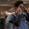
to this: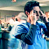
in 9 steps.
Program Used: Paint Shop Pro 8
Translatable: Yes
Involves: Curves, Color Balance, Color Layers, Hue/Saturation/Lightness
This tutorial is mostly for darker caps/images, but if you use them on lighter ones, they look good too, but it'll be very blue-ish.
1. Duplicate the base 3 times.
Set the first one (closest to the base) to Soft Light 100% and the other two to Screen 100%
2. [Curves]
RGB > I: 195 O: 200
3. [New Raster Layer]
#0B4461 > Exclusion 50%
4. [Color Balance]
Midtones: -44 18 31
Shadows: -43 -7 23
Highlights: -20 -17 -18
5. Duplicate base and drag to the top.
Set it to Screen 100%
6. [Hue/Saturation/Lightness]
Saturation > 30
7. Duplicate base (or Screen layer aka step #5) and drag to the top.
Set it to Soft Light 100%
8. Merge All.
9. Sharpen (if you want).
I like to use Unsharp Mask.
Radius: 1.00; Strength: 55; Clipping: 0
10. Add text/brushes/whatever you like.
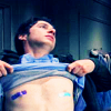
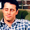
Other icons made using this tutorial:

Comments would be nice. I'd love to see your results. :)
If you use example icons, please credit either heymadeline or shadyavenue. Thanks.

to this:

in 9 steps.
Program Used: Paint Shop Pro 8
Translatable: Yes
Involves: Curves, Color Balance, Color Layers, Hue/Saturation/Lightness
This tutorial is mostly for darker caps/images, but if you use them on lighter ones, they look good too, but it'll be very blue-ish.
1. Duplicate the base 3 times.
Set the first one (closest to the base) to Soft Light 100% and the other two to Screen 100%
2. [Curves]
RGB > I: 195 O: 200
3. [New Raster Layer]
#0B4461 > Exclusion 50%
4. [Color Balance]
Midtones: -44 18 31
Shadows: -43 -7 23
Highlights: -20 -17 -18
5. Duplicate base and drag to the top.
Set it to Screen 100%
6. [Hue/Saturation/Lightness]
Saturation > 30
7. Duplicate base (or Screen layer aka step #5) and drag to the top.
Set it to Soft Light 100%
8. Merge All.
9. Sharpen (if you want).
I like to use Unsharp Mask.
Radius: 1.00; Strength: 55; Clipping: 0
10. Add text/brushes/whatever you like.
Other icons made using this tutorial:


Comments would be nice. I'd love to see your results. :)
If you use example icons, please credit either heymadeline or shadyavenue. Thanks.