She's the Man Tutorial
from
to
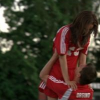
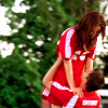
in 10 steps!
Program Used: Paint Shop Pro 8
Translatable: Yes!
Involves: Color Layers, Curves, Color Balance, Brightness/Contrast, Hue/Saturation/Lightness
1. Duplicate base 3-4 times.
(If it's an already light image, do it 2-3 times, or however man you need. Mess around with the amount).
Set the first one (closest to the base)to Softlight 100% and the others to screen 100%
[You can mess with opacities/layers until it's bright enough, but not washed out]
2. [New Raster Layer]
#FDE7FA > Burn 100%
3. [New Raster Layer]
#E7F9F8 > Soft Light 100%
4. Duplicate base & drag to the top.
Set to Softlight 100%
(If your image looks really washed out, now is a good time to adjust your screen layers)
5. [Curves]
I: 160 O: 135
6. [Color Balance]
Midtones: 15 15 25
Shadows: -15 -10 -15
Highlights: -10 -10 10
7. [Brightness/Contrast]
Contrast: 10
8. [Hue/Saturation/Lightness]
Saturation: 20
9. Add this gradient I made:

Set to Soft Light 45%
10. Merge all.
Other icons made using this tutorial:
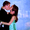
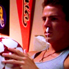
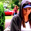
Comments would be nice. I'd love to see your results. :)
Feel free to add shadyavenue.
If you use example icons, please credit either heymadeline or shadyavenue. Thanks.