Invitation Tutorial, Challenge 43, by lwena11
Thanks for the invite! :D
From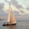
to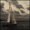
Using Paint Shop Pro X2 involving a Brightness/Contrast layer and a Curves layer, fill layers, and one texture. I believe it's translatable (and if not, the adjustment layers could probably be skipped with some creative use of soft light and screen/multiply layers, depending on your base). The basic technique is also ridiculously simple. :)
So, I wanted to try and create a vintage-y photograph/postcard type look, so the first thing I did after cropping my base was make my image black and white. I used a black colour fill layer set at Colour (Legacy) 100% to do this, but in this case, whatever grayscaling technique you like best should work.
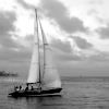
Unfortunately, grayscaling my image revealed that it wasn't very contrasted, so I created a new Brightness/Contrast layer to remedy that problem. I darkened the image (knowing that the textures I was going to use later would lighten the image again) and then upped the contrast:
Brightness: -15
Contrast: 30

->
The image was still flat and too bright for what I wanted, but instead of creating another Brightness/Contrast layer I decided to go with a Curves layer instead, because I'd have more control then. I made two points, as follows:
Click to See Curves
Point One: Input: 68, Output: 21
Point Two: Input: 199, Output: 171
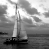
The bottom point I dragged down to darken the shadows of the image. The top point I also dragged down slightly, so that I would darken the highlights/brighter portions of the picture. This curves layer darkens the image, rather than giving us contrast. That gives us:

->
I wasn't quite satisfied with the contrast, so I created a second curves layer, this time creating something closer to an 'S' curve than I did in my last curves layer. Again, I used two points. The first point (the lower of the two), I again dragged down to make the shadows of the image darker - however, this point isn't as close to the darker shadows as the lower point in my previous curves layer was, but instead closer to the midtones of the image. The second point I created is in the highlights portion of the curves, and I dragged it up very slightly to make the image brighter.
Click to See Curves
Point One: Input: 107, Output: 82
Point Two: Input: 189, Output: 197
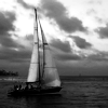
That's the last of the adjustment layers! It leaves us here:

->
Since I knew what my end goal was at this point, I knew what textures I would probably use, and knowing that they would brighten my image I duplicated my base, dragged it to the top, and set it to Multiply. The opacity was adjusted accordingly after I finished putting the textures on, and ended up at 40%.
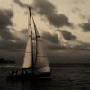
To create the sepia-tone that I was going for, I flood-filled a new raster layer with #e3d4bd, a light brownish colour, and set that layer to Multiply 100%. The image still wasn't brown enough for me, so I duplicated this layer and set it to Multiply, 50%.

+
->
The image looked fuzzy to me, so I copy-merged everything (right click > Copy Merged or Ctrl + Shift + C in PSP X2) and pasted it as a new layer on top of everything else. I sharpened this layer (Adjust > Sharpness > Sharpen) and then reduced the opacity to 50% so as to avoid over-sharpening.
Last, but not least, I resized one of peoplemachine's scratchy textures (click - it's big) and pasted it on top of my image in a new layer, which I then set to Screen 100%. The scratches weren't obvious enough to me, so I duplicated this layer and set it to Screen, 50%.

->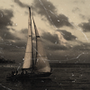
As a finishing touch, I cropped the image down to 98x98 and then added a 1px black border (Image > Add Borders) to make the icon look more complete.

If you've got any questions or comments, let me know! :D
From

to

Using Paint Shop Pro X2 involving a Brightness/Contrast layer and a Curves layer, fill layers, and one texture. I believe it's translatable (and if not, the adjustment layers could probably be skipped with some creative use of soft light and screen/multiply layers, depending on your base). The basic technique is also ridiculously simple. :)
So, I wanted to try and create a vintage-y photograph/postcard type look, so the first thing I did after cropping my base was make my image black and white. I used a black colour fill layer set at Colour (Legacy) 100% to do this, but in this case, whatever grayscaling technique you like best should work.
Unfortunately, grayscaling my image revealed that it wasn't very contrasted, so I created a new Brightness/Contrast layer to remedy that problem. I darkened the image (knowing that the textures I was going to use later would lighten the image again) and then upped the contrast:
Brightness: -15
Contrast: 30

->

The image was still flat and too bright for what I wanted, but instead of creating another Brightness/Contrast layer I decided to go with a Curves layer instead, because I'd have more control then. I made two points, as follows:
Click to See Curves
Point One: Input: 68, Output: 21
Point Two: Input: 199, Output: 171
The bottom point I dragged down to darken the shadows of the image. The top point I also dragged down slightly, so that I would darken the highlights/brighter portions of the picture. This curves layer darkens the image, rather than giving us contrast. That gives us:

->

I wasn't quite satisfied with the contrast, so I created a second curves layer, this time creating something closer to an 'S' curve than I did in my last curves layer. Again, I used two points. The first point (the lower of the two), I again dragged down to make the shadows of the image darker - however, this point isn't as close to the darker shadows as the lower point in my previous curves layer was, but instead closer to the midtones of the image. The second point I created is in the highlights portion of the curves, and I dragged it up very slightly to make the image brighter.
Click to See Curves
Point One: Input: 107, Output: 82
Point Two: Input: 189, Output: 197
That's the last of the adjustment layers! It leaves us here:

->

Since I knew what my end goal was at this point, I knew what textures I would probably use, and knowing that they would brighten my image I duplicated my base, dragged it to the top, and set it to Multiply. The opacity was adjusted accordingly after I finished putting the textures on, and ended up at 40%.
To create the sepia-tone that I was going for, I flood-filled a new raster layer with #e3d4bd, a light brownish colour, and set that layer to Multiply 100%. The image still wasn't brown enough for me, so I duplicated this layer and set it to Multiply, 50%.

+

->

The image looked fuzzy to me, so I copy-merged everything (right click > Copy Merged or Ctrl + Shift + C in PSP X2) and pasted it as a new layer on top of everything else. I sharpened this layer (Adjust > Sharpness > Sharpen) and then reduced the opacity to 50% so as to avoid over-sharpening.
Last, but not least, I resized one of peoplemachine's scratchy textures (click - it's big) and pasted it on top of my image in a new layer, which I then set to Screen 100%. The scratches weren't obvious enough to me, so I duplicated this layer and set it to Screen, 50%.

->

As a finishing touch, I cropped the image down to 98x98 and then added a 1px black border (Image > Add Borders) to make the icon look more complete.

If you've got any questions or comments, let me know! :D