Winner's Tutorial, Challenge #114, by stripped
Greetings! One tutorial for Challenge 114 coming up. While I kept careful notes that make it sound like I knew where I was going with this from the first moment, let me say that my best icon technique is "try things until something works" and that's definitely where I went with this one.
This icon was created using Photoshop CS5, along with some outside textures (I'll label them as I go).
I loved the image, but the first few attempts I made with it in black & white just didn't make me happy. I kept washing it out, and it was driving me nuts, so I decided I needed to focus on getting the crop I wanted, and introducing some color into the image to make it pop and not become overbright.
I started by using the Crop tool to select my space, and then I rotated the selected area before actually cropping it.
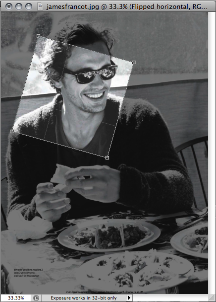
I always crop to 300x300, because usually I do a Smart Sharpen before reducing the image size to 100x100. But this time when I tried doing the sharpen, it pixilated on me and just didn't look good, so I went without it.
Once I had it the right size, I flipped it horizontal. So now it was cropped, tilted a bit, and flipped, and I really liked the composition, so I kept it.

The next set of steps came from a tecnique I learned here! I love it. I don't always use it, but sometimes it adds just the right luminescent glow.
I made three new copies of the original layer. The lowest one (right above the original) i set to Multiply, the next one up I did a Gaussian Blur of 1.5 and set it to Screen, and the last one I set to Soft Light. If this hadn't been a black and white image already, I would also have Desaturated the top (Soft Light) layer by using Image/Adjustment/Desaturate to make sure things didn't get too bright.

Next was the first introduction of color. I applied an adjustment layer (Layer / New Adjustment Layer / Photo Filter) and created a warming photo filter. I chose the third stock warming filter in the list (warming 81).

That was a good start, but not what I really wanted. So I went hunting through my textures to find something that had the right color tones to match, and came up with one of a set called Star Bright by tarla.

I set it to soft light. Close, but not quite there yet...

I used COMMAND-OPTION-SHIFT-E to create a new layer that was an amalgam of all the prior layers to work off of.
I decided I wanted to try blurring part of the image, and using that part of the image to change the color tone/brightness of the image in those spots. So first I set a quick mask, then went through trial and error to find a Mutsie's Mask brush that I liked. Deselecting quick mask after stamping the brush gave me this selection.
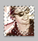
I copied and pasted the selection into a new layer. Then I blurred that layer (radial, set to spin and 17) and set the layer to screen. This gave me a bit of subtle movement in the image, as well as brightning spots and adding more luminescence. Which was exactly where I wanted to be.

Except I wanted some tiny text to finish it out, so back I went to brushes and textures to hunt something down which seemed right. This time it was a brush, which is labeled in my brush sets as jordannamorgan_violet_burning. Again, trial and error to pick one which had words I liked, and looked right, because i was really looking for a "feel" at this point. The larger words say "The palm of your hand against mine" which just amused me for some reason at the moment.
So I stamped the brush on, moved it into position, and that was it... icon done!

If I am not clear enough on any step, or you would like clarification for any reason, please ask. It is quite possible that I may have missed mentioned something!
This icon was created using Photoshop CS5, along with some outside textures (I'll label them as I go).
I loved the image, but the first few attempts I made with it in black & white just didn't make me happy. I kept washing it out, and it was driving me nuts, so I decided I needed to focus on getting the crop I wanted, and introducing some color into the image to make it pop and not become overbright.
I started by using the Crop tool to select my space, and then I rotated the selected area before actually cropping it.

I always crop to 300x300, because usually I do a Smart Sharpen before reducing the image size to 100x100. But this time when I tried doing the sharpen, it pixilated on me and just didn't look good, so I went without it.
Once I had it the right size, I flipped it horizontal. So now it was cropped, tilted a bit, and flipped, and I really liked the composition, so I kept it.

The next set of steps came from a tecnique I learned here! I love it. I don't always use it, but sometimes it adds just the right luminescent glow.
I made three new copies of the original layer. The lowest one (right above the original) i set to Multiply, the next one up I did a Gaussian Blur of 1.5 and set it to Screen, and the last one I set to Soft Light. If this hadn't been a black and white image already, I would also have Desaturated the top (Soft Light) layer by using Image/Adjustment/Desaturate to make sure things didn't get too bright.

Next was the first introduction of color. I applied an adjustment layer (Layer / New Adjustment Layer / Photo Filter) and created a warming photo filter. I chose the third stock warming filter in the list (warming 81).

That was a good start, but not what I really wanted. So I went hunting through my textures to find something that had the right color tones to match, and came up with one of a set called Star Bright by tarla.

I set it to soft light. Close, but not quite there yet...

I used COMMAND-OPTION-SHIFT-E to create a new layer that was an amalgam of all the prior layers to work off of.
I decided I wanted to try blurring part of the image, and using that part of the image to change the color tone/brightness of the image in those spots. So first I set a quick mask, then went through trial and error to find a Mutsie's Mask brush that I liked. Deselecting quick mask after stamping the brush gave me this selection.

I copied and pasted the selection into a new layer. Then I blurred that layer (radial, set to spin and 17) and set the layer to screen. This gave me a bit of subtle movement in the image, as well as brightning spots and adding more luminescence. Which was exactly where I wanted to be.

Except I wanted some tiny text to finish it out, so back I went to brushes and textures to hunt something down which seemed right. This time it was a brush, which is labeled in my brush sets as jordannamorgan_violet_burning. Again, trial and error to pick one which had words I liked, and looked right, because i was really looking for a "feel" at this point. The larger words say "The palm of your hand against mine" which just amused me for some reason at the moment.
So I stamped the brush on, moved it into position, and that was it... icon done!

If I am not clear enough on any step, or you would like clarification for any reason, please ask. It is quite possible that I may have missed mentioned something!