Winner's Tutorial, Challenge #111, by pensnest
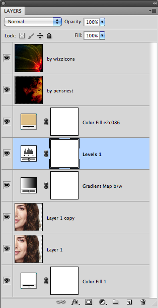
Hi all, and thank you for voting for this icon. It was made in Photoshop CS5 on a Mac, and uses Gradient Map, Levels and Colour Fill, so all quite translatable, I'm sure.
This was the crop, which as you can see from the transparent edge, I moved over slightly once I'd got it down to icon size. I put a white colour fill layer behind this base to fill it up, but as the background of the picture is very pale grey, I didn't bother to match it up. After the various adjusting layers it doesn't matter anyway.

I duplicated this later, and set it to Soft Light. At some point, I then reduced the opacity of both these layers to 80%, giving a slightly less opaque look.

Next thing was to add a black/white Gradient Map, basically because I was trying to figure out what to do with this icon.
I then used a Levels layer to up the contrast even further, essentially by moving both ends of the graph somewhat towards the centre. Here are the Gradient Map and Levels layers side by side for easier comparison:


It seemed to need a bit of warming up at this point so I put on a colour fill layer of e2c086, a nice warm beige, and set it to Multiply at 59%.

And now, it was just a matter of going through every texture I own some light textures to add the flare. I used one I made a while ago, and one from wizzicons:
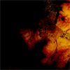
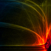
Both are set to screen at 100%.
Save for Web and Devices as a png24, and we're done.

Here's the layers palette, though it's very simple:

This was the crop, which as you can see from the transparent edge, I moved over slightly once I'd got it down to icon size. I put a white colour fill layer behind this base to fill it up, but as the background of the picture is very pale grey, I didn't bother to match it up. After the various adjusting layers it doesn't matter anyway.

I duplicated this later, and set it to Soft Light. At some point, I then reduced the opacity of both these layers to 80%, giving a slightly less opaque look.

Next thing was to add a black/white Gradient Map, basically because I was trying to figure out what to do with this icon.
I then used a Levels layer to up the contrast even further, essentially by moving both ends of the graph somewhat towards the centre. Here are the Gradient Map and Levels layers side by side for easier comparison:


It seemed to need a bit of warming up at this point so I put on a colour fill layer of e2c086, a nice warm beige, and set it to Multiply at 59%.

And now, it was just a matter of going through every texture I own some light textures to add the flare. I used one I made a while ago, and one from wizzicons:


Both are set to screen at 100%.
Save for Web and Devices as a png24, and we're done.

Here's the layers palette, though it's very simple:
