Winners Invitation Tutorial, Challenge 92, by Mscam
Winners Invitation Tutorial, Challenge 92, by Mscam
The icon was made in PSCS4 on a Mac. It includes selective colour, and gradient maps.
From this: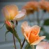
to this: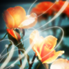
I tried several crops, before settling with this one:

I then added this blue exclusion layer:

For a more ‘vintage’ effect:
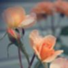
A little washed out looking. I wanted the flowers to “pop” a little, and the background was too bland. I made a selective colour layer, and messed about in the ‘reds’ and ‘yellows’ :
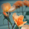
Much better, but I wanted more colour for the flowers. I added a second selective colour layer, again tweaking just the ‘reds’ and ‘yellows’:
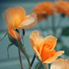
Nice, but I want the background to show up a little more. I added a ‘brightness/contrast’ layer and upped the ‘brightness’ to 20%:
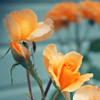
I then copy merged all the layers (cmd,alt,shift,e) and set that to ‘overlay 100%’:
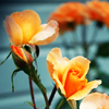
Much more contrast.
Pretty icon, but I wanted to draw more attention to the flowers. I added a radial gradient. Layer> New Fill Layer> Gradient. These were my settings:
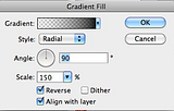
I set that layer to “overlay 70%” :
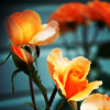
This darkens down the ousted edges, while drawing the focus more the the flowers in the centre crop.
Now fun with filters. As a new alternative to the ‘light blobs’ I’ve been experimenting with the “diffuse filter”
Filter> Distort> Diffuse Glow
My settings:
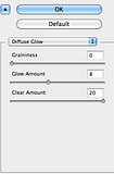
I left this layer on “normal” but reduced the opacity to 84%:

I added a ‘box blur’ as a new layer to blend the glow a little better. Filter> Blur> Box Blur. Radius 1. And set that layer to “lighten 100” :
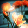
I like the icon as it was, but it needed a little oomph. After lots of experimenting I settled with this:
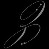
I’m sorry I have no idea who made this. It’s saved in my brush folder under “lovely.” *facepalm* Please if you know who made it let me know, so I can credit. :)
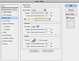
I used the eyedropper tool and picked a colour from the flowers. Then resized the brush to fit the icon. In the blending options of the layer, I added an outer glow to soften the brush a little.
My settings:
(looking at it now, I’m pretty sure I blurred it a little. It won’t show on my layer, but it most definitely looks blurred.)
Copy and merge layers (cmd,alt,shift,e)
To sharpen an icon I always use the ‘high pass filter” and this was the last step in my layers. Filter> Other> High Pass.
My settings:
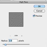
I set this layer to “soft Light 100”
And we’re done:

My layers:

The icon was made in PSCS4 on a Mac. It includes selective colour, and gradient maps.
From this:

to this:

I tried several crops, before settling with this one:

I then added this blue exclusion layer:

For a more ‘vintage’ effect:

A little washed out looking. I wanted the flowers to “pop” a little, and the background was too bland. I made a selective colour layer, and messed about in the ‘reds’ and ‘yellows’ :

Much better, but I wanted more colour for the flowers. I added a second selective colour layer, again tweaking just the ‘reds’ and ‘yellows’:

Nice, but I want the background to show up a little more. I added a ‘brightness/contrast’ layer and upped the ‘brightness’ to 20%:

I then copy merged all the layers (cmd,alt,shift,e) and set that to ‘overlay 100%’:

Much more contrast.
Pretty icon, but I wanted to draw more attention to the flowers. I added a radial gradient. Layer> New Fill Layer> Gradient. These were my settings:

I set that layer to “overlay 70%” :

This darkens down the ousted edges, while drawing the focus more the the flowers in the centre crop.
Now fun with filters. As a new alternative to the ‘light blobs’ I’ve been experimenting with the “diffuse filter”
Filter> Distort> Diffuse Glow
My settings:

I left this layer on “normal” but reduced the opacity to 84%:

I added a ‘box blur’ as a new layer to blend the glow a little better. Filter> Blur> Box Blur. Radius 1. And set that layer to “lighten 100” :

I like the icon as it was, but it needed a little oomph. After lots of experimenting I settled with this:

I’m sorry I have no idea who made this. It’s saved in my brush folder under “lovely.” *facepalm* Please if you know who made it let me know, so I can credit. :)
I used the eyedropper tool and picked a colour from the flowers. Then resized the brush to fit the icon. In the blending options of the layer, I added an outer glow to soften the brush a little.
My settings:

(looking at it now, I’m pretty sure I blurred it a little. It won’t show on my layer, but it most definitely looks blurred.)
Copy and merge layers (cmd,alt,shift,e)
To sharpen an icon I always use the ‘high pass filter” and this was the last step in my layers. Filter> Other> High Pass.
My settings:

I set this layer to “soft Light 100”
And we’re done:

My layers:
