tutorial #9
Hello Everyone! To say long time no see is definitely an understatement :P
I was hoping to make my first "comeback" post a icon post but I guess that will happen later :P
I'm recreating this icon today as requested by kateliciously who was just being totally awesome for helping me out with the tutorial challenge at landofart :D
Okay so lets get down to the tutorial.
Programme Used: Photoshop CS
Difficulty Level: Easy/ Beginners
Translatable: Yes
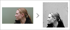
Step 01: Choose your image and crop it as per your choice.
My image was one of the images provided for one of the challenges at bwlims (about 2 years ago lol).
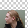
I cropped the portion I want to use and then placed the image a 100x100 blank file.
Original | Crop | Base

|
|
Step 02: Filling the blank area.
I created a lyer below the image and filled it with the colour of the background in the image. In my case it was #8E9990 (
).
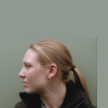
Step 03: Blending the backgrounds.
You can do this by erasing the parts of the background in the original image, but I prefer to use Layer Masks because I am really poor with the brush.
After the backgrounds were merged, I used the smudge tool to smoothen the skin of the subject.

Step 04: Brightening the image.
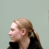
To do this part, I used a texture by iroppoii. I set the layer mode to Soft Light and reduced the layer opacity to 30%
Texture | Icon
|
Step 05: Adding a texture to the backgorund.
Okay, so the background looks rather blank so I decide to fill it with a sratch/grain texture. I used a texture by moskitoo (found at sevenstates).
The original image is quite large so I cropped it and inverted the colour (Image Menu > Adjustments > Invert OR Ctrl + I).
I put the cropped texture on top and set the blend mode to Multiple and leave the opacity at 100%. Then, I duplicate this layer once.
Original Texture | Cropped Texture | Inverted Texture
|
|
Step 06: Brightening the icon some more :P
I duplicated the first texture layer (Step 04) and brought the layer copy on the top. No changes in layer mode or opacity.
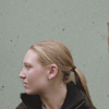
Step 07: Desaturation.
Normally people start out by desaturation their base image (Image Menu >Adjustments > Desaturate OR Shift + Ctrl + U), but I prefer to do it using fill layers.
I create a new layer on top and then fill it with white (#FFFFFF) and set the layer mode to Saturation. Instead of white black (#000000) can also be used.

Step 08: Adding some contrast.
I created a new layer on top and used the "Apply Image" option (Image Menu > Apply Image).
This option allows you to merge the visible layers without actually merging the layers.
If you use programme which lacks this option, you can use the Copy Merged option (Shift + Ctrl +C) and paste the copy on the top.
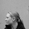
Step 09: Adding some more contrast.
Put a Brightness/Contrast layer on top (Layer Menu > New Layer Adjustment > Brightness/Contrast).
The setting I used were Brightness - +7 and Contrast - +26

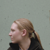
Step 10: Tada! You're icon is done!
Layer Palette

I was hoping to make my first "comeback" post a icon post but I guess that will happen later :P
I'm recreating this icon today as requested by kateliciously who was just being totally awesome for helping me out with the tutorial challenge at landofart :D
Okay so lets get down to the tutorial.
Programme Used: Photoshop CS
Difficulty Level: Easy/ Beginners
Translatable: Yes

Step 01: Choose your image and crop it as per your choice.
My image was one of the images provided for one of the challenges at bwlims (about 2 years ago lol).
I cropped the portion I want to use and then placed the image a 100x100 blank file.
Original | Crop | Base

|

|

Step 02: Filling the blank area.
I created a lyer below the image and filled it with the colour of the background in the image. In my case it was #8E9990 (

).

Step 03: Blending the backgrounds.
You can do this by erasing the parts of the background in the original image, but I prefer to use Layer Masks because I am really poor with the brush.
After the backgrounds were merged, I used the smudge tool to smoothen the skin of the subject.

Step 04: Brightening the image.
To do this part, I used a texture by iroppoii. I set the layer mode to Soft Light and reduced the layer opacity to 30%
Texture | Icon

|

Step 05: Adding a texture to the backgorund.
Okay, so the background looks rather blank so I decide to fill it with a sratch/grain texture. I used a texture by moskitoo (found at sevenstates).
The original image is quite large so I cropped it and inverted the colour (Image Menu > Adjustments > Invert OR Ctrl + I).
I put the cropped texture on top and set the blend mode to Multiple and leave the opacity at 100%. Then, I duplicate this layer once.
Original Texture | Cropped Texture | Inverted Texture

|

|


Step 06: Brightening the icon some more :P
I duplicated the first texture layer (Step 04) and brought the layer copy on the top. No changes in layer mode or opacity.

Step 07: Desaturation.
Normally people start out by desaturation their base image (Image Menu >Adjustments > Desaturate OR Shift + Ctrl + U), but I prefer to do it using fill layers.
I create a new layer on top and then fill it with white (#FFFFFF) and set the layer mode to Saturation. Instead of white black (#000000) can also be used.

Step 08: Adding some contrast.
I created a new layer on top and used the "Apply Image" option (Image Menu > Apply Image).
This option allows you to merge the visible layers without actually merging the layers.
If you use programme which lacks this option, you can use the Copy Merged option (Shift + Ctrl +C) and paste the copy on the top.

Step 09: Adding some more contrast.
Put a Brightness/Contrast layer on top (Layer Menu > New Layer Adjustment > Brightness/Contrast).
The setting I used were Brightness - +7 and Contrast - +26

Step 10: Tada! You're icon is done!
Layer Palette
