tutorial #3
I'm taking a shot at Color Balance for Photoshop 7. While most people have a misconception that Color balance is very difficult, in fact its actually the one easiest and most useful trick in the book. I will be explaining in detail each of the different aspects of color balance, so if you're here in hope of one of those "copy random numbers and slap them on" tutorials then this will be a waste of your time =]
Color balance is pretty useful as you can achieve the effect of the soft light, color burn and screen layers without the hundred layers.
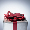
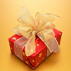
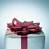
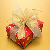
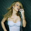
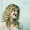
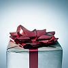
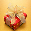
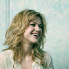
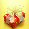
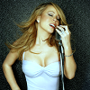
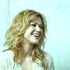
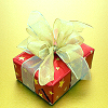
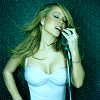
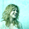
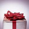
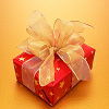
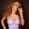
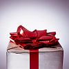
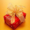
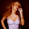
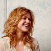
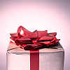
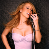
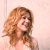
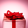
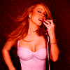
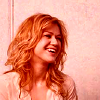
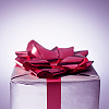
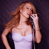
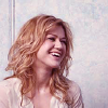
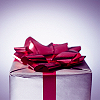
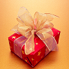
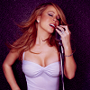
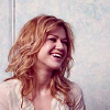
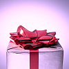
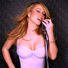
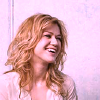
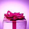
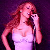
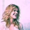
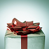
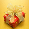
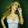
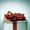
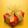
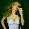
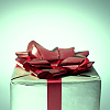
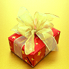
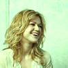
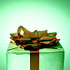
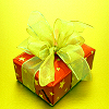
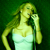
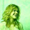
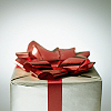
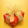
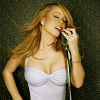
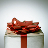
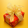
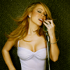
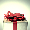
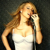
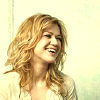
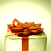
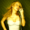
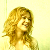
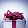
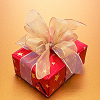
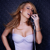
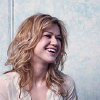
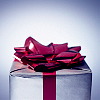
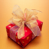
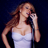
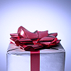
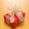
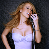
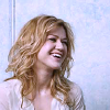
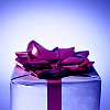
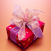
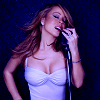
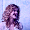
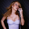
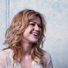
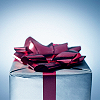
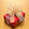
Before we start, let me show you my four bases. The reason why I've taken four bases is that not all images are same, so not all the adjustments will work for all the images. I have taken two human/people images and two stock images. One image in each category is dark while the other is relatively light in coloring.
My bases:


Start:
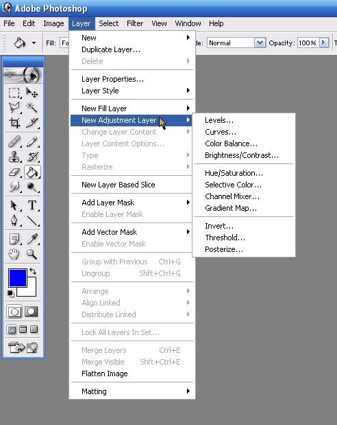
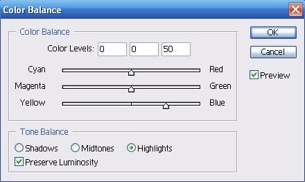
For the first timers who are new to color balance, there are two ways to choose a color balance layer.
The first method:
Layer > New Adjustment layer > Color balance
View
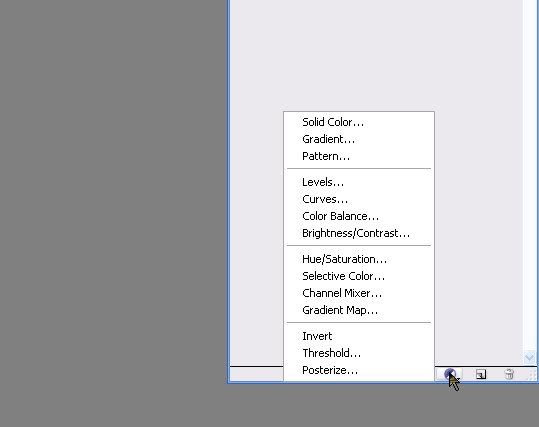
Second method:
Click on the small circle with half black and half white in the bottom of your layer palette, then choose Color balance.
View
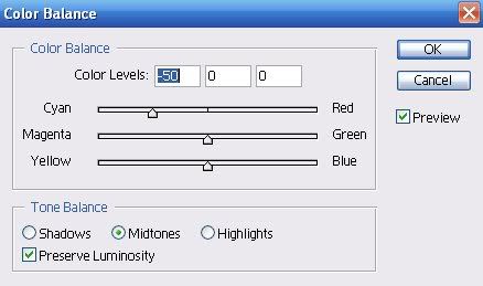
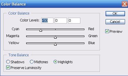
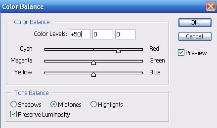
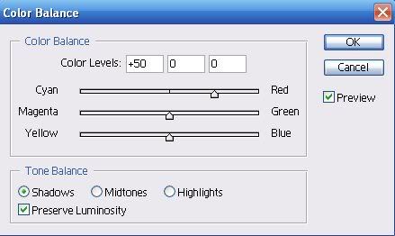
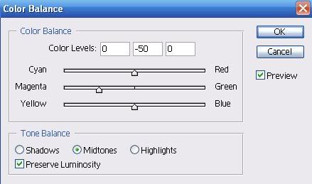
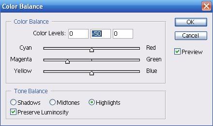
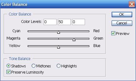
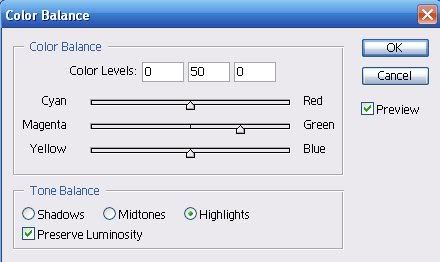
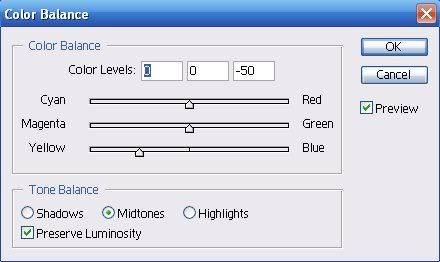
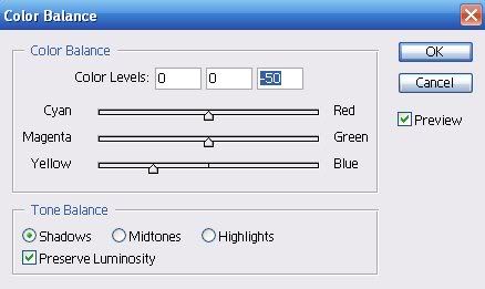
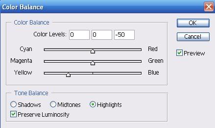
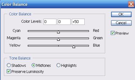
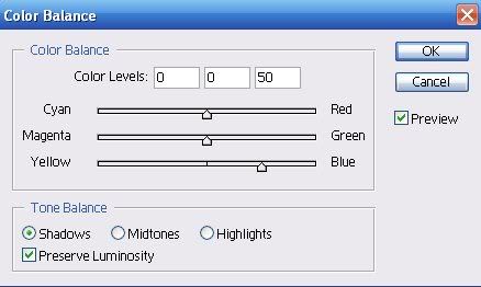
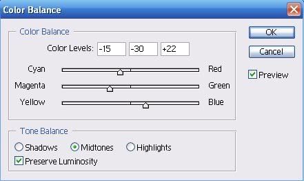
Color balance layer consist of six different colors in pairs of two: Cyan and Red, Magenta and Green, and Yellow and Blue. The reason they are in pairs is because they literally balance each other out. If you increase Cyan in Midtones, you must increase at least a little of it's opposite, i.e. Red, in Shadows. But before we start, it is a necessary precaution that you keep the "Preserve Luminosity" option check. This is because this option will save ("preserve") the original brightness/contrast of your image, you can uncheck and see the difference yourself.
Now what are Midtones and Shadows and Highlights? Well then lets see!
For each color tone I have kept the scale at half to prevent your (and my) eyes from bleeding. You'll understand as we go further.
CYAN:

Cyan is a very bright color, previously it was known as Bluish-green. If you have, and I'm sure you must have, seen those neon blue color icons, where a person's hair and shadows have mysteriously turn bluish, then you would like to know that an abuse of this color lead to those neon effects. While I personally hate that type of coloring I thought you'd like to know how to achieve it =/
All the tutorials for the neon coloring will use Selective Coloring it is easily translatable into Color Balance. The only additional thing is to add a scratch/grainy texture and you'll get a very similar result.
As mention above the scale for each color has been kept at half, i.e for Cyan its is between -100 and 0, which is -50. Now first I will show only one combination of the aspects of Color balance, i.e., only Midtones, then Shadows and finally Highlight.
MIDTONES:
Midtones are the original colors in your images, to put it in a simple way. When you adjust midtones you'll notice the colors of the object/person and background change more than the lights or shadows. When using color balance, midtones are the primary base. You must first adjust the midtones to your liking before proceeding with the other aspects, i.e., Shadows and Highlights.
Now here is a example when only the Cyan midtone is adjusted at half, i.e., -50.
Setting
These aren't that bad because I've kept at half, if you'll keep it at full then your images will become radioactive.
SHADOWS:
As the name suggests, this aspect deals with the coloring of the shadows emitted by the images/background in your image. Most people abuse this term to no ends giving their icons the afore mentioned radioactive neon blue coloring =[
Again, the scale is kept at half, i.e., -50.
Setting

These look better than their midtones counter parts no? But still never adjust them to full.
HIGHLIGHTS:
Now these are the true devils in color balance! Highlights are used to adjust the light of your image. If you'll notice then every image as a direction of light, either the light seems to coming from the center of the image or from a corner, these will often be shown by bright lights etc. Also if you must have paid attention then most of the tutorials using color balance never mess around with Highlights, why? well see for your self:
Setting

Not so good is it? That's why no messing around with Highlights for any image. This is particularly damaging to the bright icons. Only use this option when your icons are exceptionally dark and you might need 100 screen layer to brighten them up.
ALL THREE:
What would happen if I kept all the three aspects at the same level? The results would be MEGA horrible.

RED:

As said before, Cyan's counter color is Red. This color is darker than Cyan and hence balances out its awesome neon blueness. Here are the results for Red:
MIDTONES:
Setting

Agian, these are not that bad, this proves that Midtones never harm you images when used in small proportions.
SHADOWS:
Setting
HIGLIGHTS:
Setting

Again big no no if you're gonna mess with Highlights. They love to take revenge by popping your eyes.
ALL THREE:

Pictures speak a thousand words, don't they? xD
MAGENTA:

Magenta (muh-jen-ta) is a shade of red that lies between Violet and Rose. It is a horribly bright color which is highly dangerous when overdone. Thankfully the trend of abusing this color has not yet started *crosses fingers*
Magenta and Cyan when combined form a good combo when when alone Magenta is as painful as any other neon color.
MIDTONES:
Setting

SHADOWS:
Setting
HIGHLIGHTS:
Setting

ALL THREE:

I beg you, for the sake of all that is good in the world, never abuse this color ;_;
GREEN:

I have no idea why they kept Green as Magenta's counter color because I feel it is equally bright but who am I to argue? =]
This color is best when used to balance Shadows, in Midtones its not that effective.
MIDTONES:
Setting

SHADOWS:
Setting

HIGHLIGHTS:
Setting

ALL THREE:
YELLOW:

Ah yellow, the color associated with laughter. But when over used it becomes associated with fear. This color is again bright and hence possess the properties of radioactivity.
MIDTONES:
Out of all the colors, Yellow is the only one which even remotely manages to harm the poor Midtones. I, personally never use Yellow balance for human/people images, but i guess it depends upon your taste (and image)
Setting

SHADOWS:
Setting

HIGHLIGHTS:
Setting

ALL THREE:

BLUE:

This color balances out Yellow. This one is probably best used in its Shadow aspect.
MIDTONES:
Setting
SHADOWS:
Setting

This color gives an icons a cool feeling.
HIGHLIGHTS:
Setting
ALL THREE:
FINAL NOTES:
The thing about color balance layers is that just like its name implies, you HAVE to achieve a balance between all the six colors. If you try to only balance one then what happens is already shown above. I cannot tell you how to balance for which image because not all images are same. But i can most certainly give to some tips.
When you are balancing Midtones, first try to increase the Cyan tones (i.e. take the pointed towards "Cyan"), but while doing so don't exceed -50. Another thing is don't try to balance Greens and Yellows in Midtones, instead mess with them in Shadows where their effect is more needed.
While balancing Shadows, avoid to increasing the same colors you increased in Midtones, i.e., if you increased Cyan in Midtones don't increase it again in Shadows, instead increase Blue.
NEVER MESS WITH HIGHLIGHTS. You can mess with them as much as you want once you're comfortable with Color Balance.
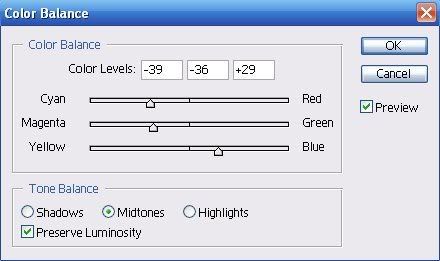
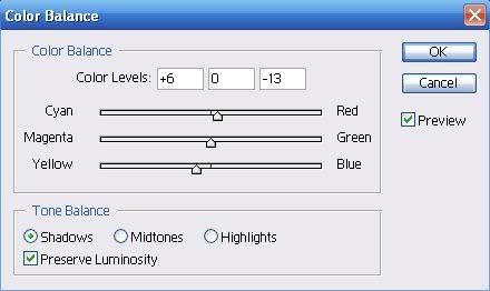
Here is an example which will help you understand better.
Icon #1:
My setting were:
Midtones Shadows
I balanced all the different colors and hence the out come. To achieve a good outcome you must do the same. But remember you cannot use the same setting for all the images. For example I used the same setting for the second image, and the outsome:
Its a bit too blue, so it doesn't look so good. But then I changed the setting for the second image and got a new look:

The setting were:
Midtones Shadows
For the other examples:
Midtones Shadows
Midtones Shadows
I hope this was helpful to at least one person. Please comment 'cause they make me feel warm and fuzzy, also then I'll know that I didn't waste 5 hours of my life writing this tutorial xD
Remember don't use the same settings for all the images. Also if you want to add text or brushes, then do it on a layer after the color balance layer.