Work in Progress -- Zoe Alone (Part 3)
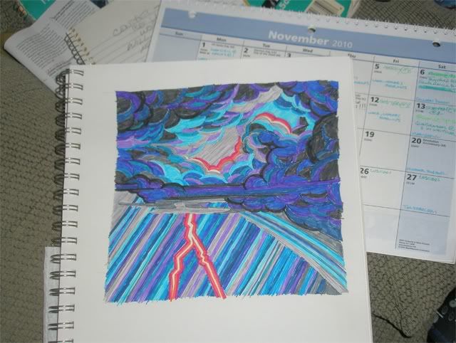
This is actually an extension of the previous post. I liked the original color sketch for itself, but it didn't quite suit what I want for the comic story. So I did a second sketch. And this was more in line with what I've been thinking of for the style. (This is a photo of the sketch, not a scan, and the following Photoshop versions are messing with the photo.)
So, I decided to check out the Daub filter and see what that got me. Which was this ---
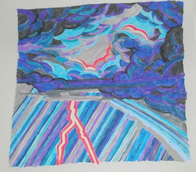
This intrigued me, but wasn't quite what I wanted. And it makes the colors lighter than I want for the dark night scene. So I tried the Fresco filter.
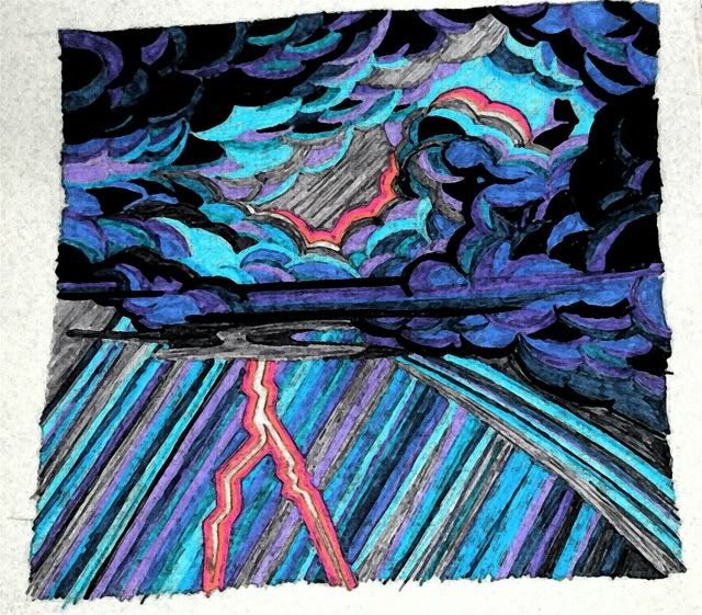
This I liked. Mostly. But it changed the tone on the "hot" colors around the lightning bolt. Hmmmm. So I tried the Watercolor filter.

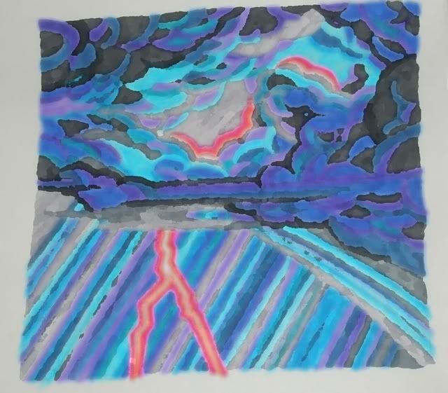
I rather like this one, and it may be what I use in the end. But out of curiousity, I also tried the Palate Knife filter.
I sort of like the way the colors blur here. But I'm not sure it would work for all the panels. Decisions, decisions!
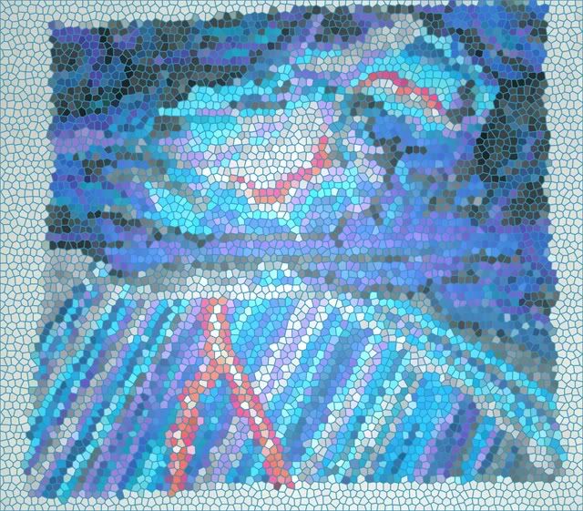
In the meantime there were two other filters that I tried out just for fun. I don't intend on using them for the project.
Here you have the Stained Glass filter ---
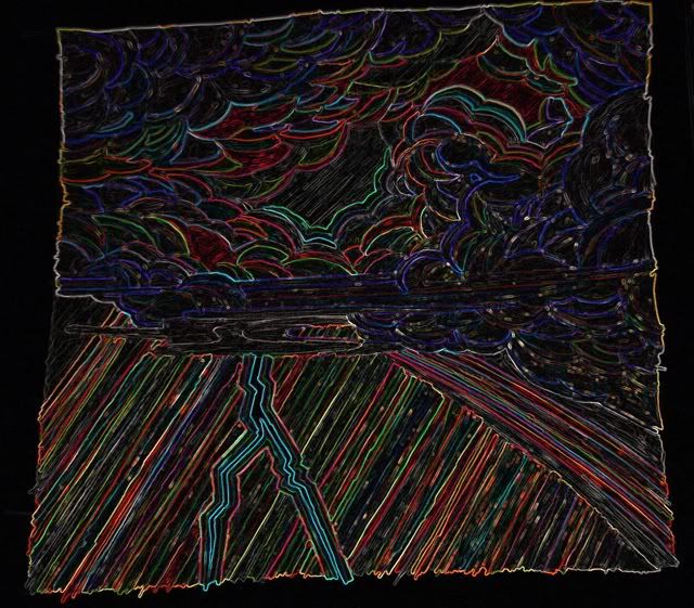
And then there's this thing called the Glowing Edge filter. It really amuses me, and I'm going to have to find SOMETHING to use it on!
All in all I think it was a profitable day of considering things.